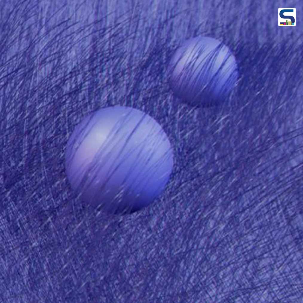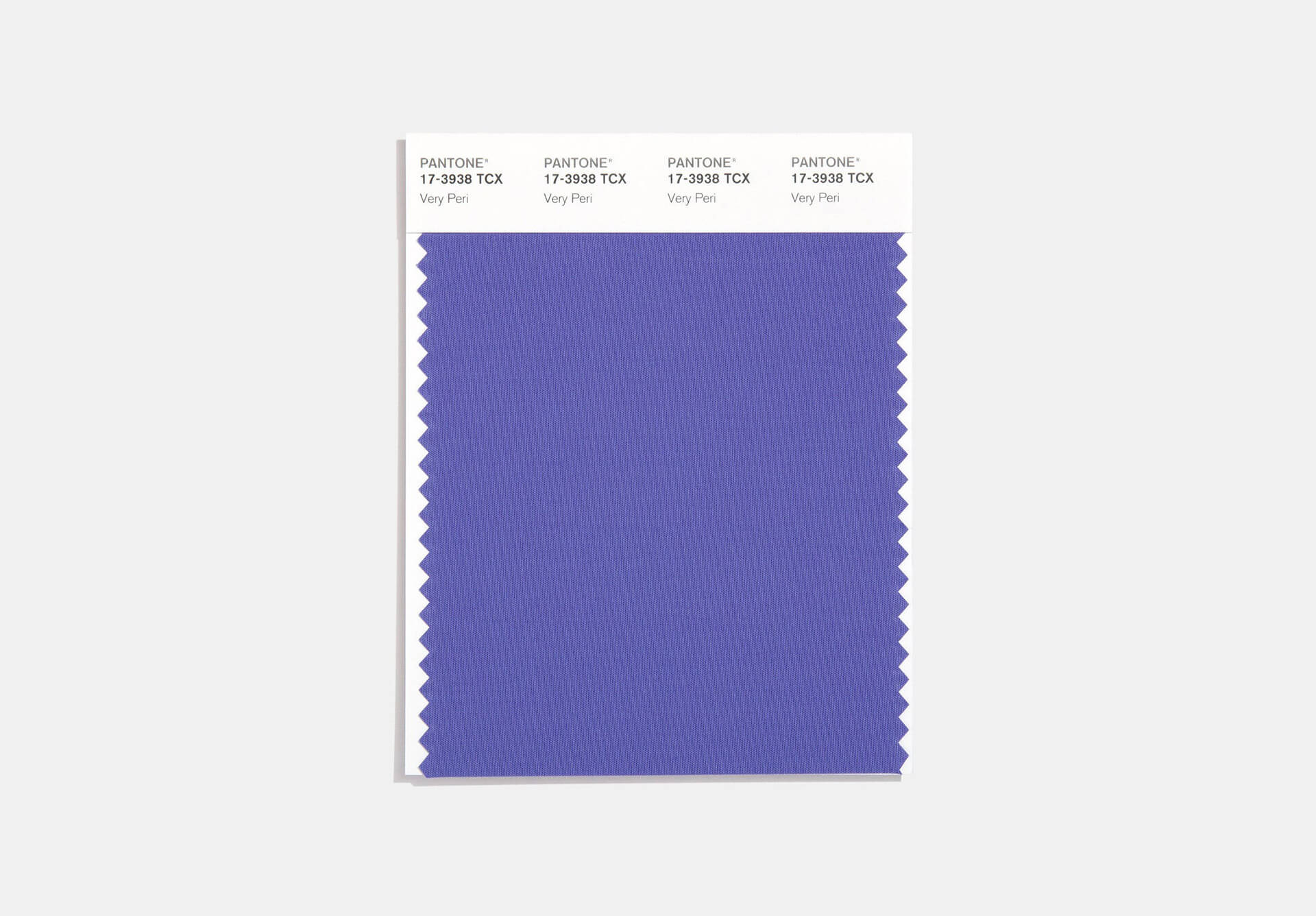
Described as the dynamic ‘periwinkle blue hue with the violet-red undertone’ is the Pantone colour of the year 2022. As we are going through transition, the colour shade dubbed ‘Very Peri’ reflects "the global innovation and transformation taking place." Created for the first time in the history of Pantone, the bold new shade will dominate the interior design world throughout the year from now onwards. Read SURFACES REPORTER (SR)'s complete report below:
Also Read: Choosing the Right Wall Paints/ Colours for your Rooms
Global colour authority - Pantone- every year unveils the shade that is going to reshape interior design trends. This year, the brand unveils PANTONE 17-3938 Very Peri, a hue that expresses “a spritely, joyous attitude and dynamic presence encouraging courageous creativity and imaginative expression."

Why this Colour Shade?
According to the global colour authority, ‘as we move into a world of unprecedented change, the selection of PANTONE 17-3938 Very Peri brings a novel perspective and vision of the trusted and beloved blue color family. According to them, the colour is a reminder to “embrace this altered landscape of possibilities, opening us up to a new vision as we rewrite our lives."
The blend of constancy and loyalty of blue with the energy and vivacity of red undertones, Veri Peri is a colour that will empower everyone to transform the familiar with something new.
How To Bring This Colour in the Interiors
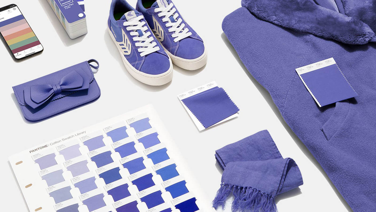
The colour will add a refreshing sense of playfulness to the interiors. The interior designers might like to experiment with this hue with different shades or can introduce a boldly-hued accessory to your space.

“Very Peri is suited to an array of different materials, textures, and finishes,’ Pantone explains. They add how the shade will provide a ‘pop of color’ when incorporated through a painted wall, accent furniture, or piece of decor. ‘[It will act] as an intriguing and eye-catching accent in a pattern,” says the company.
The elegant fusion of red and blue tones gives it a daring yet grounded appearance. In this way, it can stand alone in your interiors or can be a part of your new colour combination.
Also Read: 10 Products and Designs that Use the Pantone Colour of the year 2021
Ultimate Gray and Illuminating (yellow) were the Pantone Colour of the Year 2021 that dominated the interiors throughout the last year. Now in 2022, Very Peri is in trends as it is finding distinct expressions and different applications across interior design, fashion, textiles, and graphic design, and it appears as if it is here to stay.
Info and photo Courtesy: https://www.pantone.com/color-of-the-year-2022
Keep reading SURFACES REPORTER for more such articles and stories.
Join us in SOCIAL MEDIA to stay updated
SR FACEBOOK | SR LINKEDIN | SR INSTAGRAM | SR YOUTUBE
Further, Subscribe to our magazine | Sign Up for the FREE Surfaces Reporter Magazine Newsletter
Also, check out Surfaces Reporter’s encouraging, exciting and educational WEBINARS here.
You may also like to read about:
Colour of the Year 2019- Living Coral
Use of Unusual colours in Architecture & Design
And more…