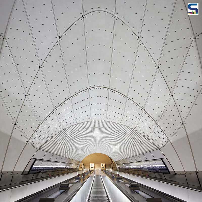
Grimshaw has recently completed the construction of London’s newest railway- The Elizabeth Line- that was a part of the London Underground network. The firm worked with engineering firm Atkins, client Crossrail, way-finding graphics & products designer Maynard, and lighting design firm Equation on the project to offer a line-wide design that offer an interconnected and reliable passenger experience. Serving 41 stations, the line runs 100 km east to west across the city through 42 km of new tunnels, plus 10 new central London stations. Also, it is upgraded with 31 existing stations. One of the eye-catching features of this line is the treatment of its passenger tunnels and platforms that showcase flowing surfaces with fluid and curved junctions. Read SURFACES REPORTER (SR)'s complete report below:
Also Read: Safdie Architects Reveals Plans To Build Interconnected Housing Towers Over Railway Tracks in Toronto | Orca
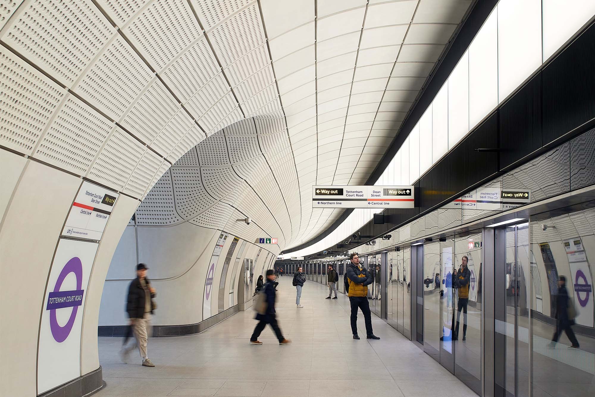 The new railway line in London comprises passenger tunnels, escalators, platforms, and station concourses such as customised furniture, signage, fittings, finishes and technology. The train is estimated to eventually carry 200 million passengers yearly, which would increase the overall capacity of the city's underground railway network by a staggering rate of 10 percent.
Wrapped With Glass Fibre Reinforced Concrete(GRFC)
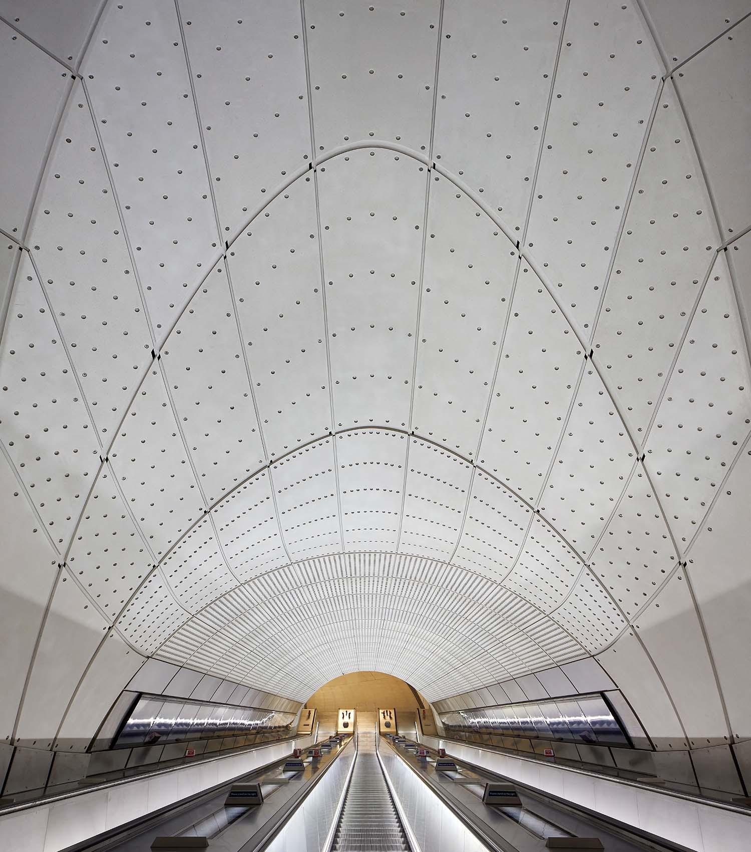
The structure is double than length and height of standard London Underground stations. Grimshaw used glass fibre reinforced concrete (GRFC) to envelope the entire structure, which sits firmly against the sprayed concrete finish of its outer coating.
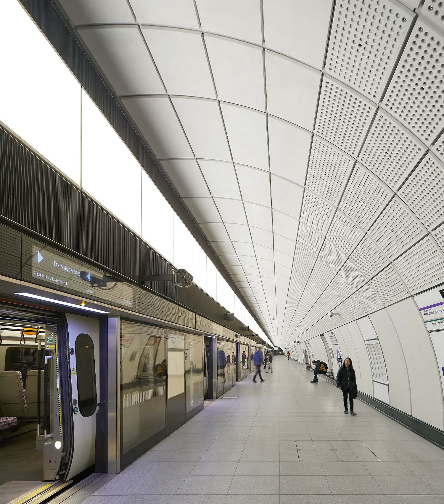 This helps in creating a fluid-structure and curved junctions in the passenger tunnels. These sinuous shape increases sightlines, improves the below-ground experience and passengers' movement and safety.
Wayfinding Totems For Guiding and Defining Routes
The firm focussed on Wayfinding, directions to onward journeys on the back wall of the platform while facing the tracks, as passengers wait for their train. In addition, digital advertising is designed within the platform edge screens, alongside the train arrival information. The firm adds zoning information throughout the tunnels with the wayfinding totems guiding and defining routes.
 The zoning of information continues through the tunnels with the wayfinding totems guiding and defining routes. The bespoke totems bring together low-level lighting, wayfinding, security cameras and speakers, all designed with ease of access for maintenance and replacement, and further contribute to the open, mannered, and consistent experience.
Combination of Cool and Soft Lighting
Passenger tunnels are decked with cool and soft lighting. Where cool lighting showcases the active, passing spaces of the passenger tunnels, warm, diffused lighting integrates into the platform edge screens and throws light down and onto the GRFC cladding, forming the soother, dwell spaces of the platforms.
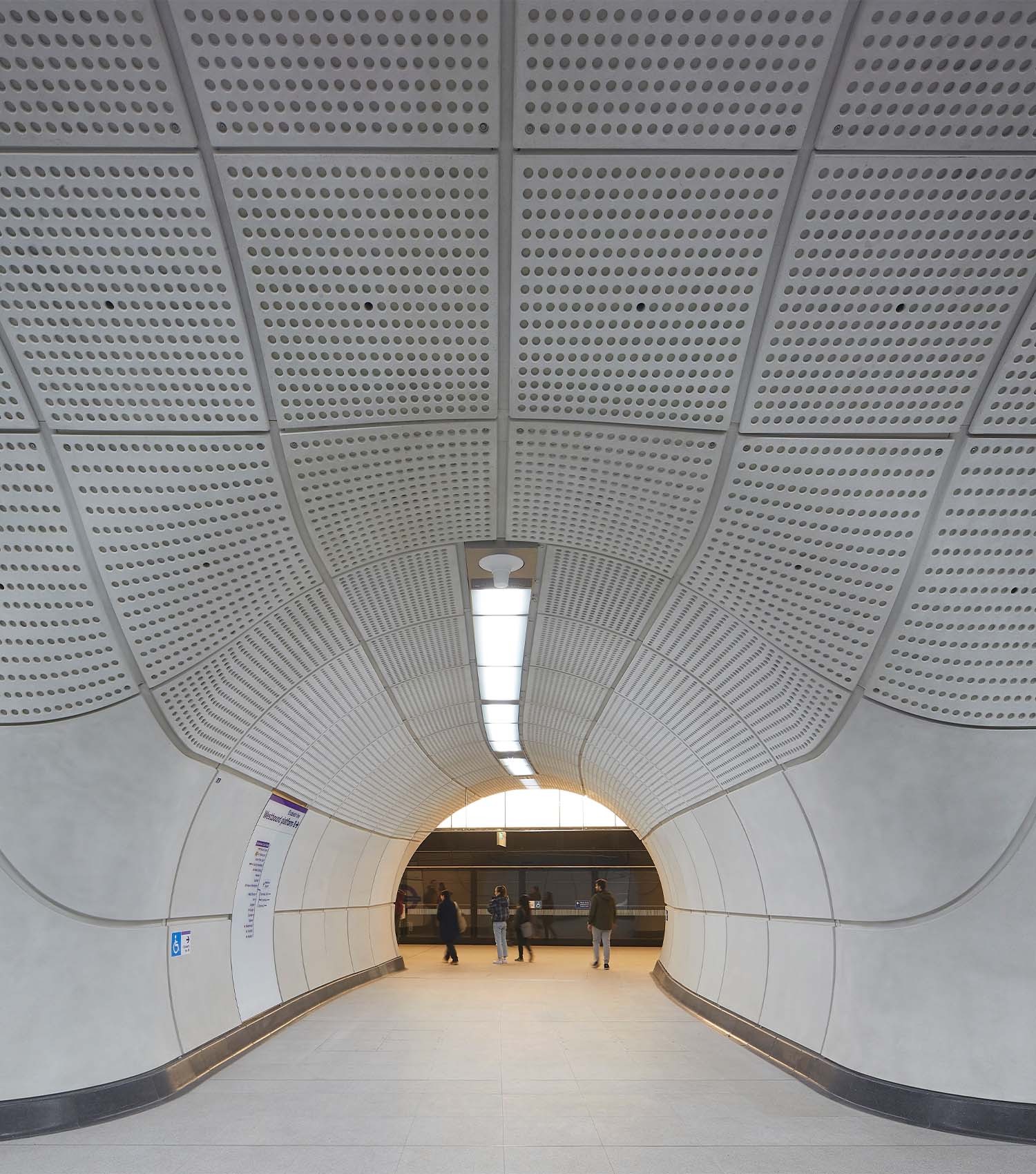 To enable the commuter to experience the core of the design, the line contains 240-meter-long walkways, while the cladding system allows integration and simplification of the signage.
Also Read: Implementing Green Initiatives, CSMT Mumbai the first Railway Station to get IGBC Gold Certification | Mumbai | Surfaces Reporter
Perforations in the Interiors
The interior shell of the structure contains perforations to serve both form and function, contributing to the distinct Elizabeth line identity as well as tempering the space acoustically.
 Grimshaw says "A design led by the engineering – expressing and exemplifying the magnitude of London's largest infrastructure project in 20 years – also gave way to the opportunity of scale."
Further, the interior colour palette is muted neutral that is characterised by GFRC cladding which is also supported by a lighting strategy. This softens the vast spaces and transitions that passengers experience across the journey from below to above ground.
“London has a long history of line-wide design which has always been about creating a common thread to the passenger experience across our dense, highly populated city and our design strategy for the Elizabeth line is no different. Working with Crossrail and the whole design team the line-wide design strategy has delivered a seemingly effortless travel environment that is intuitive, accessible, safe, and enjoyable, concluded Grimshaw.
Project Details
Project Name: The Elizabeth Line
Architecture Firm:
Project Completion: 2022
Photo Courtesy: © Hufton + Crow
Info Courtesy: https://grimshaw.global/
Keep reading SURFACES REPORTER for more such articles and stories.
Join us in SOCIAL MEDIA to stay updated
SR FACEBOOK | SR LINKEDIN | SR INSTAGRAM | SR YOUTUBE
Further, Subscribe to our magazine | Sign Up for the FREE Surfaces Reporter Magazine Newsletter
Also, check out Surfaces Reporter’s encouraging, exciting and educational WEBINARS here.
You may also like to read about:
Aidia Studio Designs Stunning Train Station For Tulum Featuring A Sweeping Latticed Roof Inspired by Ancient Mayan Architecture
The London Euston HS2 Station By Grimshaw Features A Bold Geometric Roof
and more...