
School for the blind and visually impaired children in Gandhinagar is designed for children from remote villages and towns in Gujarat and professors eager to offer them a better education and opportunities in society. Anand Sonecha, Founding Principal of SEAlab has designed the school, which can be navigated with the help of more than one of the five senses. Each interior, as well as the exterior space of this school, is marked and written in Braille. SURFACES REPORTER (SR) gets more design details about the school from the firm. Read on.
Also Read: Small and Large Circular Perforations Define The Brutalist Concrete Facade of This High School Gymnasium in Japan | Nikken Sekkei
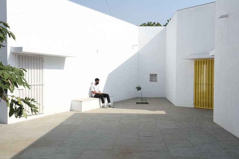 Located in Gandhinagar, India, this School for the Blind and Visually Impaired Children is designed with the support of an organization called Service Association for the Blind and Manav Sadhna, Gandhi Ashram, Ahmedabad. Also, generous local donors provided funding for the project along with Perkins School for the blind.
Areas to Play, Perform and Celebrate Festivals
Initially, the school occupied an existing building, previously a primary school. The 1st floor was used as classrooms for academic activities and the ground floor as dormitories. Earlier, there was less space for all the students (12 children shared in each dorm room) and no capacity to welcome more.
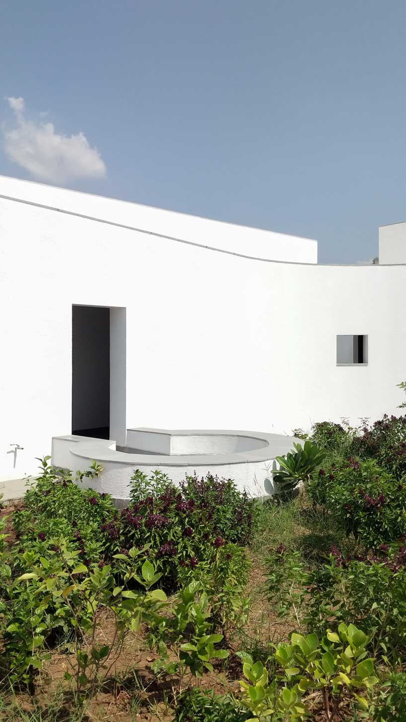
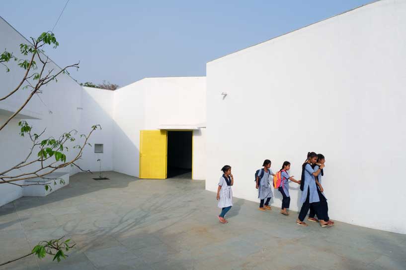 The new academic building, on the west of the existing one, has ten classrooms with five different types arranged around a central courtyard. This space provides a contained exterior space for the children to play, perform, or celebrate festivals.
Mental Mapping of the Spaces
This simple building typology allows the students to create a mental map of the spaces. The corners are identified with strokes of light or articulated volumes, and the corridor surrounding the central plaza has different widths and volumes on each side. This allows the students to identify their location in the building.
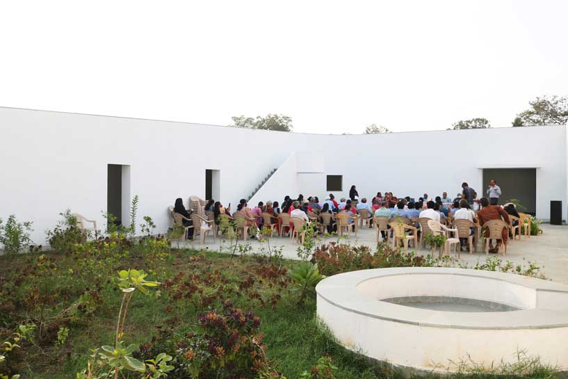 Each classroom around the central plaza has different features for specific uses – music rooms, meeting spaces, workshops, etc. Based on their functions, the "special" classrooms have various forms, volumes, and light qualities. The other classrooms are like verandahs; each opens to a private courtyard with the possibility of outdoor learning. The relation to exterior spaces allows for better ventilation and controlled light quality. The building is designed to be incremental or built-in phases according to the available funding.
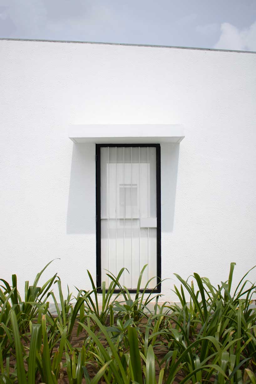
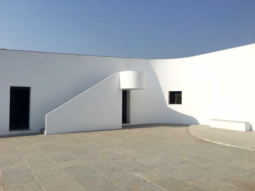 The classrooms are smaller cells plugged into the main spaces – the plaza and the corridor. The geometry of these classroom units creates a play of light and shadow and an efficient response to the hot climate.
More than 1000 shrubs, plants, and trees of 37 species are planted on campus to provide shade and fruits, invite butterflies and birds, and diversify and improve the natural environment. Khambhati Kuva (Percolation well) – a traditional rainwater harvesting technique of 10ft diameter and 30ft depth was built to collect the rainwater and the recharge ground. The well can absorb 45,000 to 60,000 litres of water in one hour.
Also Read: Mind Manifestation Uses 90s Nostalgia to Design A Cheerful and Interactive Space in This Preschool in Pune
A Multi-Sensory Design
This school is designed to be navigated with the help of more than one of the five senses:
Sight
Many students have low vision; they can distinguish spaces that have the contrast of light and shadow or contrasting colours and surfaces. Specific skylights and openings are designed to create contrasting areas with light and shade. For example, the entrance vestibule of the special classrooms is marked by a high ceiling with a skylight making a flare of light.
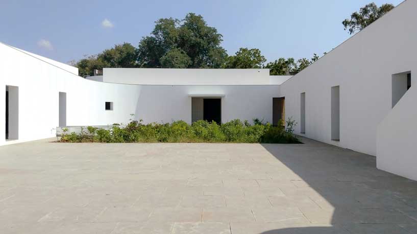 Also, contrasting colours are used on the doors, furniture, and switchboards so that the students can easily differentiate the elements during navigation. Since the students with low vision are sensitive to direct sunlight, the classroom has indirect, filtered light from the private courtyards and skylights.
Hearing
The sound of the voice or the walking step changes according to the echo produced in the spaces. The design attributes different heights and widths to areas of corridors and classrooms so that children can recognize them by sound.
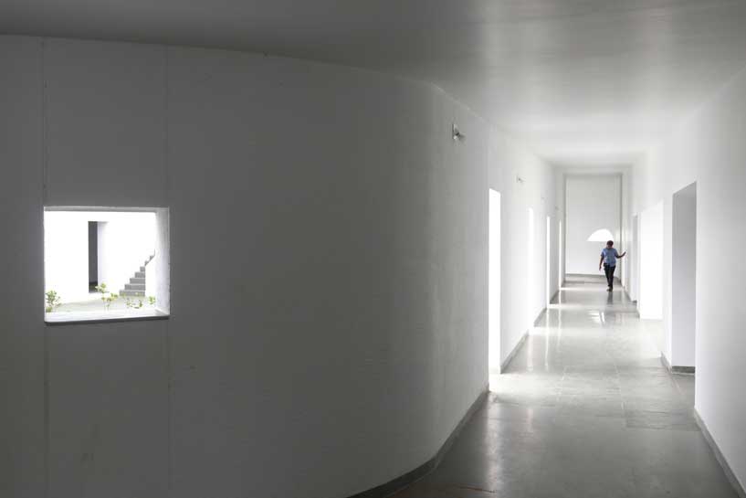 For example, the entrance corridor has a high ceiling height (3.66m), and it gradually reduces in height (2.26m) and width, giving an identifiable sound quality to each space.
Smell
The landscape has a significant role in the design. Courtyards, located next to the classroom and connected to the corridor, have aromatic plants and trees, which help in the navigation of the building.
Touch
The material and textures of the walls and floor, with smooth and rough surfaces, guide the students throughout the spaces.
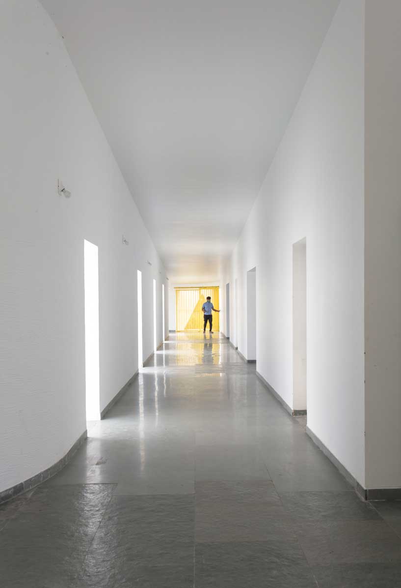 Floor
Floor
Kota stone is the principal material used for the flooring. Rough Kota stone marks the entrance to each classroom, whereas the other spaces have smooth Kota stone. While navigating, this change in textures guides the students.
Walls
There are five different wall plaster textures used in the building. The two longer sides of the corridor have horizontal textures, whereas the shorter side has vertical textures. This helps students identify which sides of the corridor they are navigating.
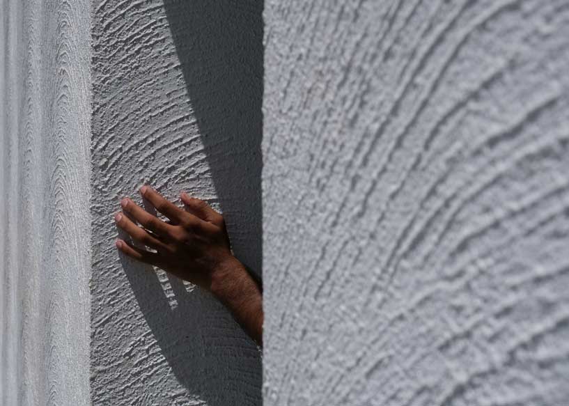 The central courtyard has a semi-circular texture, whereas the external surface of the overall building is sand-faced plaster.
User engagement approach
For the Schools design, there was a need to reinvent communication and participation tools. “We had multiple meetings at different stages of the process to engage the students and teachers on the design,” says the design team.
 Initially, the firm relied on cardboard models to start a conversation with students and teachers. They could visualize the built form through touch, but soon, they realized it wasn't easy to comprehend the interior spaces and details.
To counter the issue, they developed communication techniques using a 3d printer. This allowed for the construction of tactile drawings and robust models that the students could touch and visualize spaces.
“We developed a code of textures to communicate the design to students and teachers. These textures overlapped the plan and helped to visualize the architectural spaces. The interior spaces had a different texture than the exterior, just like circulation spaces or classrooms. Moreover, each area (classroom, corridor, courtyard) was marked and written in Braille,” they added.
Also Read: A Multipurpose Primary School in Canada Built Using CLT Modules and Passive Techniques by Université Laval Students
3d printed detailed models were also part of the communication strategy. It enabled students to touch them without breaking them. They had details like furniture and people to help understand the spaces' organization and scale.
 “Before the construction, we did a full-scale line-up on the site. All trustees, professors, and some students circulated throughout the space and gave their feedback. Lastly, during the construction, the contractor built mock-ups of some techniques that could help the students to navigate the building. For example, some of the students tried different wall plaster textures to clarify their effectiveness,” they concluded.
Project Details
Project Name: School for the Blind and Visually Impaired Children
Location: Gandhinagar, India
Team: Ayush Gajjar, Karan Verma, Aakash Dave, Aneesh Devi, Mariana Paisana, Anand Sonecha
Architect: Anand Sonecha
Other Credits :
Organization: Service Association for the Blind and Manav Sadhna, Gandhi Ashram, Ahmedabad
Funding: GMSP, Service Association for the Blind, Manav Sadhna along with the generous local donors
Project core support: Viren Joshi, Bhaarat Joshi, Jayantibhai Patel, and Pannalal Patel
Special thanks: Perkins School for the Blind, USA: Prof. Susan Decaluwe, Mike Catarzolo, Prof. Leah Kaplan, Linda Oleson, and Marianne Riggio
Construction Team: Rajubhai, Mani, Bhavna, Ramesh, Kailash, Pravin, Geeta, Mohanbhai, Vipul, Prakash, Kamlesh, Dhirsingh, Gulabbhai, Vijay, Alpesh, Arvind, Jayanti, Jagruti, Kalsingh, and Praful.
Plaster Team: Kavita, Kalidas, Anil, Komal, Mittal, Jaswant, Mitesh, Pashchu, Reva, Setudiya, and Jaswant.
On Site Management: Mitul Prajapati
Structural Consultants: Bhailalbhai Gajjar
Project Management: Kshitij Gajjar
Electrical and Plumbing consultant: Rakesh Modi, Kamleshbhai
Contractor: Vasant Prajapati
Landscape Architect: Lokendra Balasaria
Photographs: Bhagat Odedara, Dhrupad Shukla, Ayush Gajjar, Aakash Dave, Aneesh Devi, Anand Sonecha
Keep reading SURFACES REPORTER for more such articles and stories.
Join us in SOCIAL MEDIA to stay updated
SR FACEBOOK | SR LINKEDIN | SR INSTAGRAM | SR YOUTUBE
Further, Subscribe to our magazine | Sign Up for the FREE Surfaces Reporter Magazine Newsletter
Also, check out Surfaces Reporter’s encouraging, exciting and educational WEBINARS here.
You may also like to read about:
Studio Mortazavi Designs Worlds First 3D Printed School in Madagascar | Thinking Huts
Sanjay Puri’s Rajasthan School Feature Red-coloured Angled Walls and Walkways
And more…