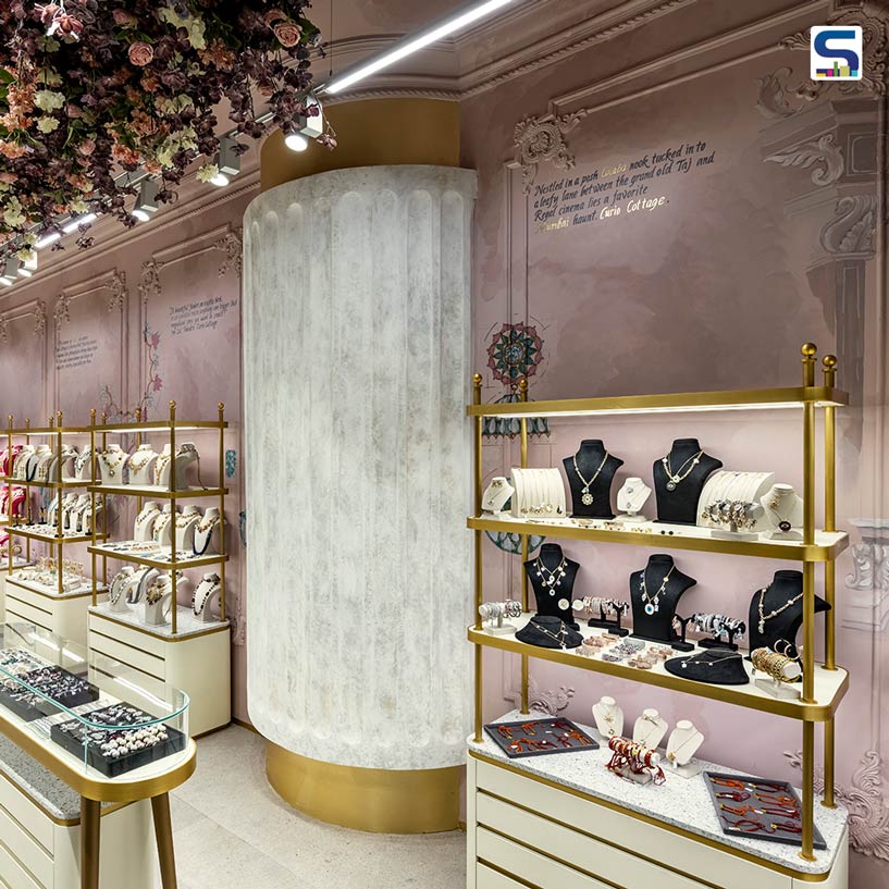
Rahul Mistri and his team including Rakesh Sharma & Vinayak Bochageri of Open Atelier Mumbai have used Peachy pinks with elaborate designs to create this beautiful jewellery store for the Curio Cottage Boutique. SURFACES REPORTER (SR) receives more details about this post from the design team. Read on:
Also Read: Timeless and Elegant Design Elements Adorn The Interiors of This Jewellery Showroom | Ahmedabad | Verve Atelier Designs
 Tucked into a clever corner of a retail hub lies the Curio Cottage Boutique – a store for imitation jewellery inspired by India’s rich heritage of design and artisanry. Set up as a brand three generations ago in 1971, they have expanded by opening their fourth outlet at the luxury shopping destination Phoenix Palladium in South Bombay. Unlike their previous establishments, the design intends to offer the brand’s elegant collection to diverse audience segments.
Design Allows Maximum Visual Accessibility
On one hand, the store’s vital location acts as an intersection of the two passageways providing maximum visual accessibility. Conversely, a Starbucks Cafe across from the store facilitates footfall improvement. Aimed to be completed within a short timeline, the design approach that has been adopted is clean and dynamic.
 The design scheme optimises space constraints via strategic circulation and balances aesthetics with contrasting design elements. The goal of the design intervention has been to elevate the exhibit by showcasing variety in a confined area.
This 400 sq. ft. plan includes one cash counter, nine showcase units, and two island counters that are meticulously designed to showcase a wide range of jewellery. Adhering to the company’s repute, the spatial experience is “non-prototypical” in its essence. With the vision of redefining the brand identity, a refined palette of shades and textured paints the feminine imagery of beauty, grace and admiration.
A Walkthrough of the Store
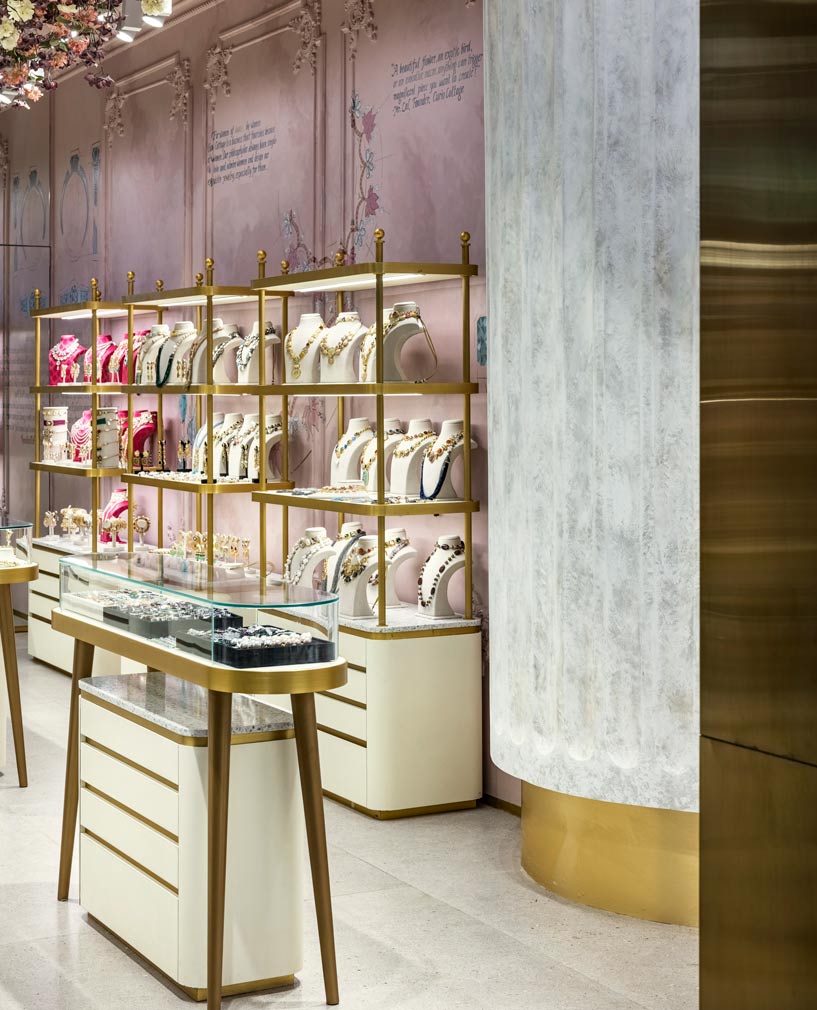
Upon entry, the customer can easily browse through the entire collection at once. The display units around the boundary create ample space for the visitors to manoeuvre around the island counters in the centre and provide a smoother exhibition experience. The lanes are met with a cash counter on the other end of the store to ensure security.
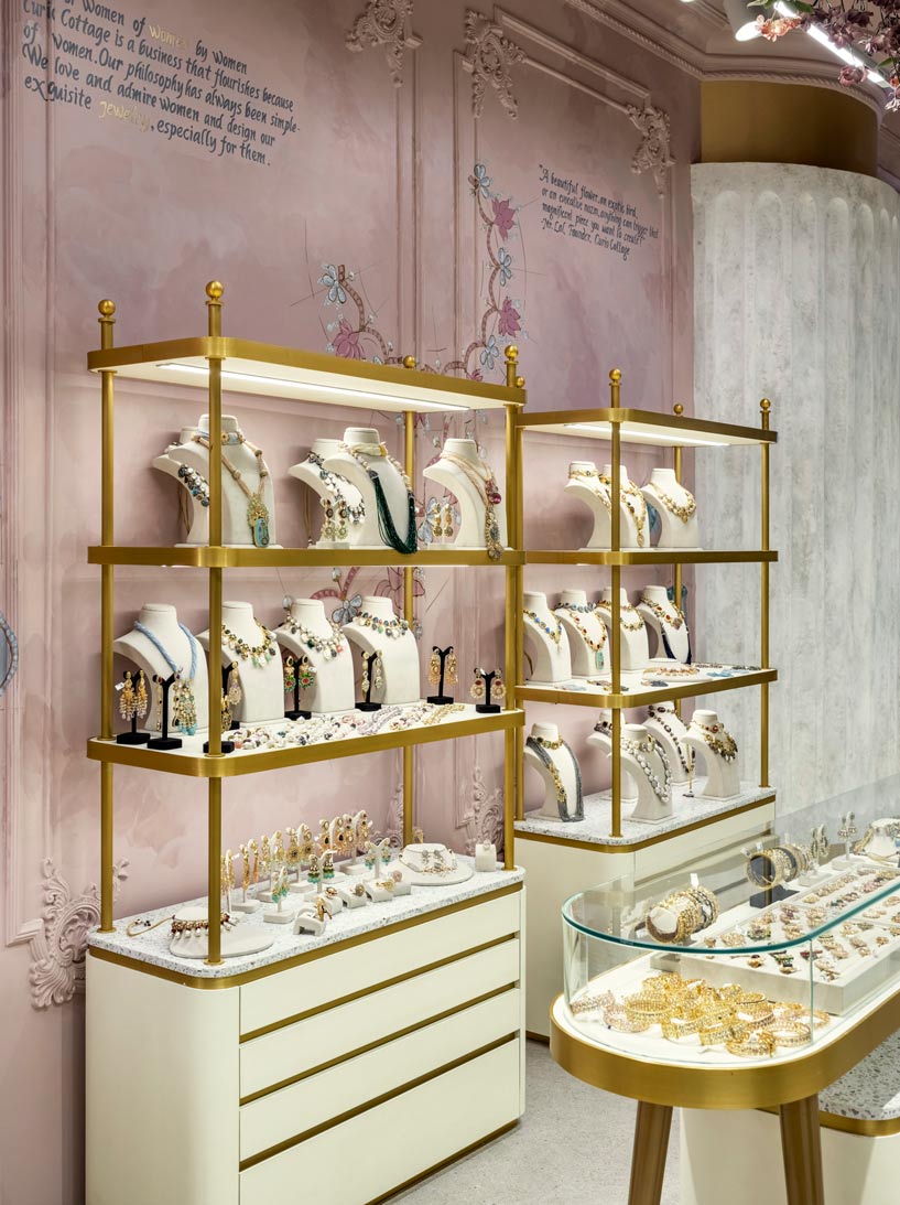
A peachy pink wall backdrop in cloudy grains states the 50-year brand legacy, whilst intricate carvings bring relevance to the charming heritage that Curio Cottage stands for. Alongside the hand-painted firm timeline, the floral illustrations on the walls represent the celebratory values of the brand which is “For women, of women, by women”.
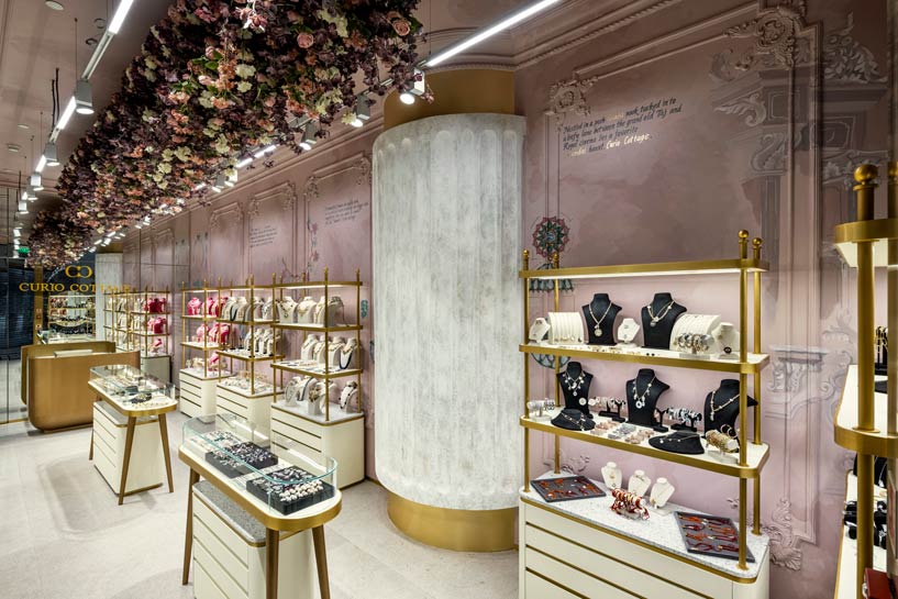 A 28-feet long ceiling installation in pink-peach-white flowers and green leaflets suspends from the top, enhancing the vertical stretch of the store. Made from dust-repellent fabric, the flowers are UV protected and assembled after various mock-ups and trials. Simultaneously, the linearity of the space is broken by a civil column detail on one side and the individual units on the other.
No Doors- Eliminating The Barrier
The entryway is visually expanded by eliminating the doors of this retail space, clearing any barrier between the visitor and the display.
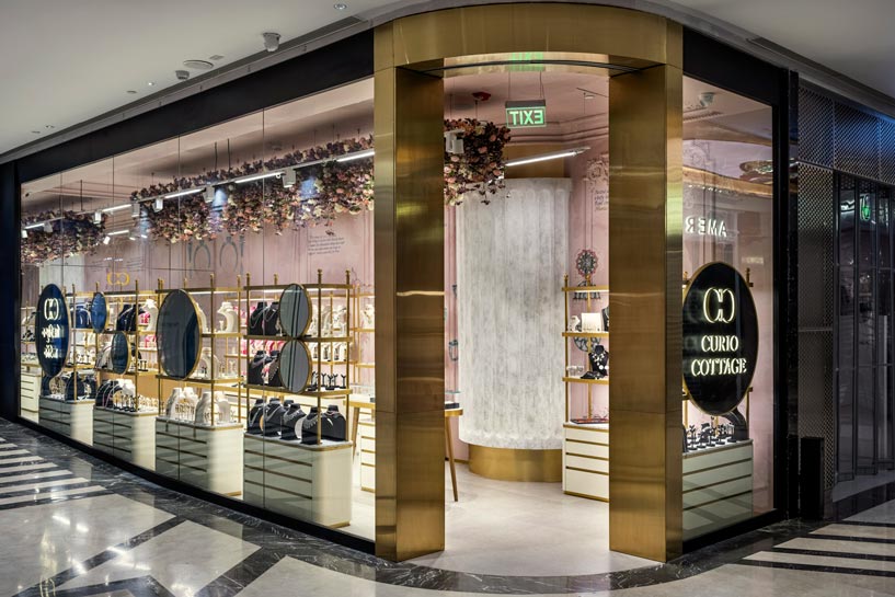 The flooring is in a subdued terrazzo tile, and mirrors behind the reception area create the illusion of a larger space. The 34-foot long outer running facade is integrated with the branded collaterals and exhibits to enhance the window shopping pursuit.
Colours, Materials and Furniture
Four display units are placed along the outer boundary of the store to attract customers, while five island units serve as the in-store furniture. Curated and detailed in-house, the display units showcase a chic mood board that spans from PVD brass sheet frames to an ivory colour base enhanced by leather finish laminate and matt brass paints.
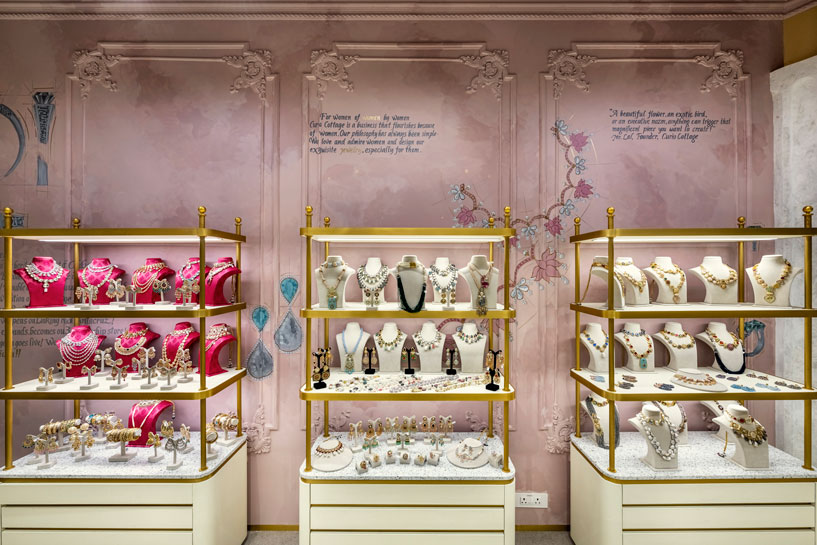 Contemporary-style free-standing cabinets are engineered with sleek shelves carrying mannequins of necklaces and elaborate earring pieces with storage drawers. Enveloped within the glass, the central units house other items like bangles, bracelets and more. All accessories and delicate pieces are laid on classic leather-finished laminate instead of the conventional felt. All materials used are fire compliant and adhere to the mall protocols of security and sustainability.
Role of Lighting
Lighting as a design element has been employed via a combination of linear and spotlights, favouring the overall purpose of jewellery assessment and selection. Generic track lights aid the overall space, and the focus lights throw one’s attention on selected items. To avoid the cut shadows from the floral bed on the ceiling, the ceiling is jointly incorporated with adequate up-lighters.
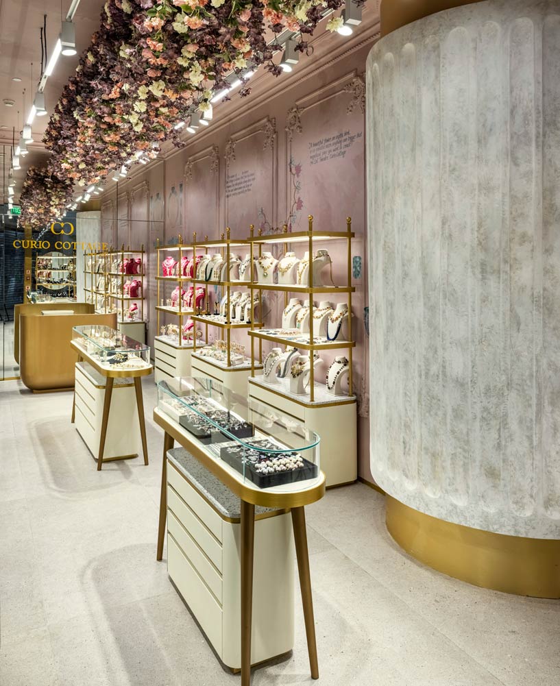 An amalgamation of the client’s vision of expanding their footprint and design inspiration from pastry salons in Paris, Curio Cottage Boutique is a vibrant, chic and contemporary space that graces the modern merchandise stage of design.
Project Details
Typology: Retail Jewellery Store
Name of Project: Curio Cottage Boutique
Location: Phoenix Palladium Mall, Mumbai.
Name of Client: Anand Bathija
Name of Client’s Firm: Curio Cottage
Contact Person: Mr Anand Bathija
Principal Designer: Rahul Mistri
Design Firm: Open Atelier Mumbai
Design Team: Rahul Mistri, Rakesh Sharma & Vinayak Bochageri
Site Area (sq ft & sq m): 400 Sq.ft
Start Date: May 15th, 2022
Completion Date: 15th June 2022
Photographer: Mr Prashant Bhat
Products / Vendors
ACP / Glass / Concrete: Saint Gobain
Flooring: Lioli terrazzo tiles
Furniture: customized
Air Conditioning: Daikin
Lighting: Maxwell's lighting
Paint: Hand-painted mural
Art: Rangari
Consultants
Electrical: Manas
Civil: Shreeji
HVAC: Innovent Aircon
Contractors: Shreeji Arts