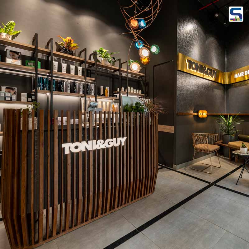
Ar. Bhanu Kharbanda and Ar. Saurabh Kathoria of Gurugram-based architecture firm Design ReseArch Workshop DRAW used an element of LINES all over Toni & Guy Salon's interiors. The firm used 'Lines' in all materials and space – ceiling, flooring, walls, and furniture, making the design aesthetics homogenous and distinctive. Architects shared with SURFACES REPORTER (SR) about their challenges while designing the project and the particular highlights. Read on:
A Continuous and Homogeneous Space
The firm wanted to create a continuous and homogeneous space, as per the client’s requirement with different areas such as the Kerastase room, spa room, hairdressing stations, etc. for varied activities.
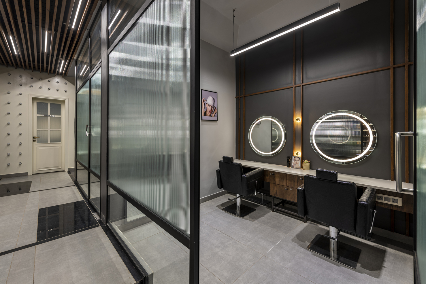
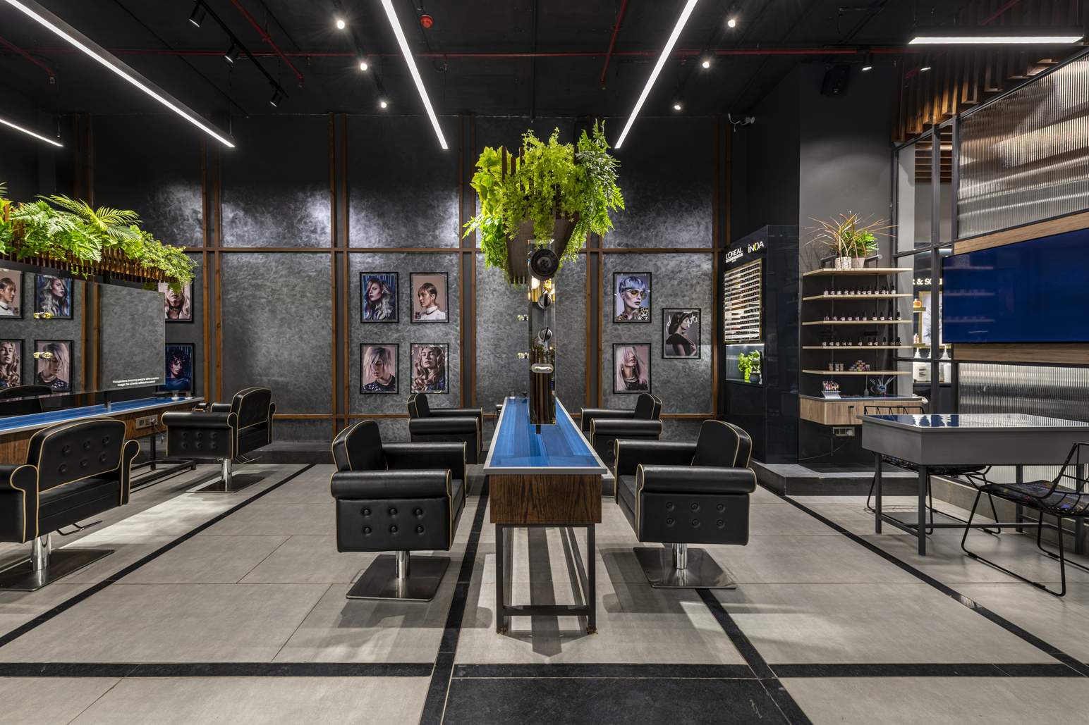
The design philosophy of the space features a contemporary and bold space with the requisite sense of luxury. Luxury can be felt the moment one steps into the salon.
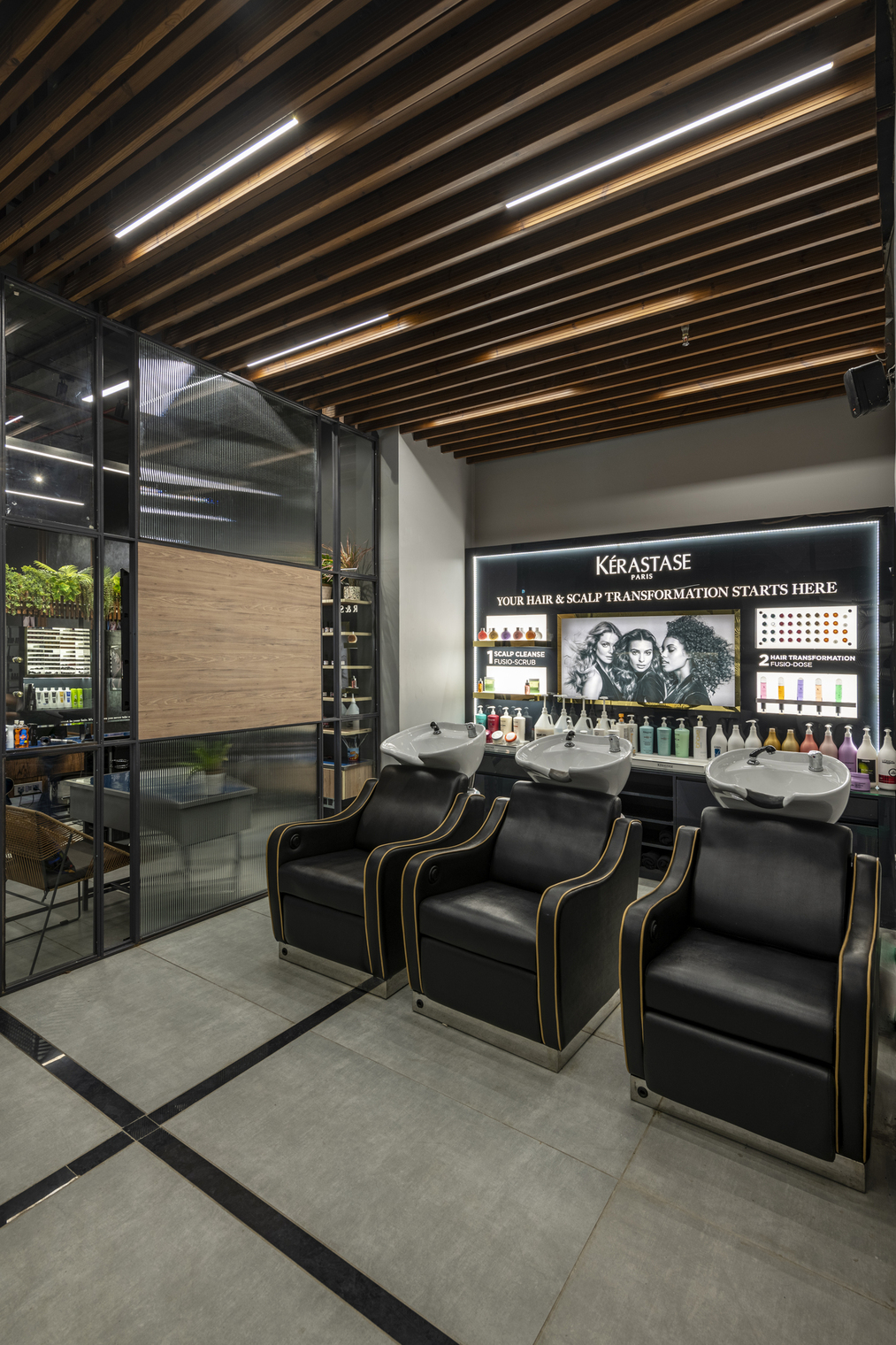
The feeling of valiance in terms of design has been portrayed through the ceiling, lighting and furniture design.
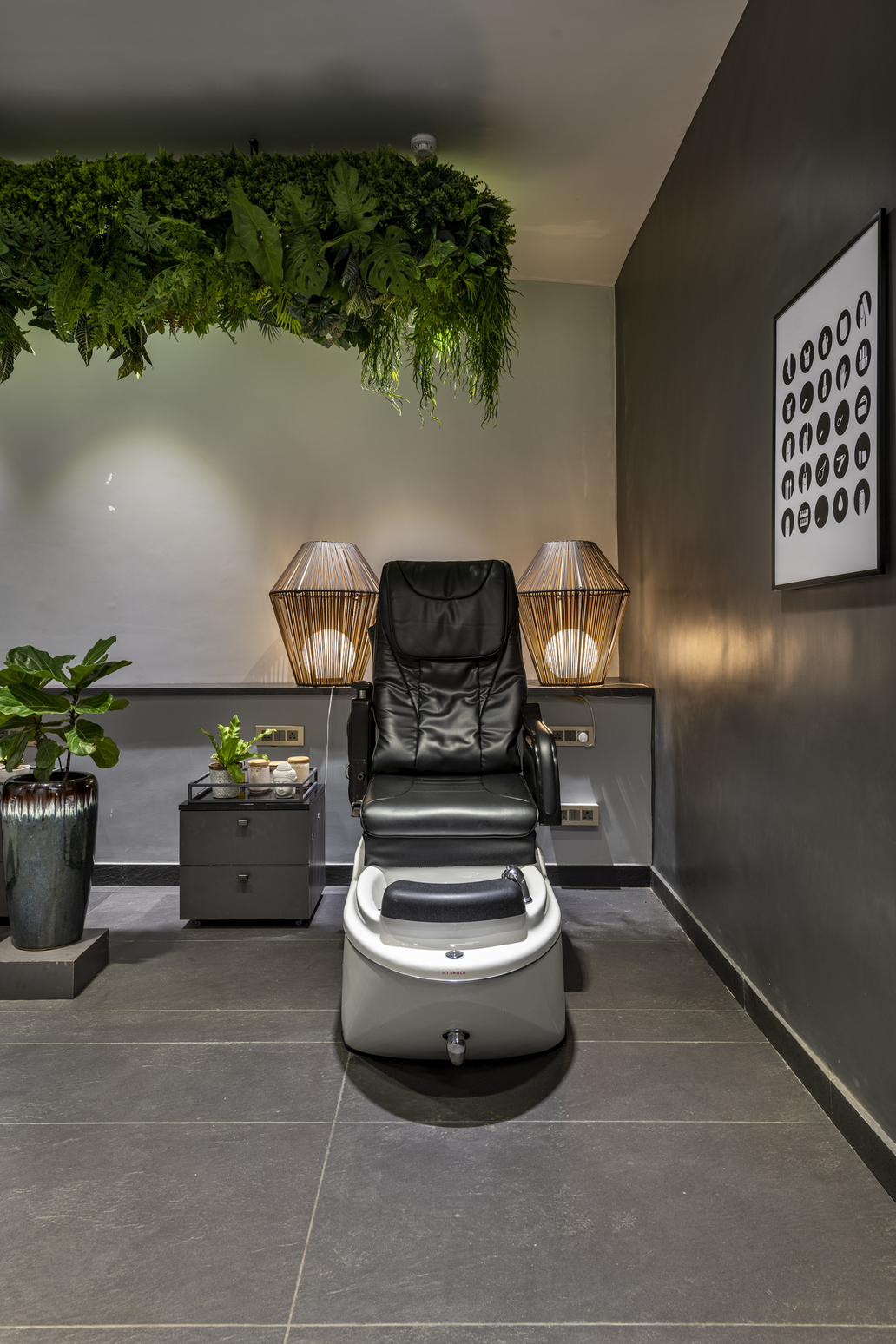
Coming together of disparate styles, juxtaposing textures and contrasting colours allows creating a cohesive, beautifully realized space.
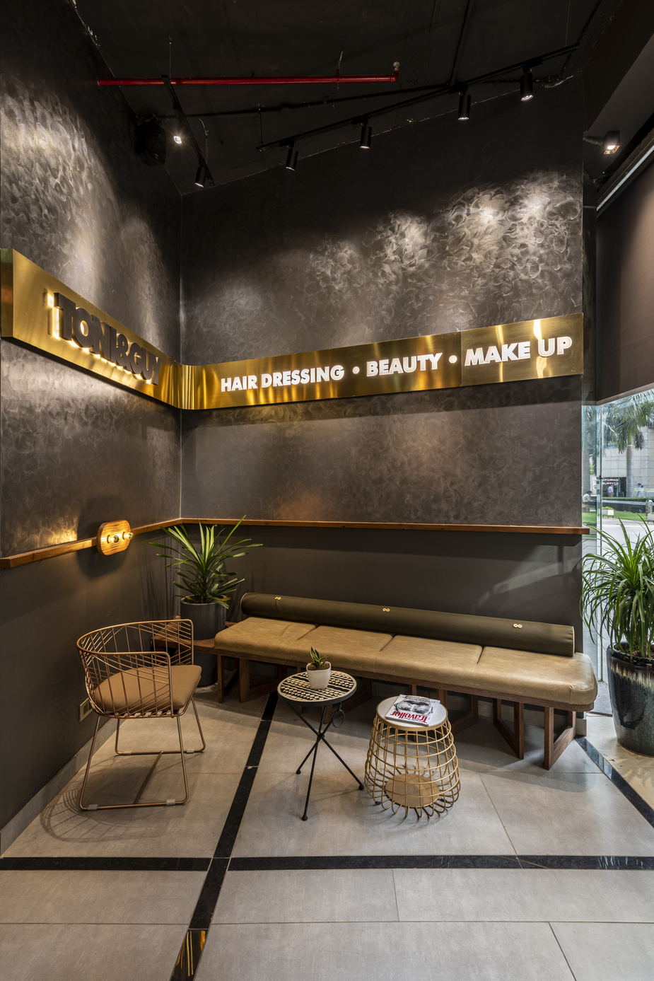
The overall dim effect of the design is stunning and exudes an enchanting feel.
Material Palette
Architects used pinewood in furniture & ceiling whereas the textured walls are enough to fascinate the patrons.
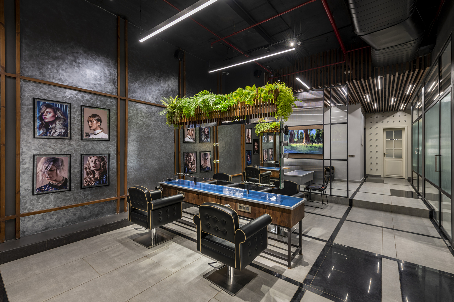
The use of fluted glass in light pieces makes an excellent combination of material palette while also giving a unique appeal to the entire space.
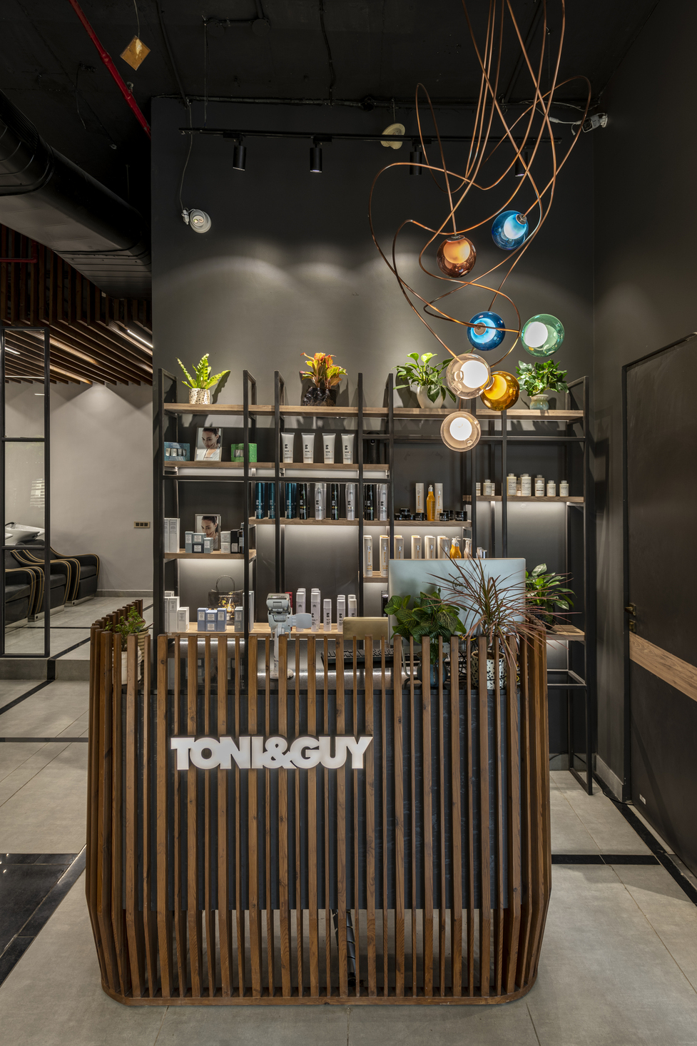
Wooden louvres in the ceiling and reception table being the showstopper.
The Focal Wall
The passage is leading to The Focal wall with bulbs, visible from every corner of the salon.
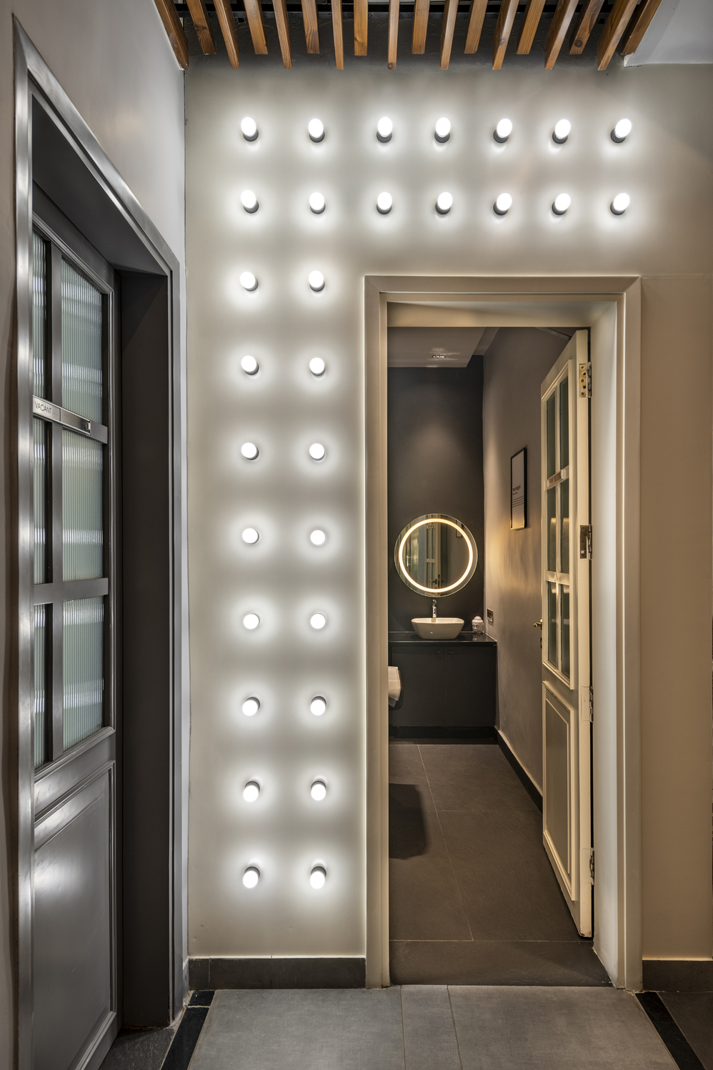
This passage was designed so that it intrigues the customers to walk around, which leads to a spa room. When lit, it is the most aesthetically pleasing space of the salon.
Ample Use of Gorgeous Indoor Plants
The firm enhanced the interior's appearance with loads of beautiful indoor plants which are one of the spotlights of the project.
Challenges
The firm's biggest challenge was to create eight hairdressing stations to be incorporated along with the Nail station in a limited space. So, space constraint issue was there. Another challenge was the furniture lay-outing.
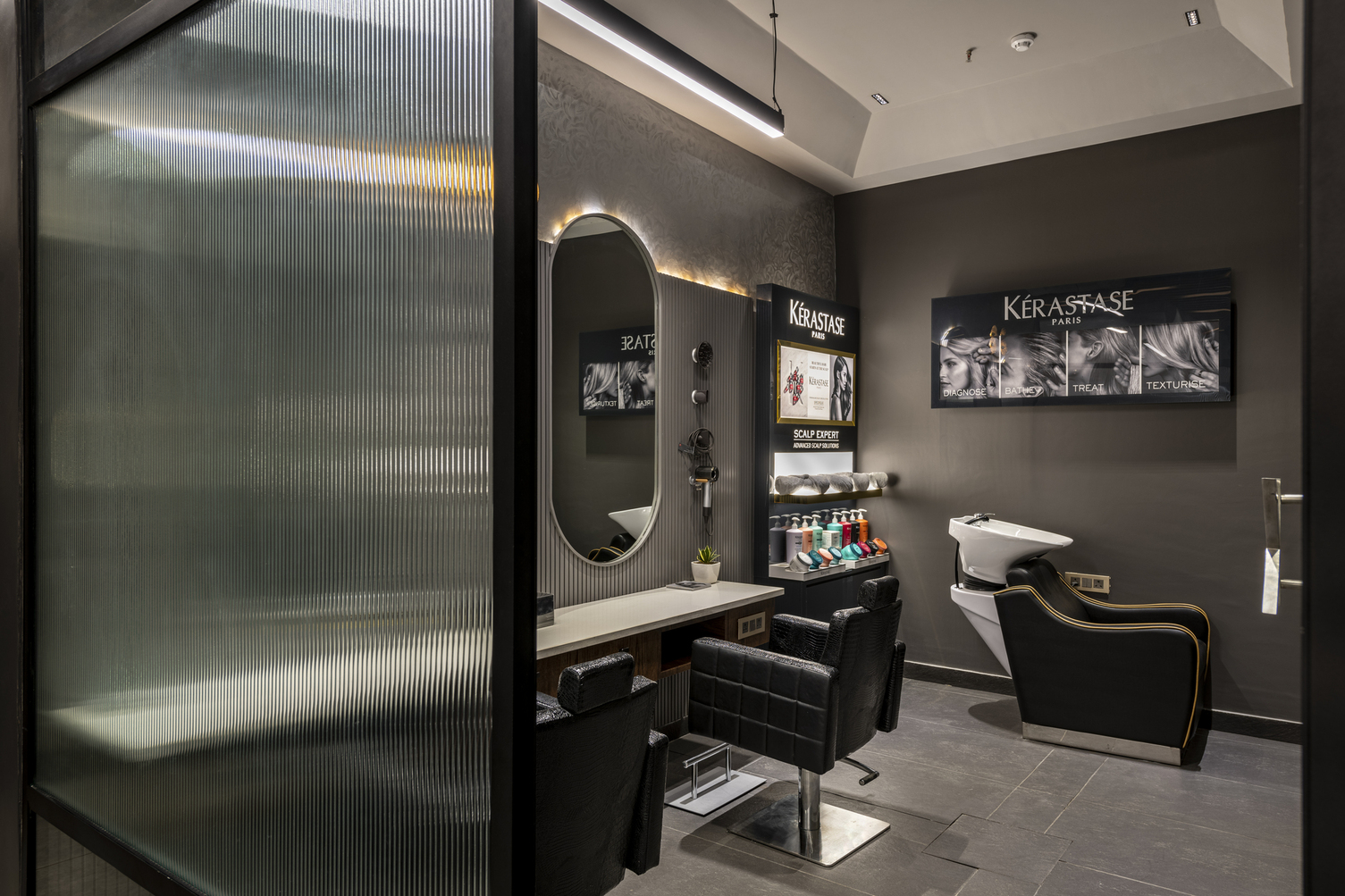
All the distinctive areas of a salon needed to integrated without making the space look tiny. The firm ably achieved a free-flowing interior space entirely with the apt furniture lay-outing.
Project Details
Architecture Firm: Design ReseArch Workshop DRAW
Interior design: Team DRAW
Principal Architects: Ar. Bhanu Kharbanda and Ar. Saurabh Kathoria
Project Name: Toni & Guy Salon
Location: Vatika Business park , Sohna road gurugram
Category: Retail salon
Client: Shiv and Sonali Bhambri – Toni & Guy north india
Built Area: 1785(sq.ft)
Year: 2020
Photo Courtesy: Prashant Bhatt
About the Firm
DRAW is a young idea-driven design office operating in territories between art and architecture. By transforming the familiar into the extraordinary, DRAW makes architecture perform the unexpected. The firm’s expertise lies in its pure functional forms exaggerated by a play of materials, the judicious use of technology and a design sensibility. This interesting co-existence and conversation of various materials are utilized in all projects to create responsive and responsible architecture.
Keep reading SURFACES REPORTER for more such articles and stories.
Join us in SOCIAL MEDIA to stay updated
SR FACEBOOK | SR LINKEDIN | SR INSTAGRAM | SR YOUTUBE
Further, Subscribe to our magazine | Sign Up for the FREE Surfaces Reporter Magazine Newsletter
You may also like to read about:
An elegant minimalistic synchronisation of shades and materials in this hardware showroom
Plywood Lines Every Surface of Shen’s New Beauty Store in Brooklyn | Mythology
All-Concrete Facade of This Coffee Production Plant in Tbilisi, Georgia Is Topped by a Green Roof | Giorgi Khmaladze Architects
and more...