Architects Tushar Kothawade and Chiranjivi Lunkad of Studio Infinity has designed ‘Brick by Brick’- an eye-catching Advocate’s Office in Pune, Maharashtra. Exposed brick work and earthy toned palette ground the design of this office. The archiects have shared with SURFACES REPORTER (SR) how they realized the client’s desire to create an office aesthetically different from the other legal offices in the vicinity. Read on:
Also Read: Exposed Brick facade
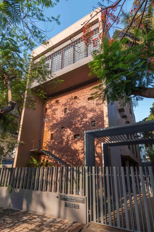
The initial challenges revolved around creating a visual relief in the tight space available and developing a design vocabulary that will redefine the way one looks at an advocate’s office and moreover considering the fact that most people come there under stress due to their legal issues.
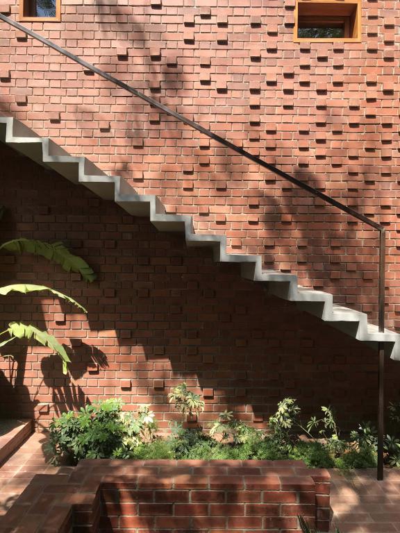
The client, a young advocate couple wanted primarily an office that will accommodate their present & future staff and have a spacious front office to accommodate large number of people coming for consultation.
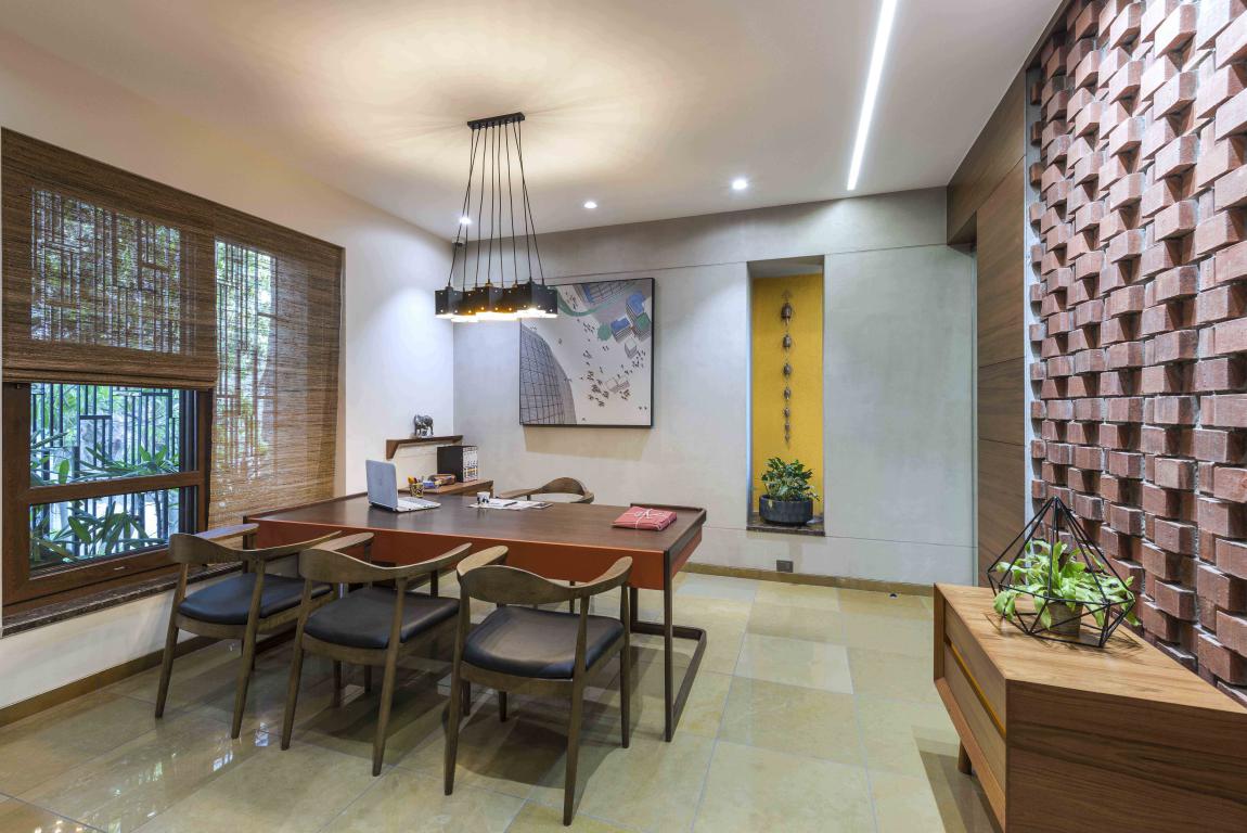
The firm’s response to their requirements started by understanding their way of working, the clientele they had and the kind of growth they were aiming to achieve in the near future. One of the major constraints in space planning was the structural & services grid, which was defined by the residence above. So, their space allocation started by addressing this aspect.
Also Read: Rippling Brick Façade-A Sunscreen for House
Three Fundamental Aspects
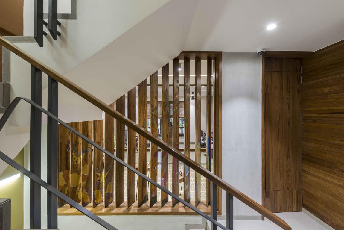
The project spreads across two floors in a 3 storied mix use building. Throughout the project, their efforts were primarily based on three fundamental aspects, viz: creating a seamless transition from the entry into the site and then into the interior spaces. Secondly, they wanted to define inter-relations of spaces thru' visual connectivity and lastly, work around a common design vocabulary to bind all spaces together.
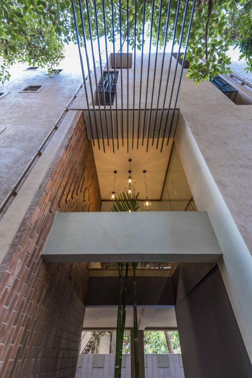
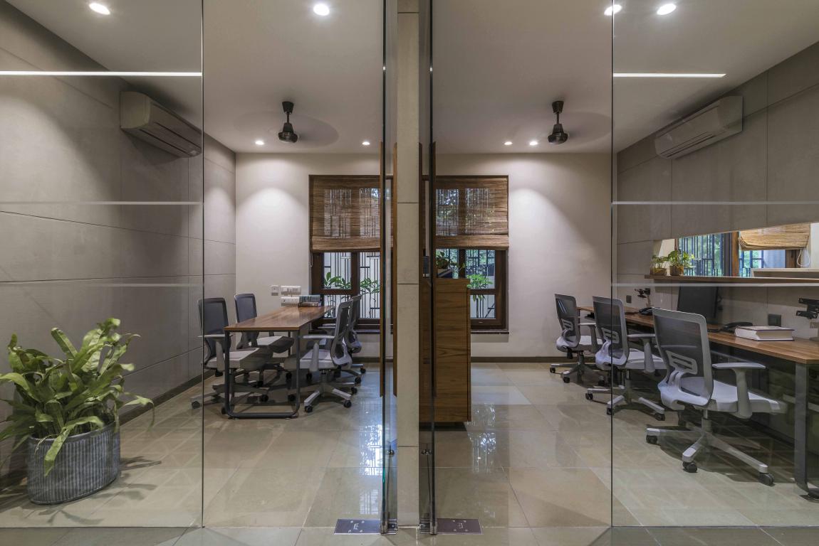
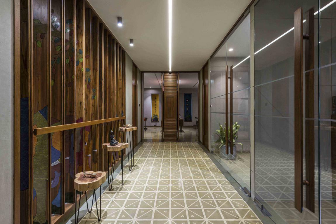
The public or visitor areas and the semi-private spaces like consulting cabin and conference room were segregated with a wide corridor. The planning is largely open with all spaces visually inter-linked.
Segregation of Spaces
Then considering functional requirements, the firm segregated the user and visitor spaces. Separate entries were defined for office staff and visitors.
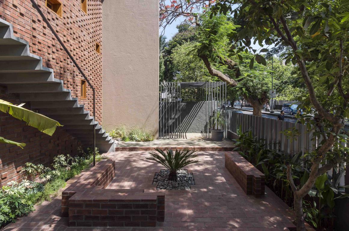
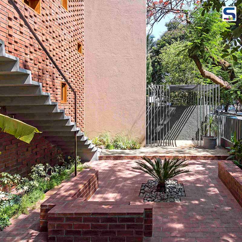
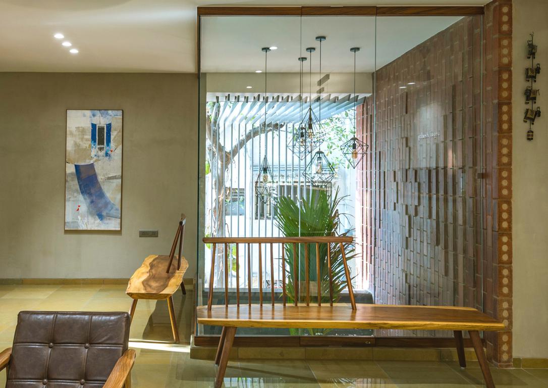
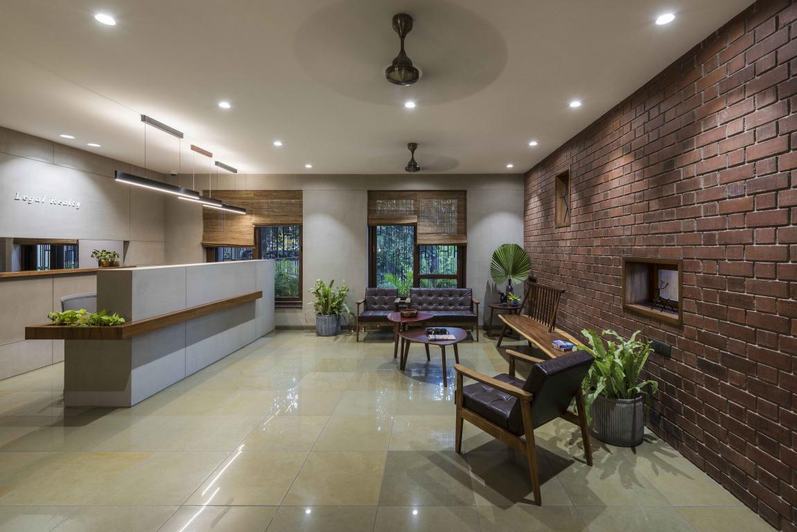 A fore-court was designed to act like a transition space between the first floor office & ground floor entry. Efforts were taken to maintain a visual connect with the adjoining street.
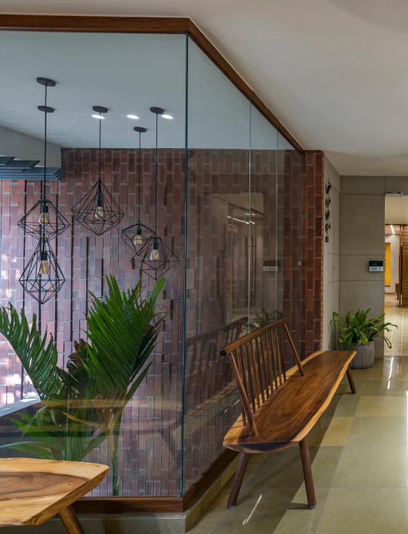
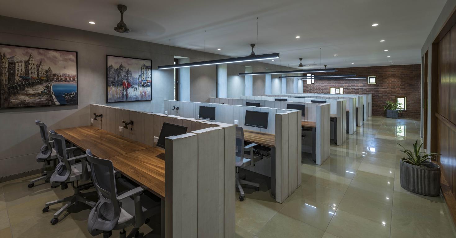
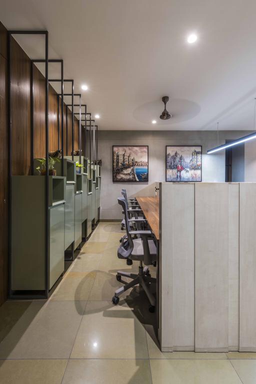
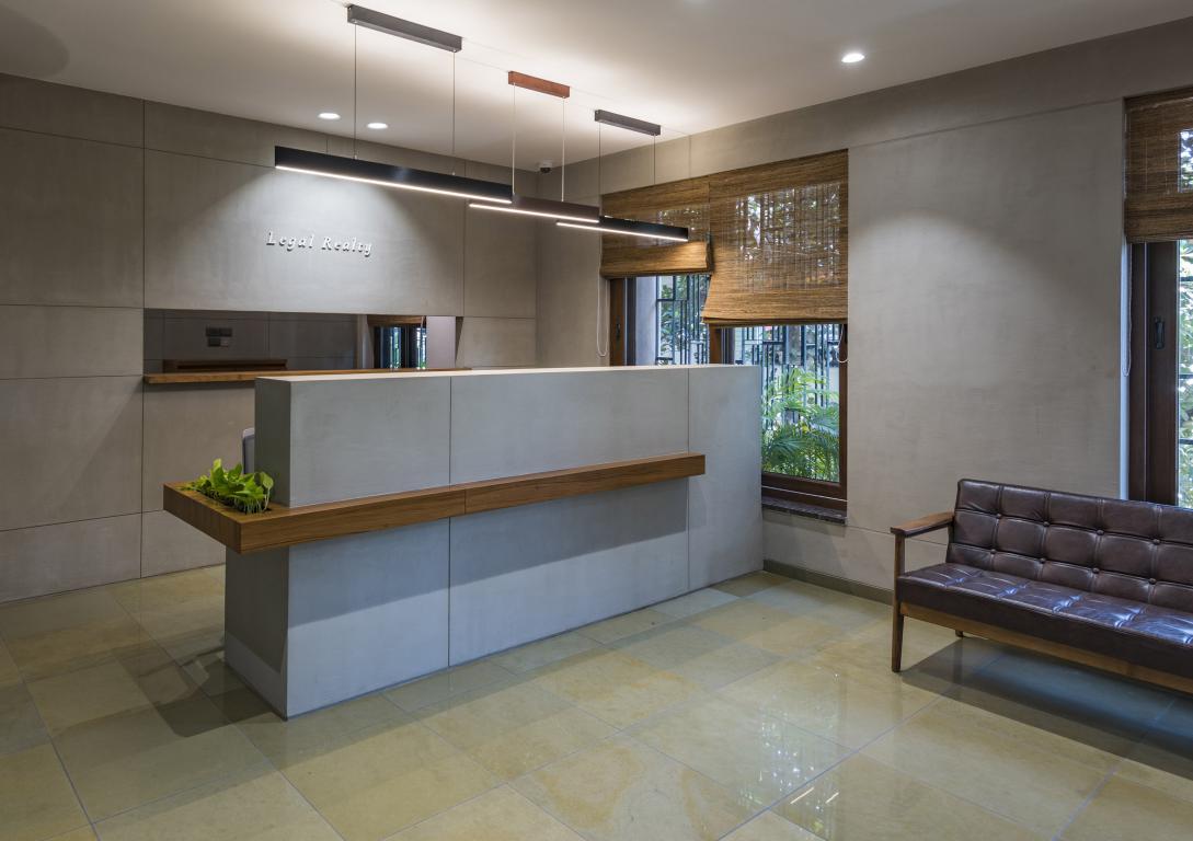
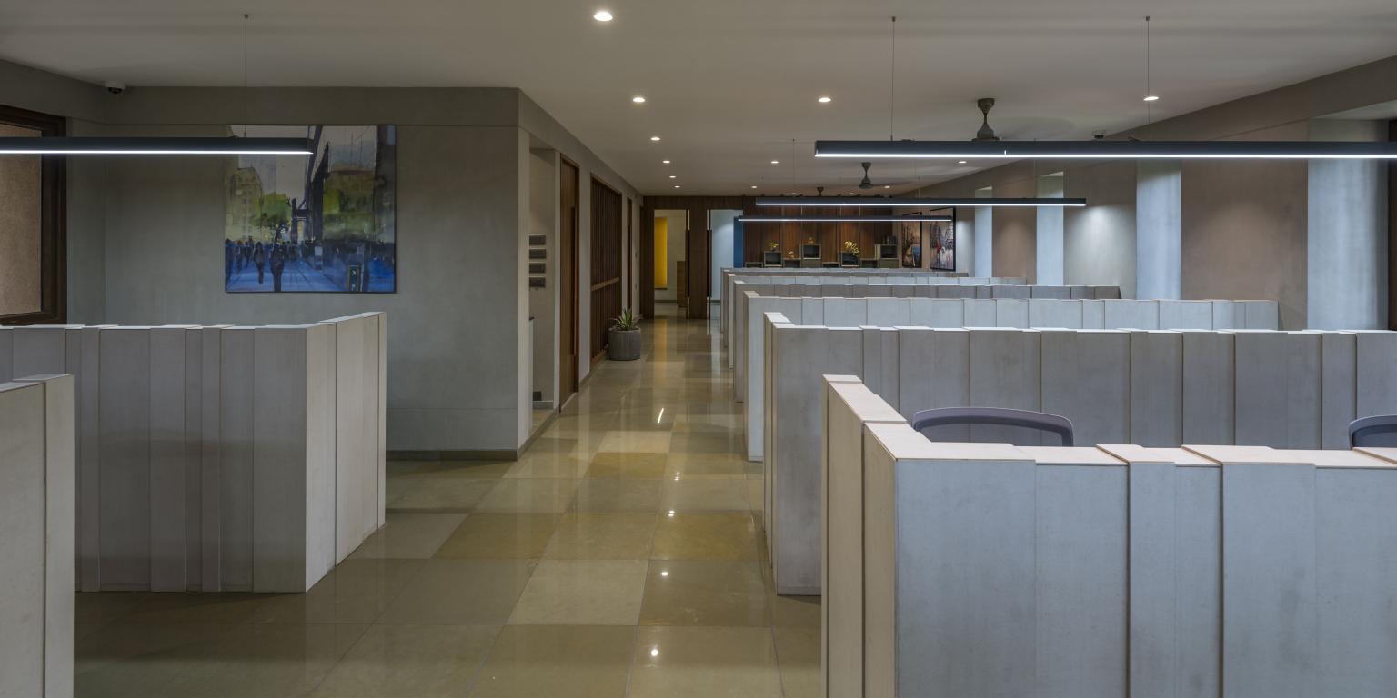
The first floor acts like a semi-private space where visitors are attended, while the second floor is a more private space where all advocates work. Considering the stressful state of mind of clients coming to consult an advocate, the studio designed a double height tree-court which overwhelms the reception - waiting zone.
Also Read: Fascinating Facade: A Brick House in the Lap of Nature
Further, keeping in mind the level of concentration required by their staff while working with documents and legal terms, the second floor designs were defined.
The contextual setting also played an important role in helping the firm define their spaces.
 The plot is surrounded by residential development all around and except the front side; there are buildings at a mere 18 feet distance.
 Thus, they decided to respond to this situation by creating largely inward-looking space. The openings are derived to respond to directions in which they are placed and the functions happening around them.
Material Palette & Detailing:
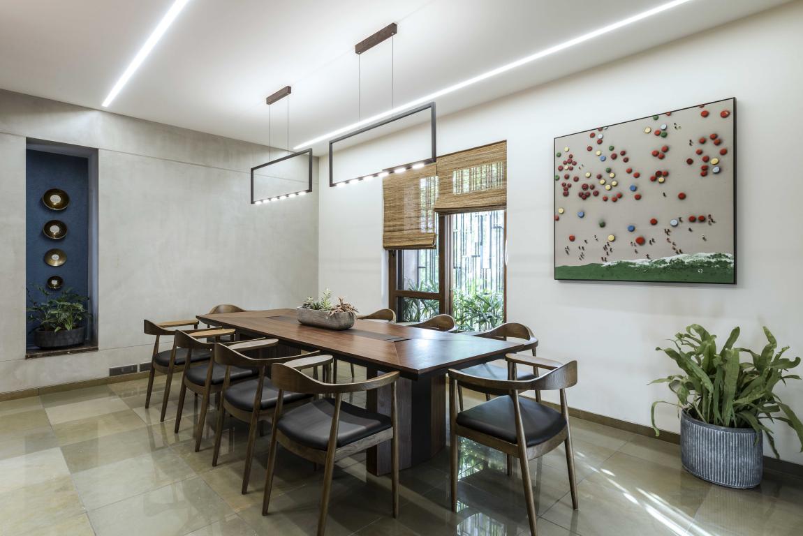
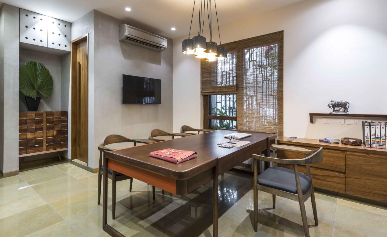
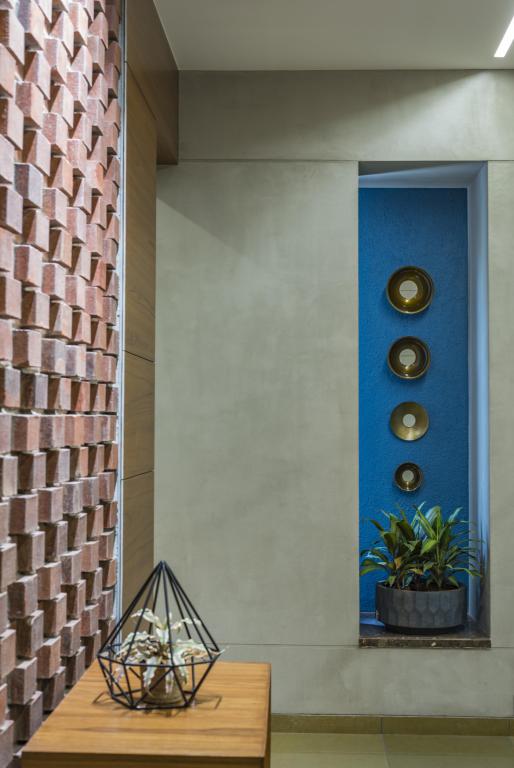
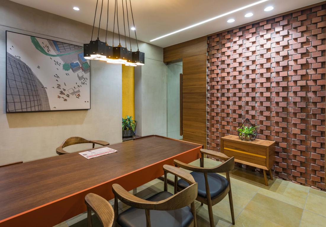
The material palette is more on an earthen side and subtle changes in detailing give each space its' individual identity. A series of courts helped to break away from the tight nature of space at their disposal.
Their designs focused around conceiving a formal office space that will enhance the sensorial experience which a user or a visitor goes through while moving around in this premises.
 Textures, colours, greenery and materials were all intended to create this experience.
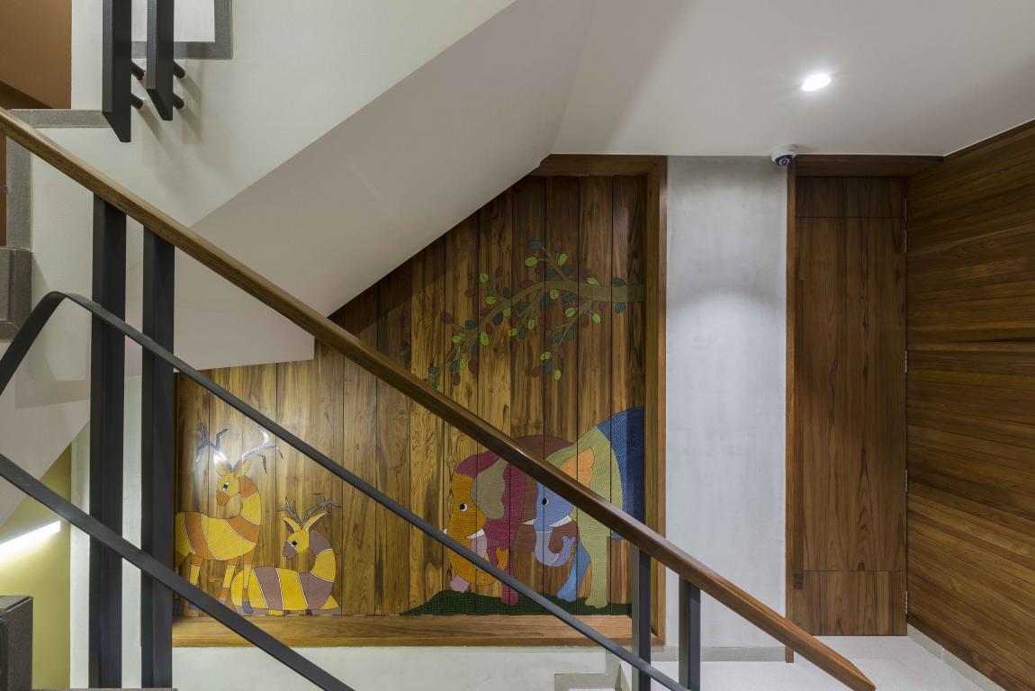
Lastly, integrated use of traditional Gondh art and handcrafted elements in wood and copper defined their design vocabulary.
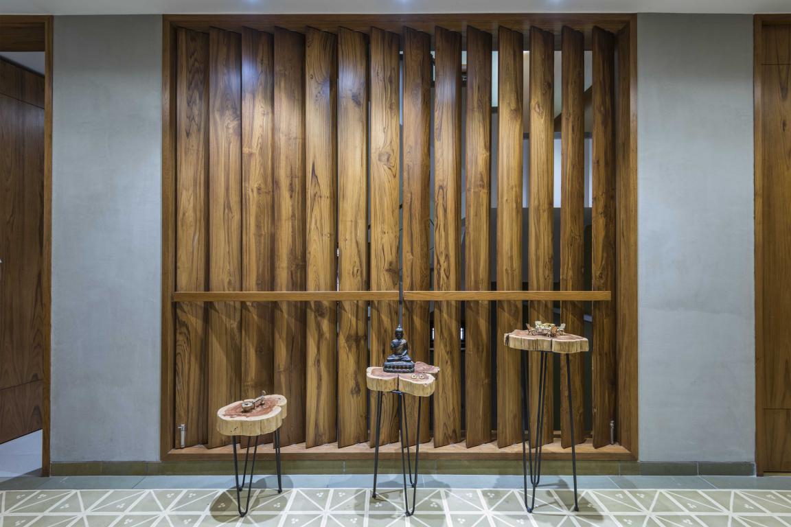 The architects wanted these elements to overwhelm aesthetics and in turn govern overall special outlook of the entire office.
Project Details
Firm Name: Studio Infinity
Project Name: Brick By Brick
Typology: An Advocate’s Office
Location: Pune, Maharashtra
Carpet Area: 3400 sq.ft.
Photo Credits: Sebastian + Ira (PHX India) & Atul Kanetkar
Keep reading SURFACES REPORTER for more such articles and stories.
Join us in SOCIAL MEDIA to stay updated
SR FACEBOOK | SR LINKEDIN | SR INSTAGRAM | SR YOUTUBE | SR TWITTER
Further, Subscribe to our magazine | Sign Up for the FREE Surfaces Reporter Magazine Newsletter
You may also like to read about:
The Brick House
This Multifaceted Brick Facade Takes Inspiration from Laurie Bakers Philosophy to Foster Local Brick Industry | The Pirouette House | Trivandrum | WallMakers
And more…
More Images
