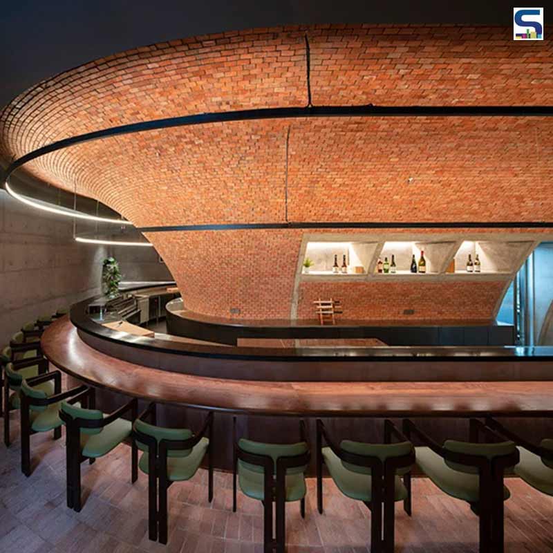
Chinese firm bigER Club Design has recently designed the interior of Biiird Yakitori, a Japanese restaurant in Shenzhen China. Inspired by the traditional designs of Izakaya and Yakitori street stalls, the new restaurant offers a unique dining experience to visitors. The captivating feature of it is the raw brick funnel-like pillar surrounding the bar-like dining area. Read more about the project below at SURFACES REPORTER (SR):
Also Read: Organic Shapes, Green Walls and Nature-Inspired Hues Give A Dreamy Vibe To This Restaurant | Ahmedabad | Amogh Designs
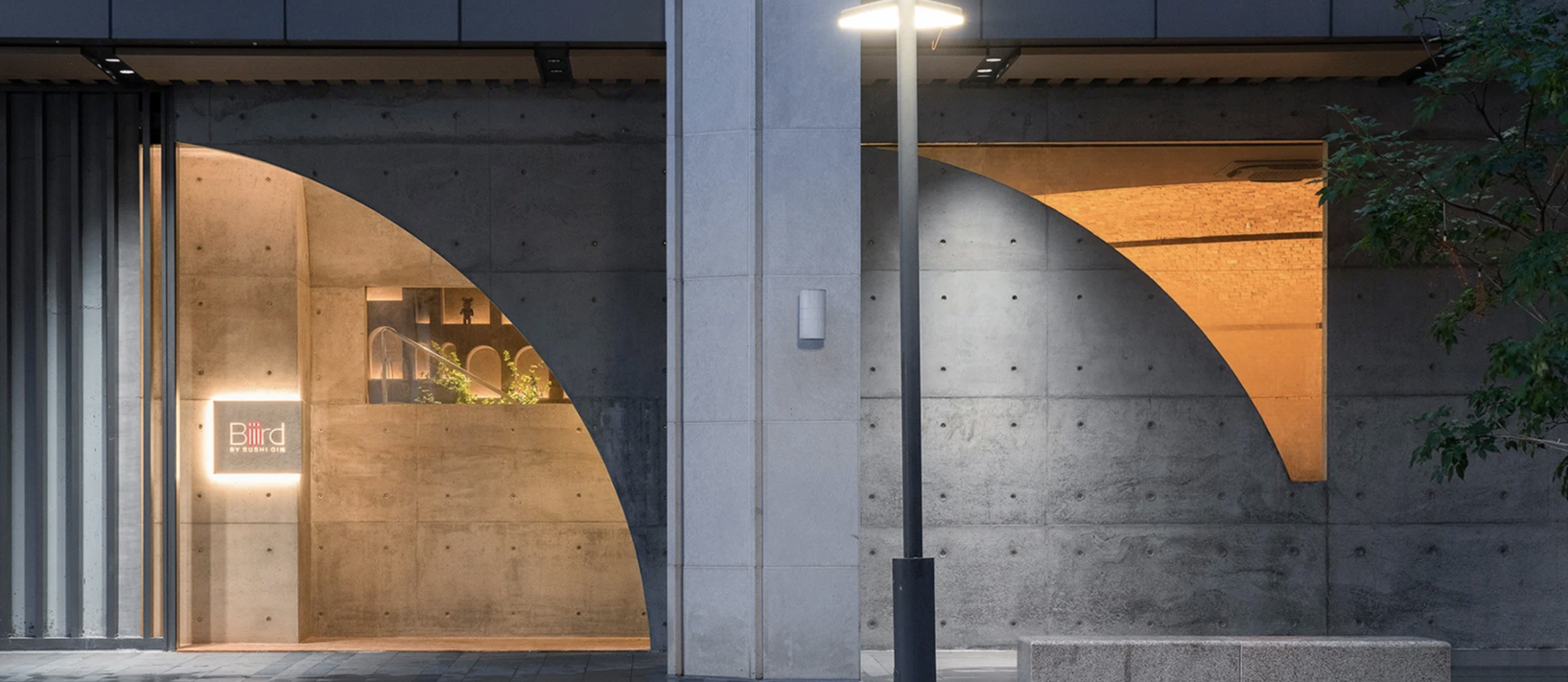 This Japanese restaurant is designed keeping in mind the traditional Yakitori form of dining and its interiors embracRaw e the feel of traditional yakitori stalls that line the streets of Japan.
The main concept was to encourage social interactions while ‘drinking and eating in front of a crackling charcoal fire’ while also promoting more modern ambiance.
Pillars Segregating Spaces
The firm has innovatively designed the pillars inside the restaurant to section public, private, and services functionalities.
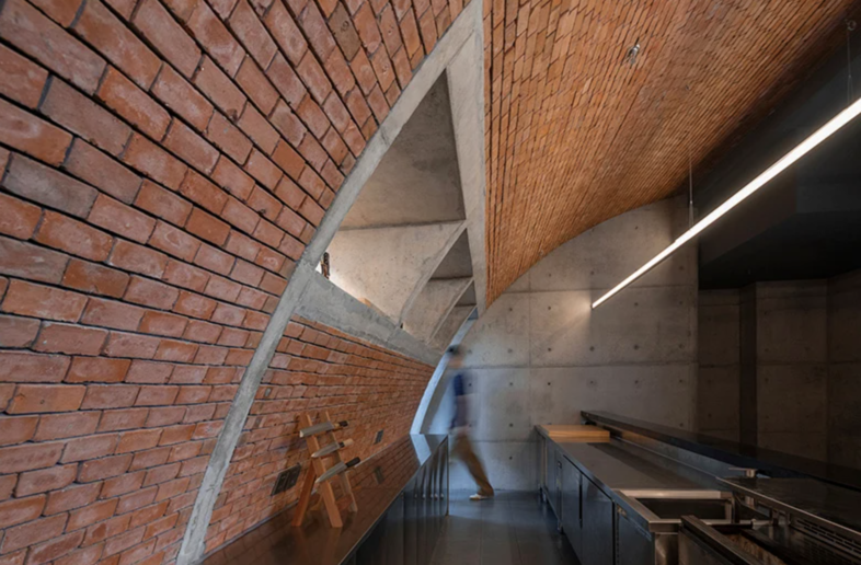
For instance, the kitchen is sealed behind an imposing funnel-shaped brick pillar circumferenced by a bar-type dining area. The interiors of the restaurants get a warm ambiance with the soft lighting that provides a mesmerizing dining experience.
The rawness of brick and concrete
For crafting the restaurant, bigER club designs experiments with how traditional Yakitori as a form of dining can help model its interiors and spatial layout. Positioned on the first floor of a commercial building with a beautifully glazed elevation that gives a continuous porousness to the project.
 Taking the rawness of concrete and brick, the project's facade and interiors are obstructed by several irregular decorative columns that pass through the restaurant and became a major design challenge for the architects. They not only divide the space, but also dramatically affects the overall functional flow.
To resolve this issue, architects sectioned the space into two larger functional divisions of the dining and kitchen, which sits on the eastern side of the restaurant.
Also Read: Half Tilted Into the Sea, This Restaurant Offers Panoramic Views of Above and Below the Waterline | Under
Funnel-Like Dining Space
The dining area is arranged in the form of a bar. Its length determines the number of seats. “The dining spaces are arranged in the form of a bar, with the length of the bar determining the number of seats. As such, the design team experimented with various forms and possibilities of the bar and wider spatial arrangement to find the optimal solution, before placing the dining area and kitchen in the ample space embracing the columns, mentioned the team.
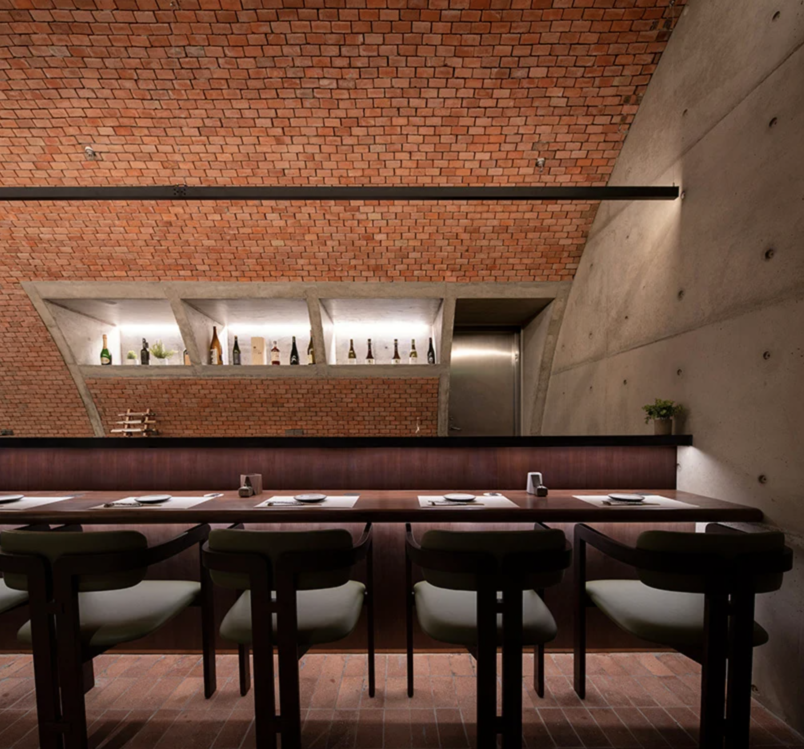 A Brick funnel-like structure embraces the dining area and kitchen wherein the columns are tucked away. This forms a regular semi-ring space void of hindrances and it enhances the visual continuity. Long single tablers from the dining spaces where diners can sit on one side allowing visitors to comfortably sit and enjoy their food.
The other private and smaller spaces are organized into one multifunctional infrastructure and circulation core, placed on one side of the space. “By dividing the central functional spaces, the dining area and the ‘core’ are independent of each other but partially connected, creating a more interesting residual, organized space.”
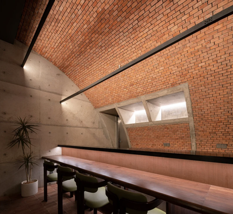 Further enhancing the spatial possibilities of Biiird Yakitori, bigER club design reactivates part of the remaining space during non-dining hours as additional social spaces and exhibition spaces.
Keep reading SURFACES REPORTER for more such articles and stories.
Join us in SOCIAL MEDIA to stay updated
SR FACEBOOK | SR LINKEDIN | SR INSTAGRAM | SR YOUTUBE
Further, Subscribe to our magazine | Sign Up for the FREE Surfaces Reporter Magazine Newsletter
You may also like to read about:
The Brick-Concrete Exteriors and Vaastu-Compliant Interiors Accentuate This Simple Contemporary House in Pune | Alok Kothari Architects
The Curved Walls In This Modern Restaurant Are Inspired By Painting Brushstrokes and Marble Sculptures | WAY Studio | China
And more…