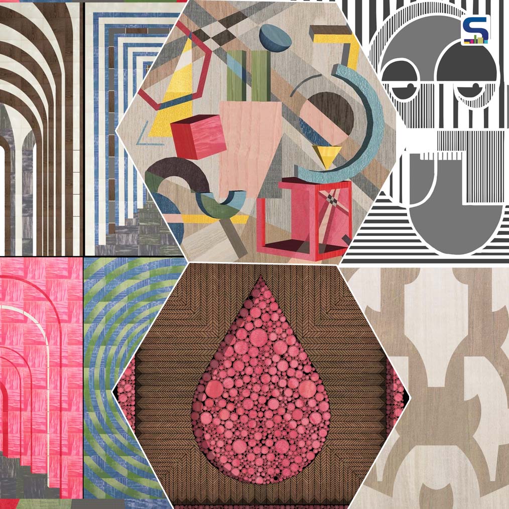
The versatility of art is endless. Sometimes, it can go beyond the art and the artist himself or herself. Art allows us to create self-imposed challenges while breaking the stereotypes and pushes us to explore the new processes into unveiling the unique, unfathomed outcomes. Lately, in a campaign, 10 renowned and brilliant designers presented their beautiful creations that are actually embodiments of their prodigious thoughts expressed through an unconventional medium- Veneer. The outstanding art creations by the designers show the fraternity what can be achieved with the use of veneer as a material. SURFACES REPORTER (SR) presents here the marvellous creations by the famous Indian designers / design studios. Take a glance:
Also Read: Exploring Creativity with Artist Seema Kohli
1. LOVE IN TIMES OF WAR by Kumpal Vaid

Kumpal Vaid’s LOVE IN TIMES OF WAR is inspired by a celebrated photograph from the time of World War II. Kumpal Vaid says, “Given the current sentiment, I was reminded of a photograph that has people debating since 1945 titled V-J Day in Times Square, clicked by Alfred Eisenstaedt it portrays a U.S. Navy sailor embracing and kissing a total stranger on Victory over Japan. The photograph was published a week later in Life magazine, among many photographs of celebrations around the United States that were presented in a twelve-page section entitled "Victory Celebrations".
2. Symphony by Rajiv Khushalani
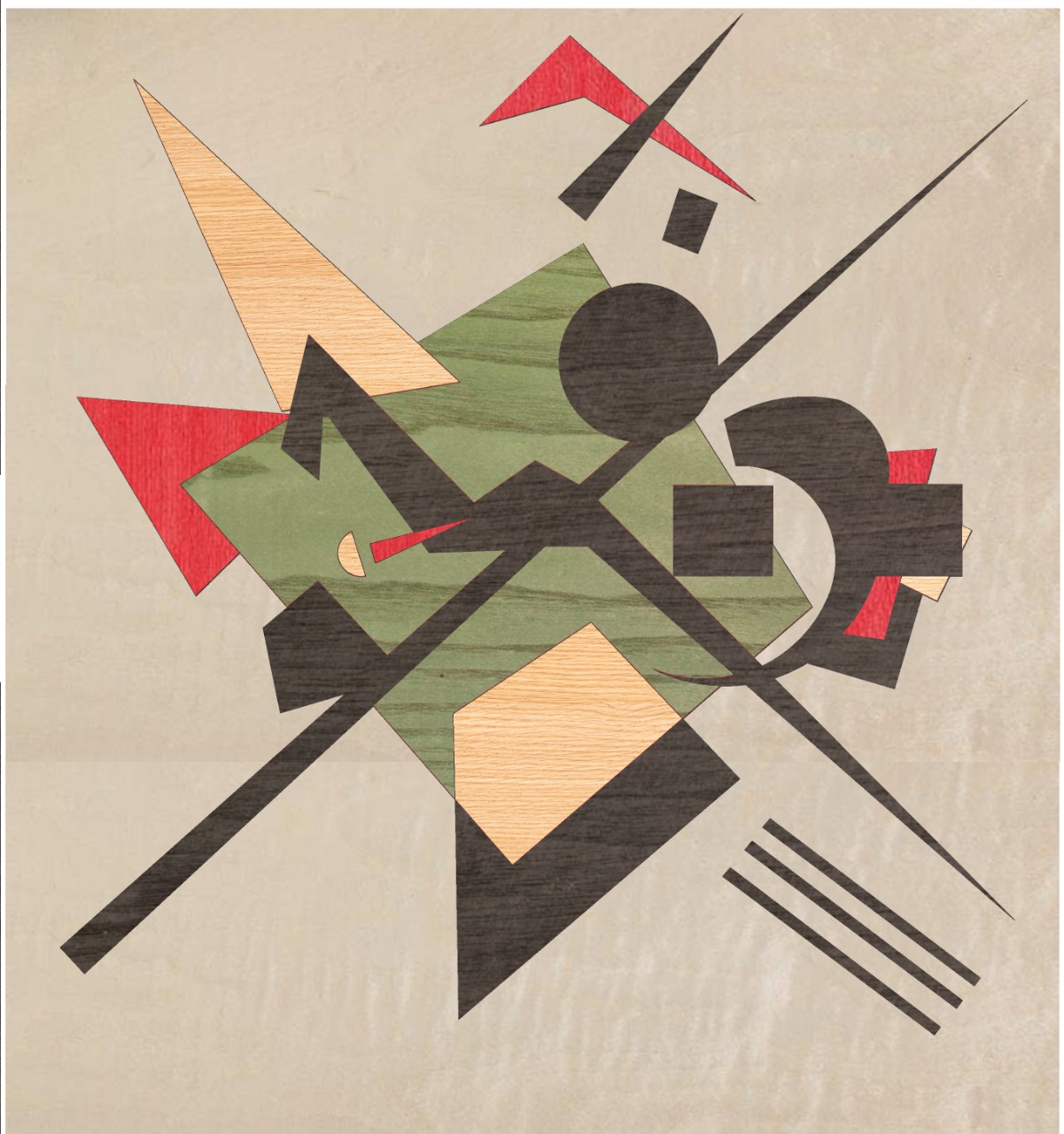
What could be the artist Rajiv Khuhalini be thinking when painting this vibrant piece of art 'On White II'? The designer splashed a pop of colours, of contrast on the white canvas, while imposing a jagged black cross subdued by the yellows and reds. This is a wonderful piece of art for architects, it is being painted in a period where Kandinsky taught design theory at Bauhaus in Dessau. This early modernist oil on canvas, like all abstracts, is open to multiple inferences.
3. CODED ILLUSIONS by Anand Menon

The mono-toned CODED ILLUSIONS by Anand Menon comes from a universe of its own that explores the unique geometry of the human face. It is an assessment in veneer marquetry that is formed by combining black and white grey-toned veneers. The exemplary artwork uses strong human face formation to create a fascinating composition of curves and lines. The deeply thoughtful art with the precise line work and varied spacing establishes a sense of illusion and depth.
4. DROP by Kanhai Gandhi
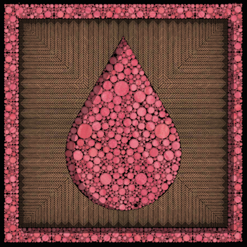
Kanhai Gandhi’s DROP is part of a larger initiative – a constant reminder of saving Water- the most precious resource on this planet. All living creatures need Water to survive. Benjamin Franklin had famously quoted "When the well's dry, we know the worth of water." The painting shows a drop or droplet- the tiniest visible form of Water to the naked eye, which is so pure. The art gives an understanding of the prime significance of even a minuscule form of Water. To put things in perspective, every dot of Kanhai’s DROP is an individual piece inlayed into the canvas like a massive jigsaw puzzle.
5. BINDU by Ishan Grover
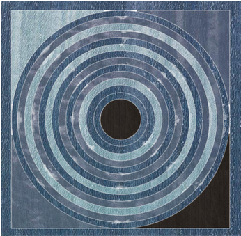
Ishan Grover’s BINDU is inspired by his love for pure geometric patterns and works of Raza. The artist says, “I came across the legendary works of Shri S. H. RAZA. My love for pure geometric patterns and symbolic gestures made Raza’s work the right choice.” The ubiquitous use of Bindu in Raza’s all creations show the significance of “shunya” - The abstract of nothingness and yet that which can add value to whatever it is affixed to. It is at the center of this work from which all creation is born.
6. EQUILIBRIA by Studio Osmosis
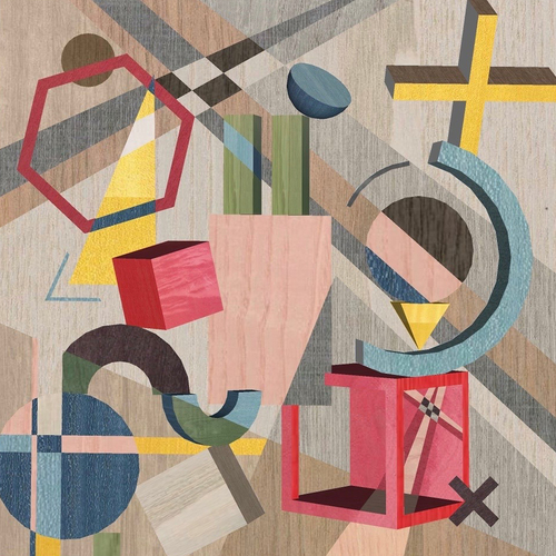
The ‘Equilibria’ artwork by Sameer Balvally and Shilpa Jain Balvally led Studio Osmosis shows the design principle of balance in composition, colour and forms. “Unlike Kandinsky’s Composition VIII, we wanted to create depth using 3-dimensional forms and contrast of colors,” said the designers. The background perfectly harmonizes with the foreground to present a linear yet dynamic visual narrative for the viewer. The contrast of subtle background against the vibrant colors in the front part and the shapes balancing each other, create symmetry yet a sense of intrigue. Every grain is finely cut and matched with the rest of the artwork.
7. Lucky 7 by Jannat Vasi
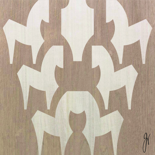
Prosperity and good fortune are the essences of this work of art. Jannat Vasi's artwork is based on the concept of seven running horses that bring positive energy and good luck to space, as per Vastu. This art piece is also designed as a symbol of positivity. Number seven is considered auspicious as per Hindu Shastra. The designer used her eclectic design approach by optimising abstract lines to create seven horses in a distinct way.
8. ART MAP 2020 by Saniya Kantawala
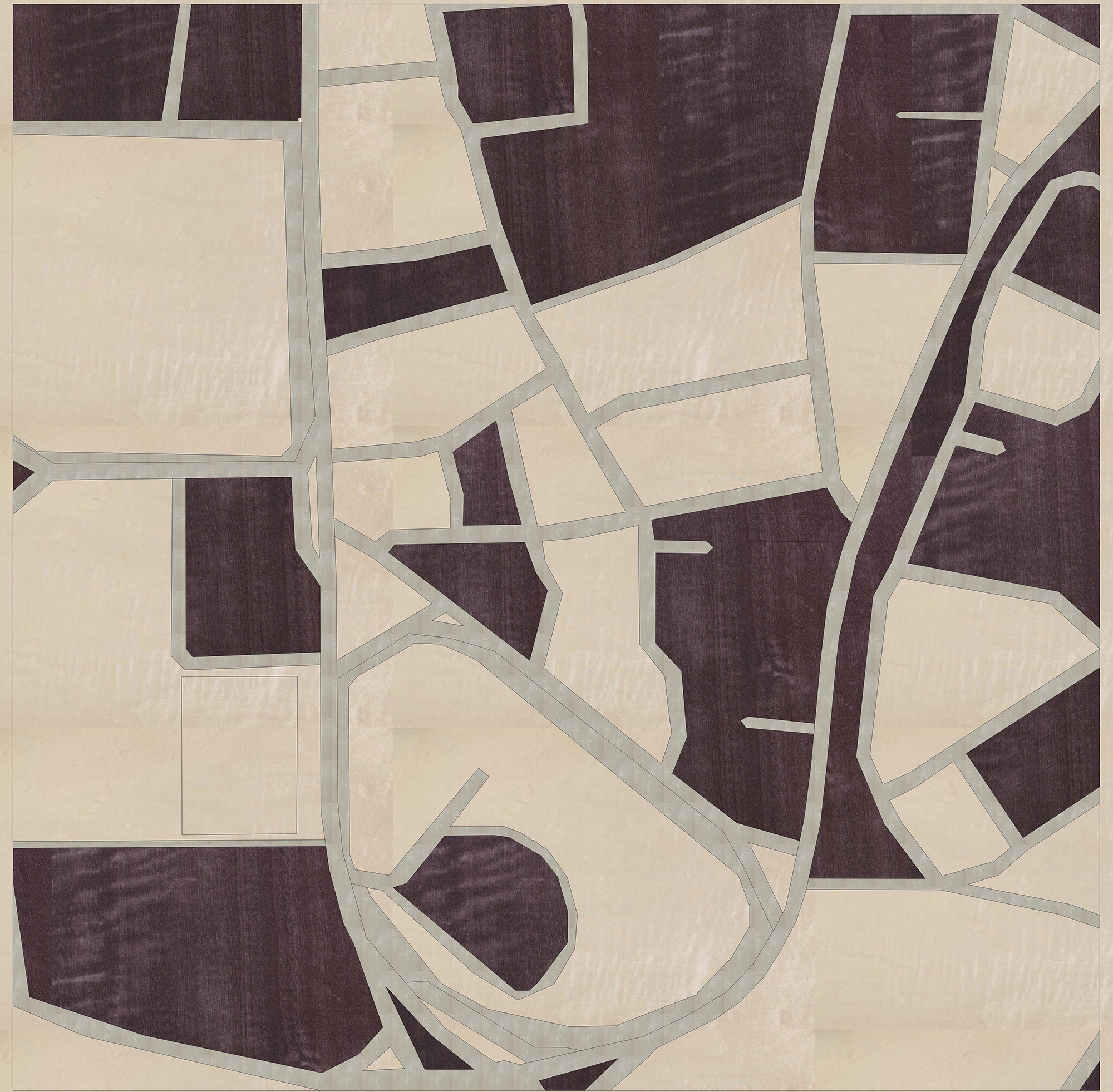
Saniya Kantawala decided to pay homage to the heritage, art & design of South Mumbai by creating a map of Kala Ghoda. The creation explores the works of Mondrian- a Dutch painter and art theoretician- where he largely contributed to abstract visual language despite using a relatively small canvas. The designers used thick taupe brush works (in the form of veneer) in comparison to the black brushwork that Mondrian used. While etching a part of South Bombay that combines arts, heritage & design culture, Kala Ghoda was the first place that came to mind. The use of Cubism can be shown widely in the works of Mondrian. He would use primary colours and imprint maps of various cities around the world.
Also Read: “Rerouted Realities”: A Solo Exhibition by Eminent Artist Santosh Kumar Das
9. VIRYA by AMPM Designs
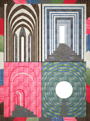
Akash and Poonam Mehta’s colourful set of windows – VIRYA takes cues from the outstanding works of famous Paris-based Indian artist Raza, who is known for using Indian religious imagers & philosophical concepts with the vibrant colours of Indian primary shades in all his creations. The most prominent of his art series has been “The Bindu” (the dot or the epicentre) derived from the Indian concept of “Shunya.” An abstract of shunya or the void of nothingness serves as a symbol of seed which captures the prospective to give birth to all life and is the central point of both creativity and energy.
10. POSITIVELY by Manish Dikshit
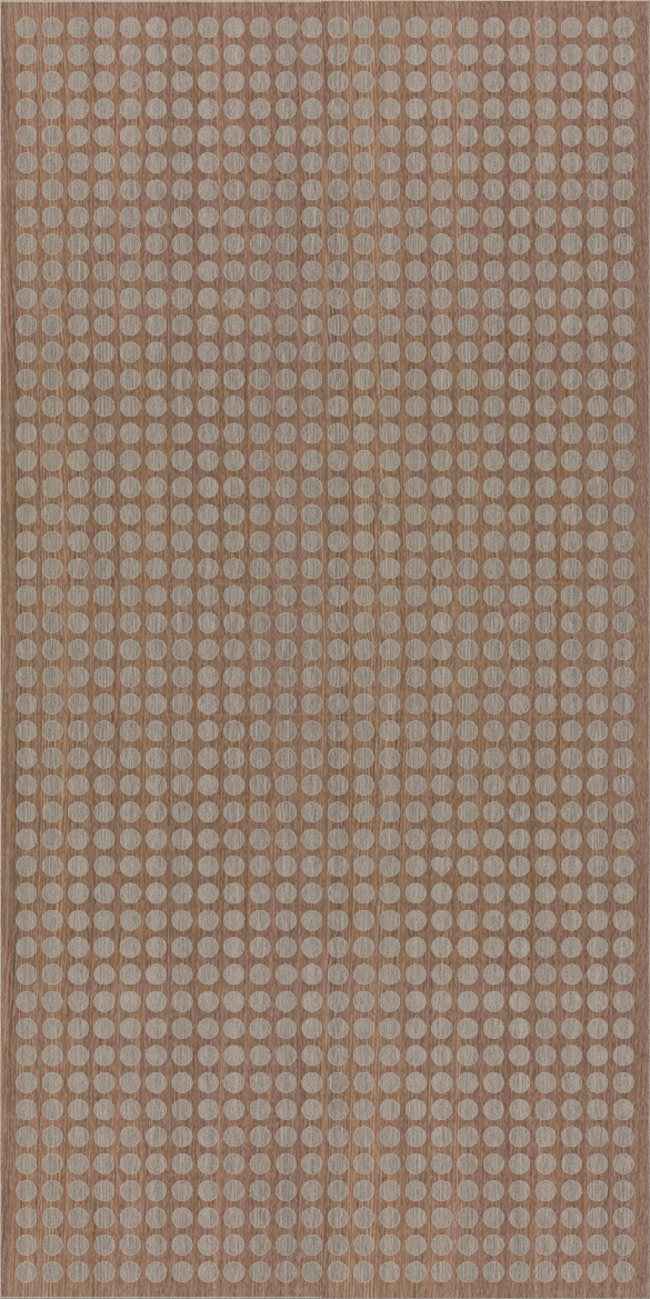
Manish Dikshit’s POSITIVELY had everyone searching for the one single heart he managed to sneak in amidst the dots.“Yesterday is not ours to recover, but tomorrow is ours to win.” POSITIVELY by Manish Dikshit takes us into a positive future path. The designer says, “Turn over from the hasty break of the year that went by. A time that dispersed us; yet brought us together. The crux of building over, Positively, we walk in union towards the future.” Just a small spark is enough to ignite the wildfire of care and love.
Creating each & every artwork was a time-consuming labour-intensive process where every shade of colour, is a different veneer, laser-cut and inlayed into the canvas. Not only the colours but the grains of the veneers had to be in-sync with the entire artwork to make it look flawless.
Which artwork did you like the most? Let us know in the comments below.
Keep reading SURFACES REPORTER for more such articles and stories.
Join us in SOCIAL MEDIA to stay updated
SR FACEBOOK | SR LINKEDIN | SR INSTAGRAM | SR YOUTUBE | SR TWITTER
Further, Subscribe to our magazine | Sign Up for the FREE Surfaces Reporter Magazine Newsletter
You may also like to read about:
23 Monumental Structures of Migrants by Chinese Artist Liu Jianhua In Naples
and more…