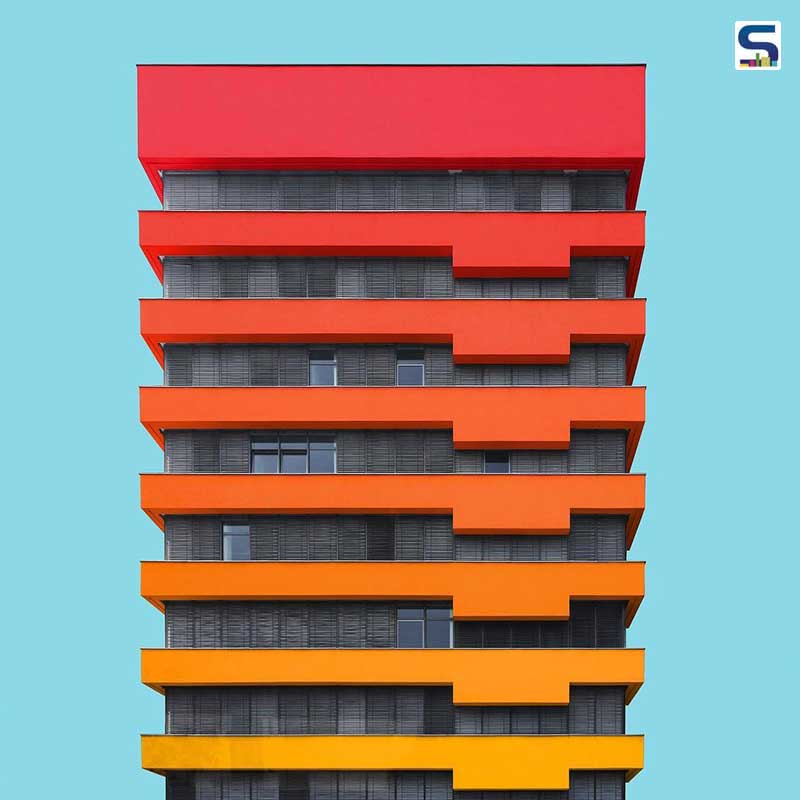
Colors in Architecture
Architecture is generally valued for its essential and practical use in sustaining and growth of a society. But for the architect, on top of it all, it is also an art, their chosen mode of expression. Architects unleash their creativity not only through the shape and form of the structure but also through the color story. Now most of the architecture are safely painted some shade of white and this is why the use of color becomes both interesting and challenging. Challenging indeed because if the color story is not well-conceived it can easily turn into an eyesore. While the architect tries to spin his own story with colors, one thing that he cannot ignore is the influence of colors on humans, the people who would occupy those structures. Colors trigger emotions and responses from humans, that is a psychological fact. Human beings are also strongly influenced by their environment. Architecture incorporates color into human beings’ environment. Therefore, in architecture, the psychology associated with colors becomes important.

In psychology, different colors are associated with different emotions. However, the association of colors with various emotions varies depending on culture, gender, etc. Red is usually associated with excitement, passion, warmth. Depending on the hue it can also be perceived as a signal of danger. Red in architecture can become overbearing without the right concept. Red does grab attention, so it can work well for an area that needs to be highlighted.
Orange, though not too popular in architecture, is a color of creativity, joviality, playfullnessThe less-aggressive hues of orange can produce a soothing effect while keeping the overall tempo of the place bright. The calmer hues are also less risky to use than red.
The color yellow in architecture is reminiscent of sunshine, radiant and cheerful. It is a quirky addition to architecture that can make a space livelier. For these reasons, yellow is used in spaces like daycare and kindergarten.
Blue, a popular choice among architects and clients, is soothing, more dignified. Blue can also give off a sense of royalty and security. A range of different hues is used to impart different feel to different spaces.
Different shades of purple produce different effects. Something close to lavender gives off soothing vibes whereas neon purple brings fun, cheerfulness to the atmosphere.
Warm colors, like red yellow, orange, are associated with excitement, passion. Cool spectrum of colors, like blue, grey, green, and purple, are linked with calmness, a more serene atmosphere.
Some Architects and their Color-infused Creations:
SAM Monthey Kindergarten by Bonnard WoeffrayArchitectes
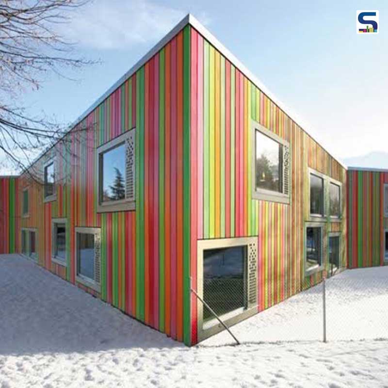
This kindergarten is situated in the shivering country of Switzerland. The place where the kindergarten is receives snowfall. So the use of multicolor was an ingenious idea to brighten up the surrounding. Spaces meant for children are usually liked to be colorful. This candy-colored kindergarten made of timber slates works for both its purpose and its surroundings.
BioMuseo by Frank Gehry
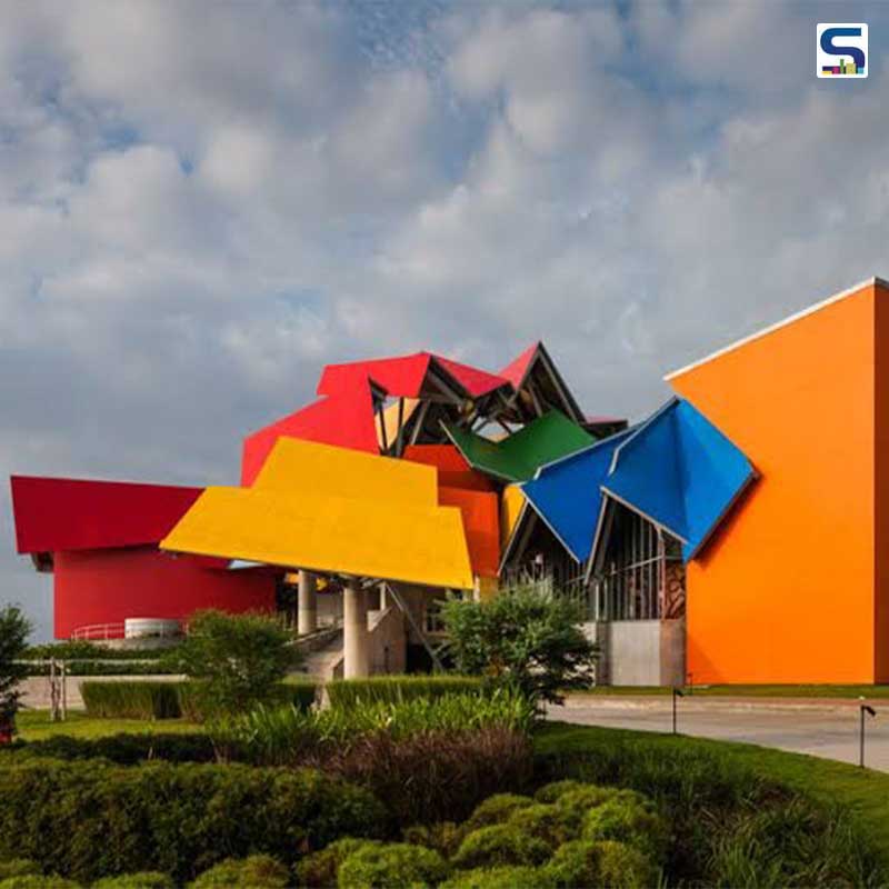
Biomuse is a natural history museum, an ode to the biodiversity of Panama. It is situated on a natural reserve at the mouth of the Panama canal. It is interesting and awe-inspiring to look at both from the perspective of color and structure. The architecture is influenced by Panama, its structure inspired by Panama’s tin roofs and the vibrant color palette is a nod to Panama’s tropic situation.
Serpentine Gallery by Atelier Jean Nouvel
It is a strikingly red art gallery in the heart of London, United Kingdom. This is the 10th Serpentine Gallery Pavillion created in celebration of its 40th anniversary by the world renowned French architect Jean Nouvel. In a play of contrast, the gallery stands strikingly against the green grass backdrop. The color choice is intentional because in London the color represents the famous phone-booths, buses, post-boxes.
School Centre Antas by AVA ARCHITECTS
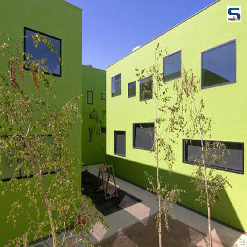
This is a very green school in Antas, Spain. The natural and obvious associated of green is with nature. Color green is also linked with balance and harmony. All these positive attributes make it a good choice for a school building. Another reason for this rear choice was to create an connection between the interior and the exterior environment aka bringing a flavour of nature indoors.
No99 Straw Theatre by SALTO in Tallinn, Estonia
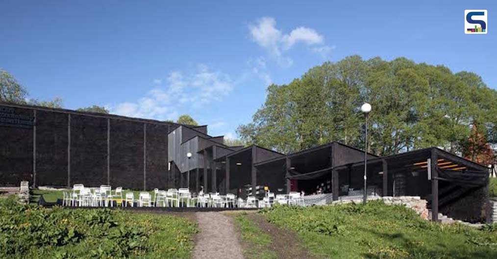
The architects define the structure “as an object standing on the verge of being a pure functional container on one hand, and an art installation on the other.” This was a temporary structure that remained for half a year, built on the occasion of Tallinn being the cultural capital of Europe. Straw was asking chosen as a material both for its architectural power and for its unique texture. The black color lends a bold statement-worthy presence to the structure.
La Luciole Concert Hall / MoussafirArchitectesAssociés, France
This is a project of bold geometry finished off with the soothing presence of the colorblue. The structure consists of two tilted cylindrical steel frames. About the structure, this is what the architect had to say, “It's somewhat bizarre, and eccentric, and very different from everything else designed by our office,” The choice of a soothing color like blue for a public building like this makes sense.
Color in architecture is more than an artistic element. It has various layers of importance. However, architects around the world are standing up to the challenge and creating genre-bending structures incorporating color in a bold statement -worthy way.