
Situated in the historic Bickerseiland neighbourhood of Amsterdam, the De Walvis office building is a renovation project by KAAN Architecten. The old building was stripped down to its bones and given a new look by the firm. The project owner- Maarsen Groep- desired that the building design "coexist with fashion and industrial feel" while maintaining the magnificent volume of the original building. The intention was to make it fit for the future tenants from industries such as media, advertising and the tech sector. KAAN Architecten has been awarded the BREEAM (British Building Research Institute Environmental Assessment Method ) Certificate of Excellence for the building's renovation. BREEAM is one of the globally recognised points-based rating systems for building's sustainability and minimum environmental impact scores. Read more about this beautiful project below at SURFACES REPORTER (SR):
Also Read: KAAN Architecten Designs Grand Circular Staircase in the Netherlands Largest Courthouse
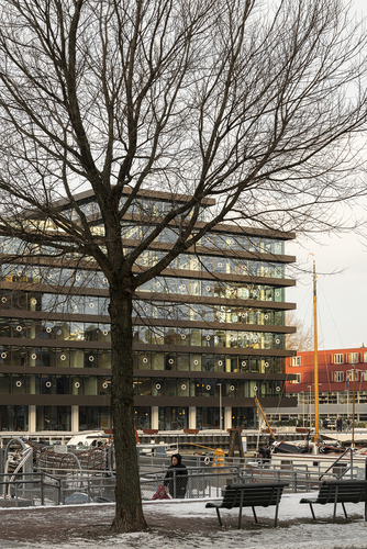 The building has a controversial history. It was part of Amsterdam's urbanisation project of the early 1960s. Although local citizens opposed it at the time, the building was ultimately forced to be constructed. Real estate developer F.H. Gaus proclaimed that Bickerseiland district will become little Manhattan.
Finally, the project became a turning point in urban planning policies. Today KAAN Architecten has turned the building from an old-fashioned building into a community-based building that brings people a pleasant experience.
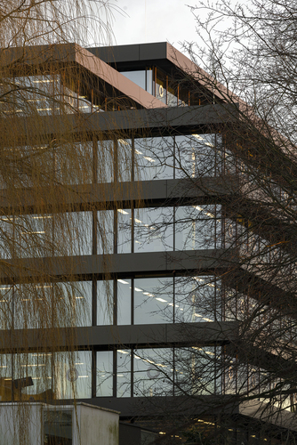
Sprawling over 10,000 square meters, De Walvis is a typical rationalist office building that emerged in the 1950s-60s. Architect W.F. Lugthart (1921-1999) designed it, the creator of Diaconessenziekenhuis Hospital in Eindhoven- the first high-rise hospital building with stacking floors.
How it got its name?
De Walvis is christened after the old shipyard close by, which translates as "whale". When the building was completed, locals nearby did not see it as architectural progress. Instead, they regarded it as a threat to the community.
Design Details
The firm took cues from the work of artist Donald Judd and their early design drafts.
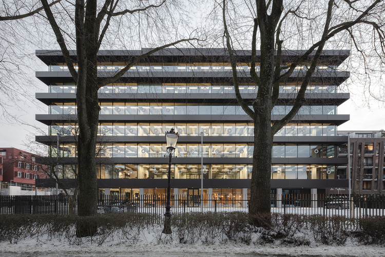 The firm has visually detached the floor of De Walvis and kept all the openings on the original foundation. This treatment accentuates the horizontal lines of the structure and makes the interiors more flexible, creating space for any amendments in the vertical traffic flow in the future.
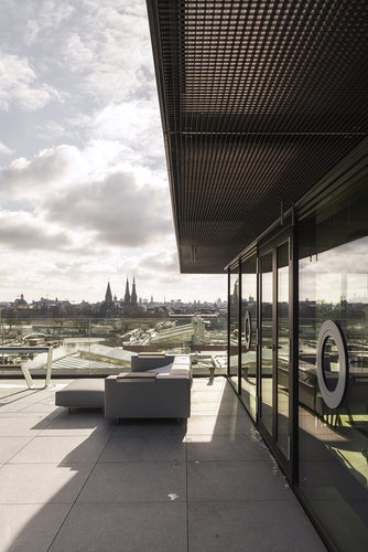
The remodelled floor slab outspreads at a distance of about one meter. The solid-looking dark bands seem sturdy and stable. However, they are created from a very light and hollow metal structure.
Also Read: The Silkworm Sanctuary by Lamz Arquitectura presents a Gridded Facade Of Concrete And Glass | Mexico
The elegant and clear horizontal lines impressively heighten people's visual experience: most of the load-bearing columns are hidden within the outer structure, and the overhanging floor slab becomes the most expressive feature of the building, and the horizontal lines can be called the soul of the building.
Floating Floor
The inserted triple glazing curtain wall further increases the effect of 'floating floors on each storey.
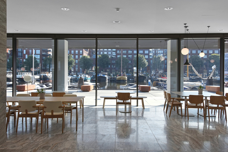 The window glass curtain walls stretch from floor to ceiling and have an almost invisible vertical fixed structure.
Round Pivot Window
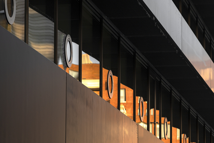
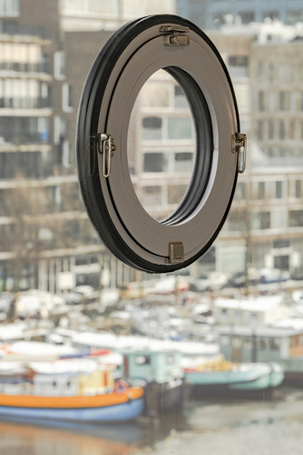
The firm has created portholes into the glass windows to avoid a sense of fragility.
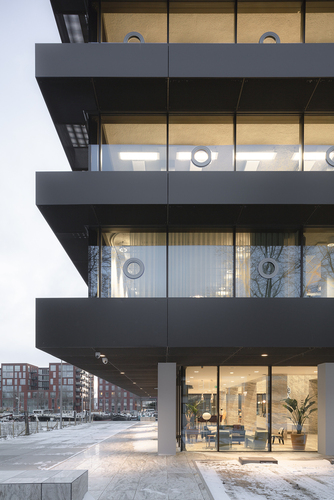 They were integrated into a tight rhythm to the glazing, at eye-level on each floor and are easy to close and open. The circular pivot windows echo the local district's long maritime history and recall the original building's pivot window formation.
Also Read: Glass Façade That Romances With Light | BLUE CRYSTAL, Anand | KPA Design Studio | SR Facades
The firm tried to keep each storey as open as possible and made the structure much lighter in volume than before. Large windows allow the visitor to enjoy the surrounding views and natural light into the interior space, further increasing the sense of lightness.
Ornate Marble Finishes on Floor
The design strategy incorporates the retreat of the ground floor lobby, which is richly clad in ornate marble finishes, visually separates the building from its foundation, and completely eliminates the heavyweight previously pressed down on De Walvis, giving the building flabbiness.
Project Details
Project Name: De Walvis Offices
Architecture Firm: KAAN Architecten
Location: Amsterdam, The Netherlands
Area: 10400 m²
Completion Year: 2020
Photo Courtesy: Sebastian van Damme, Dominique Panhuysen
Source: https://kaanarchitecten.com/project/de-walvis-2/
Keep reading SURFACES REPORTER for more such articles and stories.
Join us in SOCIAL MEDIA to stay updated
SR FACEBOOK | SR LINKEDIN | SR INSTAGRAM | SR YOUTUBE
Further, Subscribe to our magazine | Sign Up for the FREE Surfaces Reporter Magazine Newsletter
Also, check out Surfaces Reporter’s encouraging, exciting and educational WEBINARS here.
You may also like to read about:
FR-EE Adds Sculptural Helicoidal Staircase in Kering Group’s New Office in Mexico City
Mexico-based Architects Hand-Made This Sustainable Moon Sculpture | KBANIA and F*Money | El Pescadero, Mexico
Wooden Facade and Lots of Greenery Features The Tree Life Boutique Hotel | DNA Barcelona Architects | Mexico
and more...