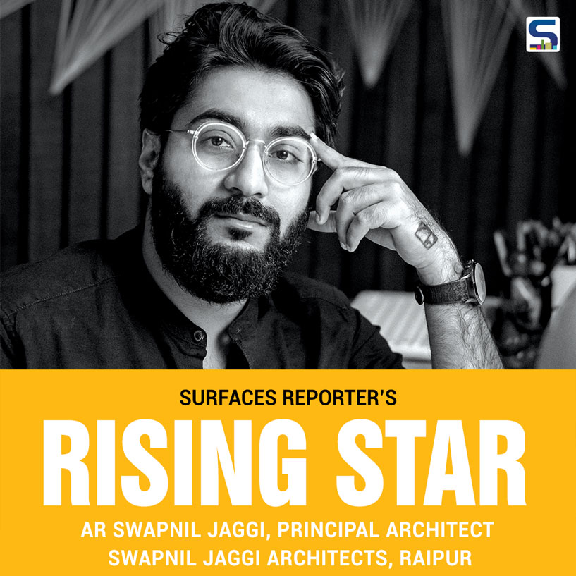
Swapnil Jaggi completed his architecture from Priyadarshni Institute of Architecture and Design Studies, Nagpur (2012). He was the University topper for 4th and 5th year of his college. His Architectural thesis got selected in Top 10 of zone 3 by National Institute of Advanced Studies in Architecture (NIASA). He was also a part of “Sarva Shiksha Abhiyan” and designed 34 Government School and Toilets in Wardha and nearby villages, under Center of Science for Village,Wardha. He worked with Kiran Nair Architects Pvt. Ltd.(Pune) after his Graduation. He is also the Hon. Secretary of Institute of Indian Interior Designer, Raipur Center. He believes in designing space with appropriate material & utilizing space according to its need and function.
Tell us about your architectural journey so far? What are your major milestones covered?
My architectural journey started in the year 2007. At the age of 17 year, I took my first solo trip to Italy where I was fascinated by the Roman architecture. I learnt and observed architecture on my own through live sketching. At that moment, I decided to pursue Architecture and joined the college within a week of returning. During my first year of architecture, I truly enjoyed the design classes where I could show endless creations. I also received Design excellence award during the same year. From 2nd year onwards, I was the design topper of my class till 4th year. Meanwhile, I started working as an intern in Nagpur where I learnt the details of practical approach of the design using which I studied in school under SARVA SIKSHA ABHIYAN in Wardha.
During my Thesis year i.e. 5th year, I was awarded as the University Topper and was selected among the Top 10 NIASA, Zone 3. After completing graduation, I joined under Ar. Kiran Nair in Pune where I was heading the Raipur projects which helped me in understanding the working pattern and architectural texture of the city. By the end of 2013, I received an offer for designing the set of MTV Splitsvilla Season 6 as the head designer. Altogether, the experience has a different vocabulary in itself. With all the courage, I came back to my Hometown i.e. Raipur and started practicing as a freelancer. Initially, I worked on 4 projects. In 2014, I started my own office in an area of 9’X14’ office space along with 3 designers working under me.
The major milestone was desiging the glamorous set of MTV Splitsvilla Season 6. We have also done interior designing for Raj Bhawan and Vidhan Sabha, and currently, we are designing the House of the Chief Minister of Chhattisgarh.
The major milestone of my architectural journey was desiging the glamorous set of MTV Splitsvilla Season 6. My first residential project, The Parwani’s residence was also a large scale project and is now considered having one of the unique design in the city. We designed more than 12 cafes in the city, which became popular over a period of time due to their innovative approaches and the ideas we put in. In commercial projects, Poshtown turned into the benchmark in the façade design in the whole central India. We have also done interior designing for Raj Bhawan and Vidhan Sabha showcasing the culture and heritage of Chhattisgarh. Currently, we are designing the House of the Chief Minister of Chhattisgarh.
Tell us about the design trends in Chhattisgarh?
Do you think that currently tier 2 cities are becoming the center stage for luxury design activities? After becoming an independent state, the standard of living of Chhattisgarh has grown rapidly. Majorly, the population of state is business class people which led to the developments of the city. The growth of the city has doubled over the last 10 years. Due to the availability of open and clear areas, the demand of luxurious and comfortable spaces has expanded. Now-a-days, the clients are coming to us for modern and contemporary designs along with huge landscape and open spaces.
I believe that tier 2 cities are becoming the center stage for luxury design in order to ensure the better standard of living.
Keep learning new things and travel as much as you can which will give you lot of exposure and will help you to discover your own design style.
Since you have headed the design team for a popular reality show, tell us how it is different to design for reel than reality?
From reel to reality, it was of course an immensly varied experience. In reel designs, we have budget constrain as well as the requirement of trendy yet temporary materials. At the same time, the design should be glamorous and attractive which would act as the trendsetter. While in reality, the design perspective turns around as it has to be more subtle, permanent and maintenance free.
Your first project?
MTV Splitsvilla, was my first reel project and my first residential Project was ‘The Parwani Residence’, having the plot size of 56’X 75’ north facing, meant for a family of four. It was designed in such a way that the front 20’ was dedicated for a beautiful garden and the remaining 36’ x 75’ was constructed as the residential space. The ground floor consisted of garden, servant area, parking and a bridge which connects the garden with a staircase to the first floor. As we enter the house, the foyer area opens up to a skylight which provides natural light to the area throughout the day. It was completed in 2014.
Materials you love to work with?
We love to explore new materials and try to incorporate them as per the design. But the most impressive materials for us are natural wood, stone, variety of textures and linen fabrics.
How do you select different materials for your projects?
The selection of material in my project totally depends “As per project requirement”. Such as in Poshtown, Aluminum Composite Panels were chosen as to show the dynamic form with budget restriction. Whereas, in residential projects, again according to client’s necessity and project demand, it changes.
Your advice for young architects and designers who wish to start their own practice?
Be innovative, be creative. Just make your struggle “FUN” journey and frame your future practice accordingly. Keep learning new things and travel as much as you can which will give you lot of exposure and will help you to discover your own design style.
Message for SURFACES REPORTER®?
Surfaces Reporter® Magazine provides a great platform to the architects and interior designers from smaller town to metro cities. It helps the designers to connect & learn new trends and design ideas. It caters to various scales of projects with multiple categories which shows the advanced design and makes an institute in itself.
MINOCHA RESIDENCE
Project Name: Minocha Residence
Location: Swarnabhoomi, Raipur, Chhattisgarh
Built-up Area: 11,000 sq.ft.
Plot Area: 59 ft. X 98 ft. East facing
Client Brief
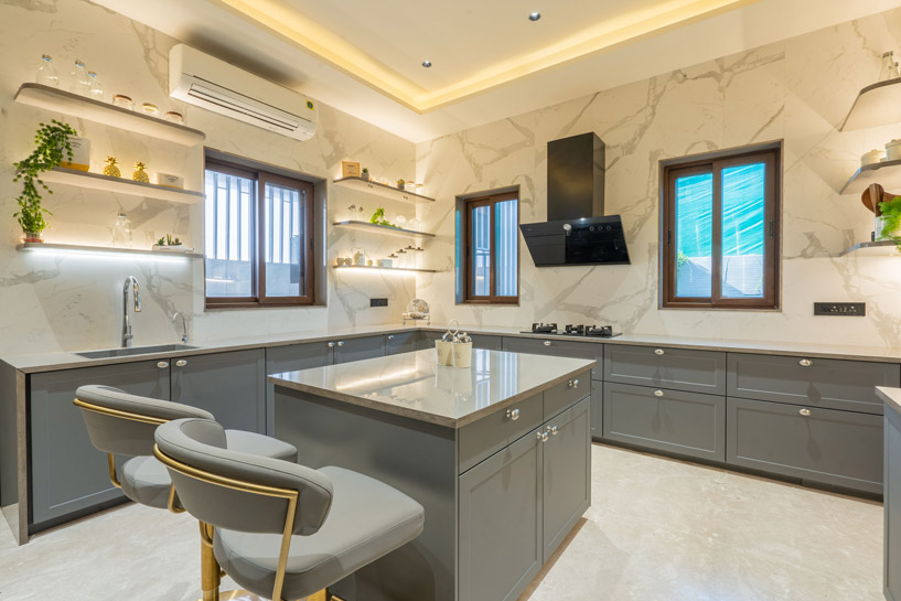
The client, twobrothers, consisting of8 family members desired their home to be modern yet contemporary, having simple requirement of Living- dining, drawing room, mandir, bedrooms, family entertainment room and landscaped areas merging with indoor to outdoor areas.
The Concept
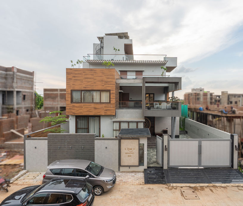
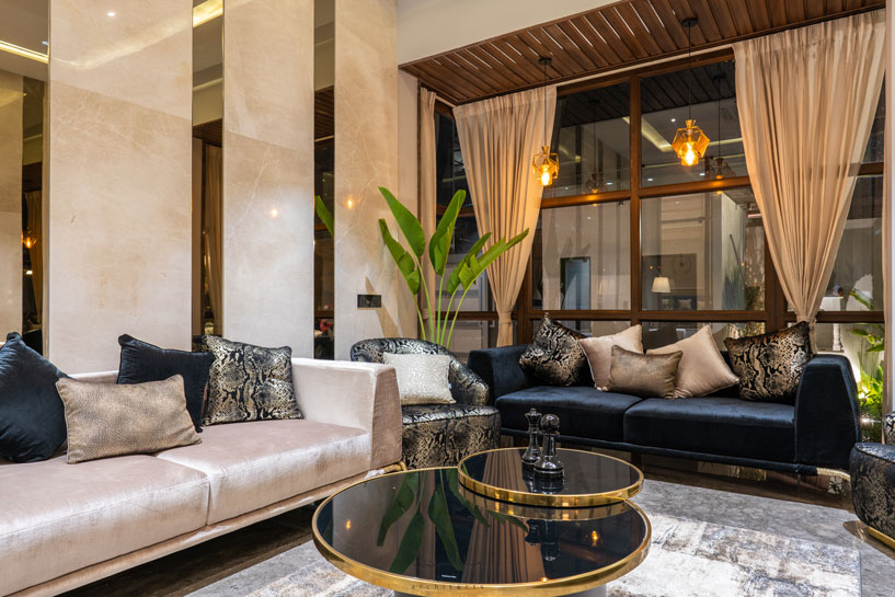
The team came up with concept that revolved around space that connects to nature and well-ventilated pockets. The exterior façade of the residence is kept contemporary using neutral colour palette. Also, the designers endeavored to pair enclosed volumes with open area to amplify the sense of freedom. The interiors of the residence are inspired by luxurious living with a modern contemporary touch.
The Design
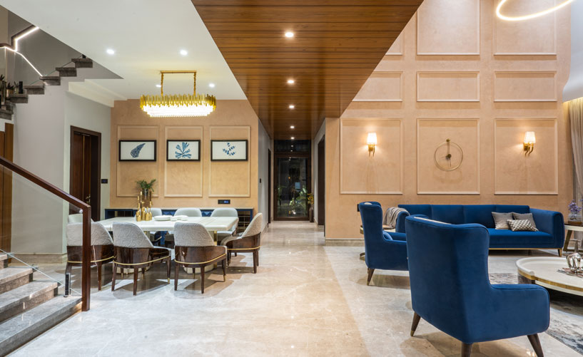
The architectural planning of the residence is done in such a way that all the areas like the double heighted living area, the drawing area, the guest bedroom &the master bedroom opens up to the landscaped spaces. The strong wooden block projecting out adding the preeminent component to the entire outside façade. The C- shaped cantilevered balcony over the entrance foyer supported by V-shaped pillars balancing the whole façade pleasantly.
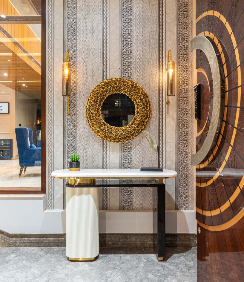
As one walks through the 11’ high main entrance door, the home greets with bold geometric wallpaper which leads to the living room and another to the drawing room. On entering the living area which has dining area in it allows the user to have a pause point & admire the grandness of the space.
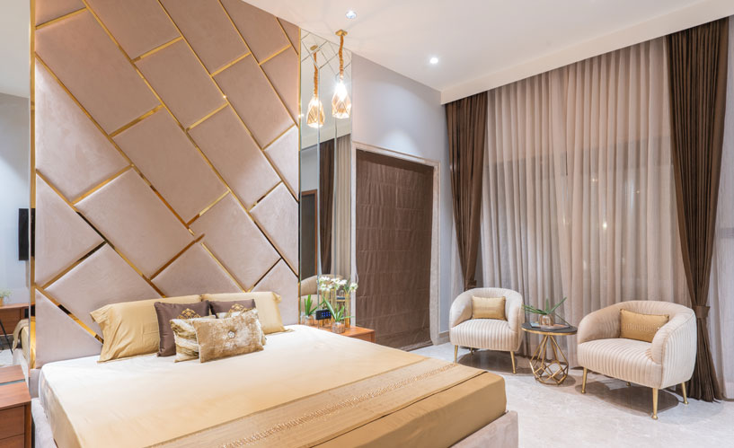
The interior of the bedroom are curates in subtle colour palette with clean lines and plush furnishings. All the bedrooms opens up to a private balcony which supply ample of natural light inside the space. The pergolas are creating interesting light and shadow play to the primary walkway leading to the Bedrooms throughout the day and in turn also act as a security feature. Each room has walk-in wardrobes and additional functioning space permits the client to productively utilize the space more.
The cutout at the west side ensures a beautiful sunset view between the two rooms and passage surrounding area. Also, it acts as an air tunnel for the bungalow which lets the hot air excavate through it. The family Room has a warmth feeling through its bluish-green colour palette offers a sense of relaxation and leisure time.
The architectural planning of the residence is done to keep the double heighted living area, the drawing area, the guest bedroom & the master bedroom open to the landscaped spaces. The C- shaped cantilevered balcony over the entrance foyer supported by V-shaped pillars balances the façade pleasantly.
CHATURANGA
Symbols are powerful because they are the Sign of the Invisible Realities

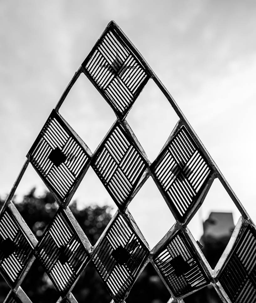
The design is to make a notorious image that explains the Idea of India for today and tomorrow. An Idea that’s speaks on behalf of the population of India while simultaneously creating a Landmark and visualizing a milestone that won’t ever stop in its goal to astonish, despite of the time in which it is seen. Chaturanga means “four limbs”, or “four parts”, it is a poetic reference to the four divisions of the army as used in India in ancient times. Add to these the raja and his wazir, and you have six different types of pieces from the game of chaturanga. The idea of replicating this into a sculpture is in context to connect the people of India to its spiritual, cultural and historical inheritance and to acknowledge it and by preserving its momentousness. The Design speaks “of the people and for the people”.
The concept
The chess board consists of total 32 pieces out of which one of the main is the Queen, one of the main protectors of the king and is free to move in any step in any direction, a representation of women in India.
In Chaturanga, as each piece have their own value and are strategically used for moving & ultimately winning, Similarly, India having the huge diverse sectors working with different strategies, goals to be one of the Developing Country in the world.
The foot soldiers, which are 8 in no. for both the teams, in most amount on the board, but with the least power and only one step at a time, represents the majority population of the country which keep on rising as they move further. And just like when it reaches the end of the board it has the ability to turn into a Queen, the most powerful playing piece on board which is the same for the country. The king is one who needs to be protected representing the functioning and the democracy of the country. In Chaturanga, as each piece have their own value and are strategically used for moving & ultimately winning, Similarly, India having the huge diverse sectors working with different strategies, goals to be one of the Developing Country in the world.
The Design
The design aims to rejuvenate the path of India in terms of its cultural inheritance, global representation and the path of democracy. It acts as hope, possibilities of the future, ambition and Pride. The sculpture is to symbolize unity, strategy and diversity of India. The interaction with the people is through the sense of the sculpture just being there. It is majorly based on perception of the public what they take from it. The play of light and shadow in the sculpture makes it more alluring and interactive for the people. The sculpture provides peace, joy and calmness whatever the user is seeking.
POSH TOWN THE STRIKING FACADE
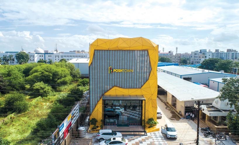
THE CONCEPT
As the name, we utilized the letter “P” to improve the facade of the building just as the horizon of the neighboring region. The positive and negative region of the exterior comparing precisely were isolated and used to make a powerful element.
FROM RENDER TO REALITY
The facade of the 3-storied commercial building was transformed using triangular cut ACP sheets, creating prism-like elements throughout the building which gave it a dynamic, heterogeneous appearance. Intricate 3D designs with these sheets can create a dramatic look for the facade. The curves and bends on the facade provide a delightful play of light and shadow.
The volume dematerializes itself through the projection, distorting the main building block, creating a sculptural moment that can speak for itself. The material is rigid, light and durable and has good insulating properties. Furthermore, it is easy to install and can be formed into variety of shapes. An aluminum framework was specifically designed on top of which these sheets were fixed.
The facade of the 3-storied commercial building was transformed using triangular cut ACP sheets, creating prism-like elements twhich gave it a dynamic, heterogeneous appearance.
The number of cross sections was resolved comparing to the three planes i.e. X, Y and Z. Grids were then set apart on the site comparing to these areas. The grids on the z plane were isolated significantly into 4 unique separations i.e. 0”, +6”, +1’, and +1’6” from the facade of the structure. ACP sheets sizes were determined and the triangles were numbered and the sheet sizes relating to the numbers were sent to site for cutting and fixing.