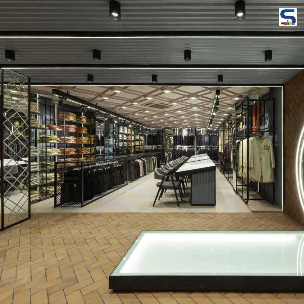
Portico Design Concepts designed Pehnawa- a 3-storey apparel outlet in Aurangabad. A reasonably spacious 5,400- square-foot area and a triple-height entry gave the architects enough room to explore a striking, eye-catching retail design replete with colours, textures and diverse materiality. The products being retailed included women's wear, contemporary clothing for men and ethnic menswear. SURFACES REPORTER (SR) presents more information about the project shared with us by the architecture firm. Take a look:
Also Read: Ravish Mehra Deepak Kalra Architects New Boutique Store Is A Quintessence of the Indian ‘Heritage’ | New Delhi
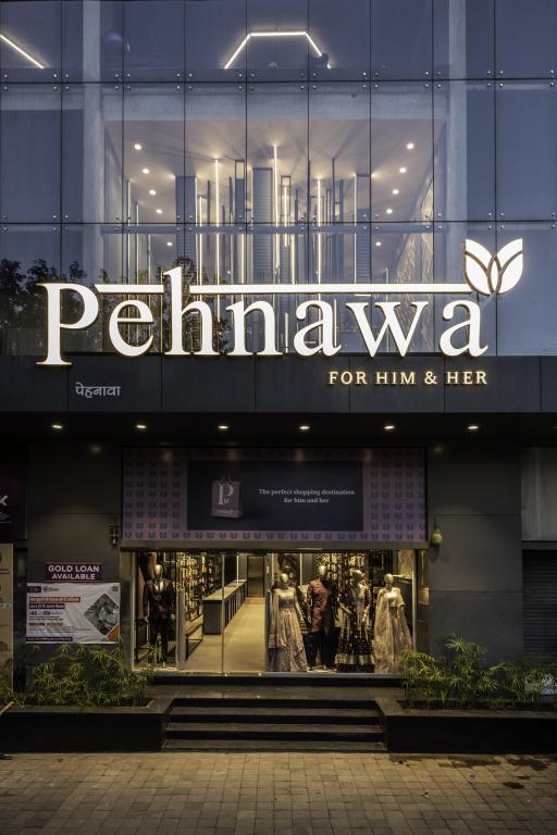
When the architects were handed over the ground + 2 site, the civil work was already over. In effect, they received the site as a bare shell.
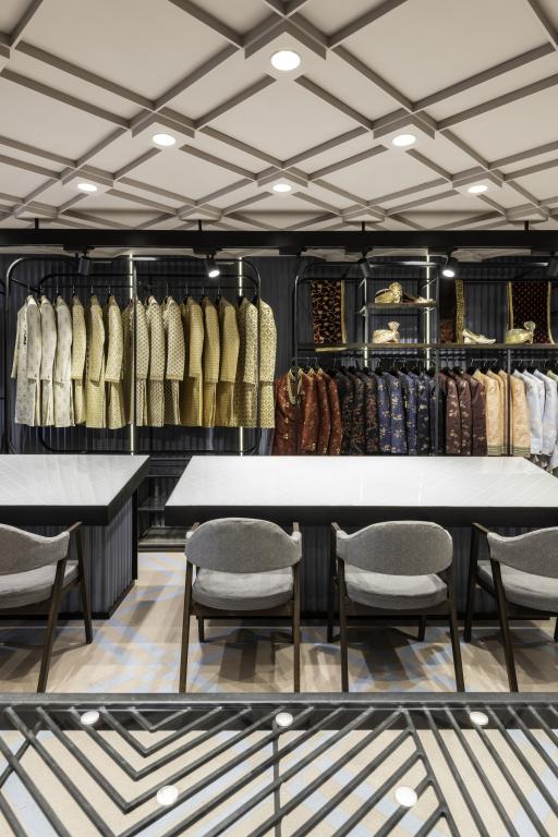 Other than specifying how the different types of fashion wear would be segregated floor-wise (see next point) and the fact that the tables that would seat customers to mull over intended purchases be white (to best set off the colours of the garments), the clients gave carte blanche to the architects where material usage and the overall look & feel were concerned.
The layout
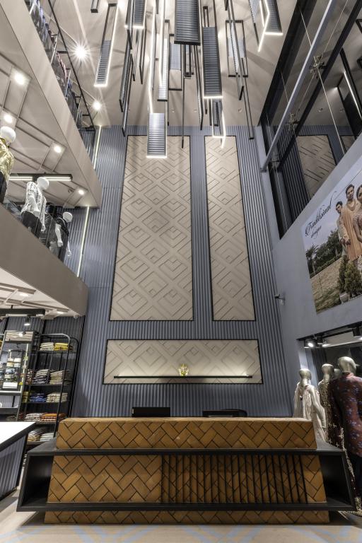
The ground + 2 structure has a triple-height volume at the front, with the rest of the floor plates being singular entities without any further demarcations. The lofty volume functions as a waiting lounge and billing area.
The levels were used to segregate the merchandise as follows: the ground floor was devoted to women's wear (girls and ladies); the first floor to men's wear; and the last floor to men's ethnic wear.
The Visual Aesthetic
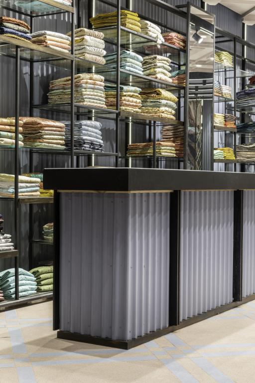
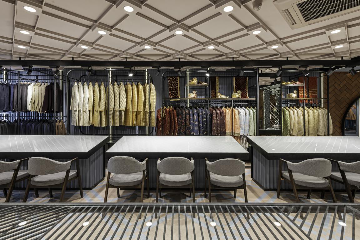
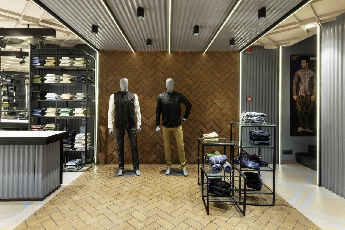
Corrugated GI sheets, vitrified tiles, back-painted and clear glass, mirrors, exposed clay- bricks and mild steel form the leading materials.
While the chromatic direction was decided as pastels accented with black lines, the surface finishes included textures and patterns, both visual and tactile.
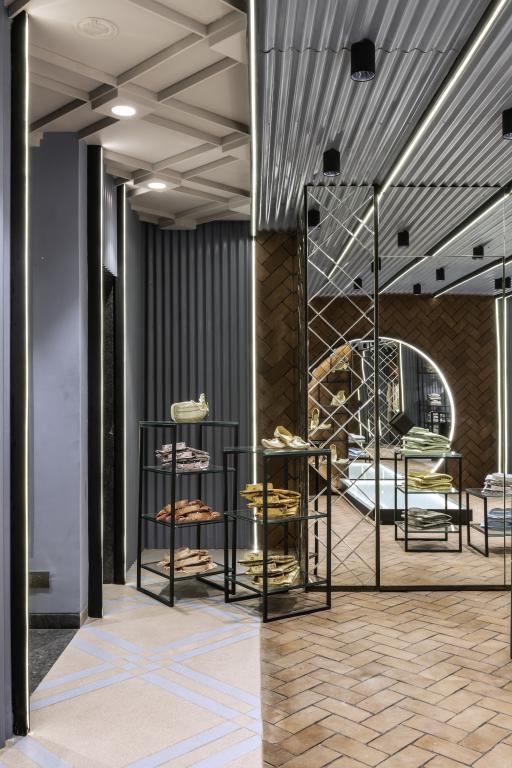
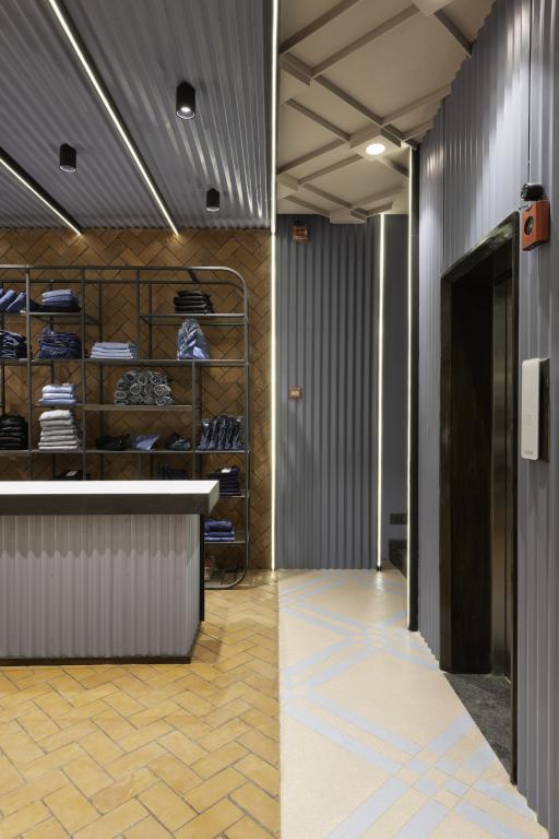
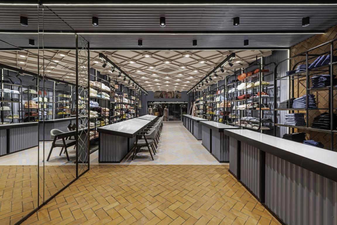 Essentially, the architects sought a cool, contemporary scheme that was offset with swathes of warmth woven via exposed brick expanses on select sections of walls and the floor.
Also Read: An elegant minimalistic synchronisation of shades and materials in this hardware showroom
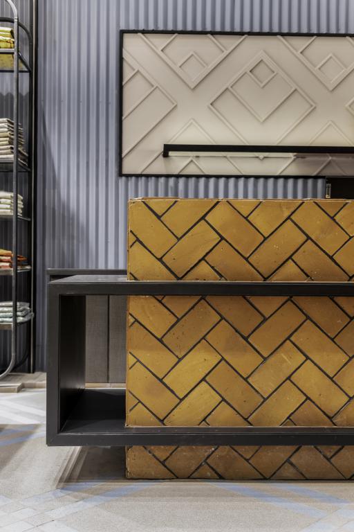
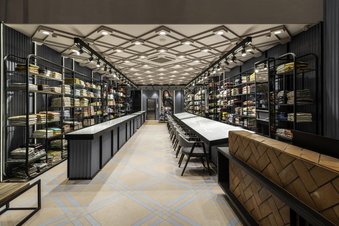
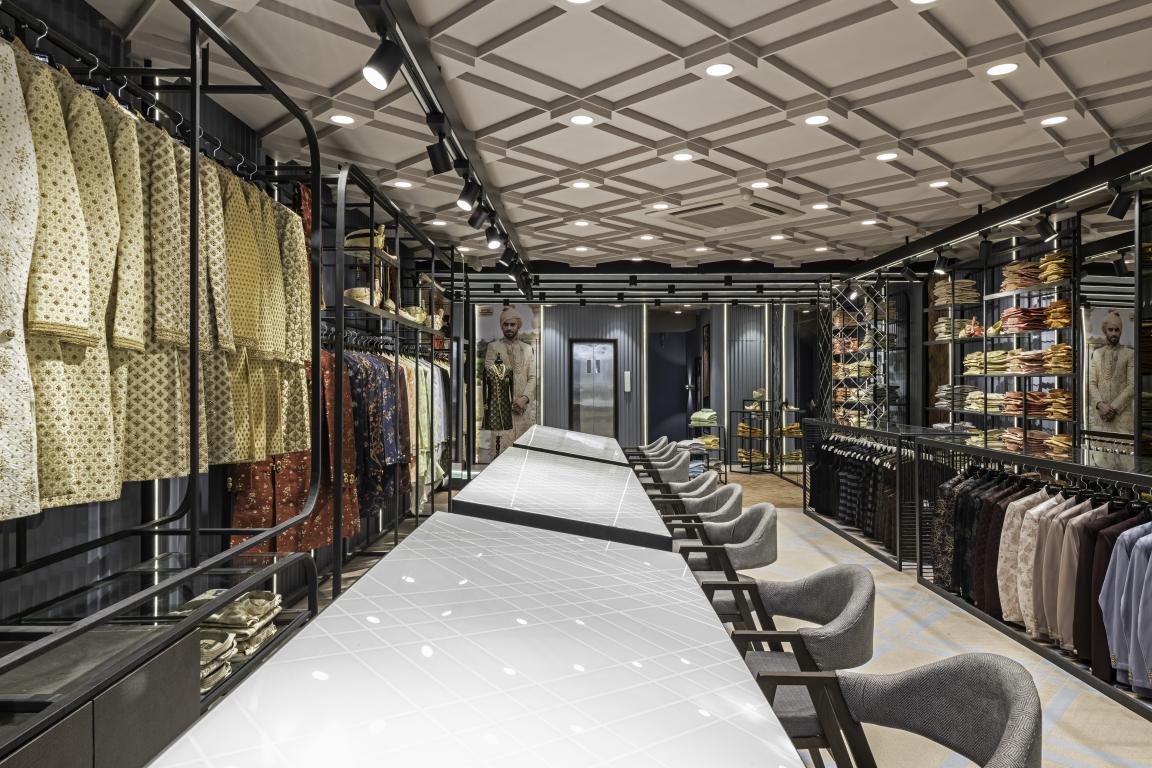
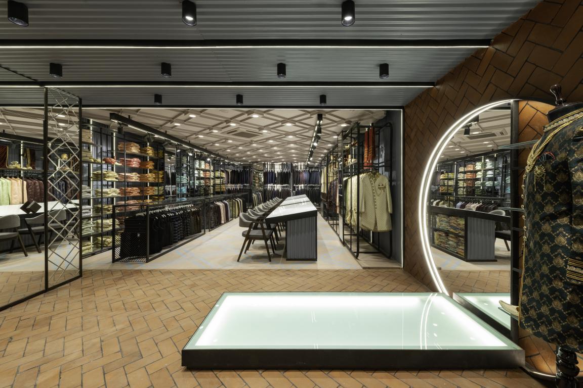
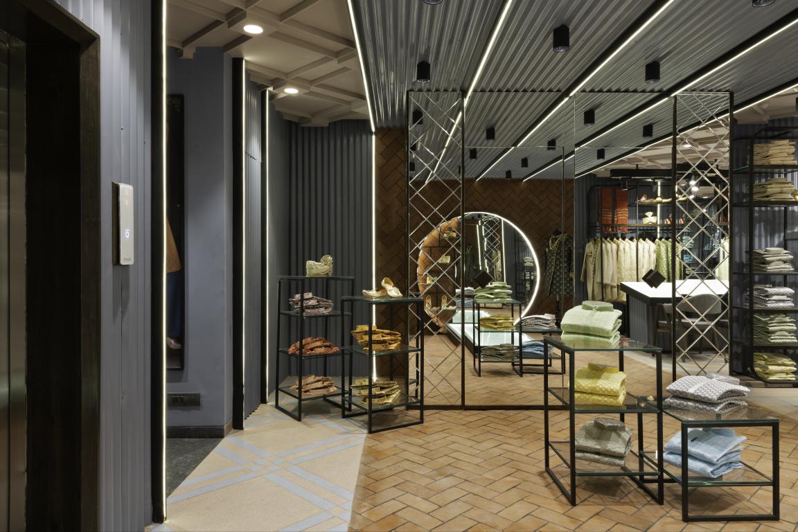
A bespoke floor design, crafted out of regular vitrified tiles, signals thrift and the desire to achieve cohesive detailing. The overall impression is a space filled geometric patterns — the lines of exposed bricks, the corrugations of the GI sheets, the rhomboids of the bespoke mosaic floors, the grid-like POP patterns on the ceiling, the cut- glass-like bevelling on the mirrors.
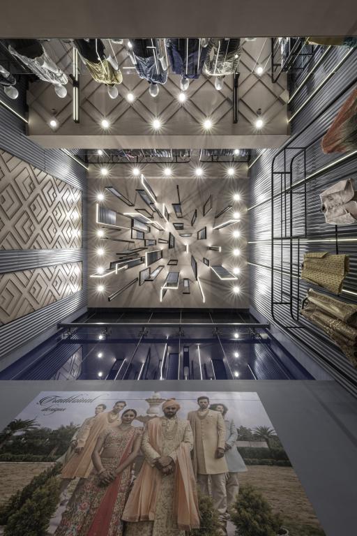
The Triple-Height Volume
The compact footprint of the triple-height volume created an exaggeratedly linear entity.
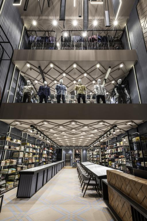 To reduce this skew while not actually physically cutting down the size, the architects created a cascading lighting installation of aluminium frames suspended at various heights (some hanging till first-floor eye-level) to break the soaring feel. Profile lights were added to the frames to add drama and a play of light, and aid with the general illumination of the space.
 To 'erase' the mess of lines formed by the rectangular frames, the design team added infills of corrugated GI sheets — which were repeated in the wall panelling of the volume (GI sheets presented an economical alternative to creating the texture with punning and POP). This striking atrium design adds its own muscle to the elevation of the showroom.
The billing desk stands in the triple-height atrium. A black frame-like element, set off beautifully by the background of terracotta bricks, is rendered from tiles. It wraps around the desk and transforms into a tabletop on the other side. The wall behind the billing desk sees an added detailing of patterned MDF, which is carried forward to the store's ceilings but as a POP design.
Also Read: Plywood Lines Every Surface of Shen’s New Beauty Store in Brooklyn | Mythology
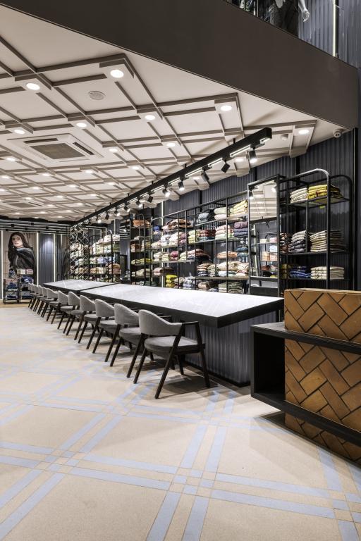
Opposite the desk, a slim, contemporary display rack presents snippets of collections available at the expansive showroom. A bench provides a comfortable perch to customers as they wait for the billing to be done, while a potted plant on the slatted table adds a refreshing touch and breaks the monotony of colours. The table, bench and rack were custom-made on site.
The main retail sections
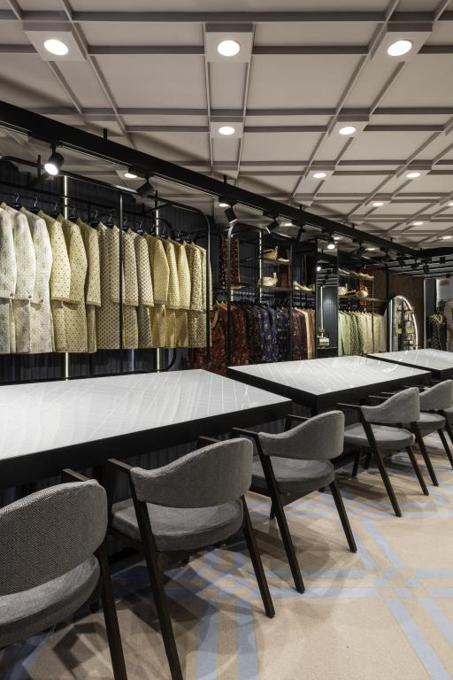
The merchandise is displayed on open metal shelves whose gently-rounded corners provide a subtle yet perceptible contrast to the straight-lined geometry that dominates the visual flavour. Strangely enough, given the rich and more complicated details that abound, it was getting these contours right that proved to be the challenge of the assignment — one that saw two fabricators throw in the towel and took the best part of two months to complete!
The display tables are of two types: closed ones with white back-painted glass tops and open ones with under-counter hangers and clear-glass tops. Here and there, smaller display units, almost like occasional tables, dot the floors.
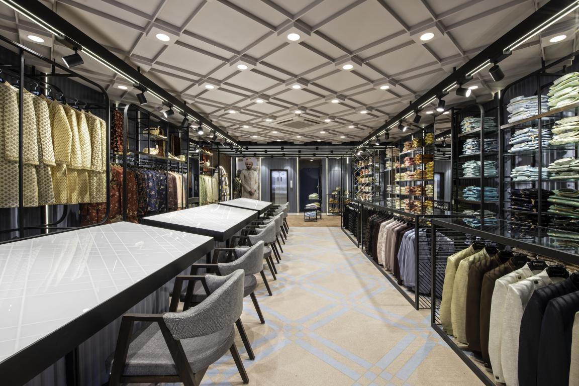
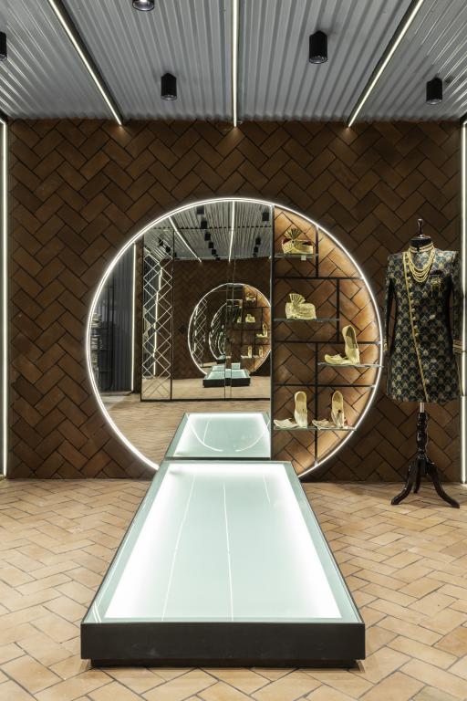
Mirrored expanses, delicately bevelled with geometric patterns, amplify the contemporary ambience as well as serve as looking glasses (in addition to the mandatory trial rooms of course, which are tucked discreetly to a side).
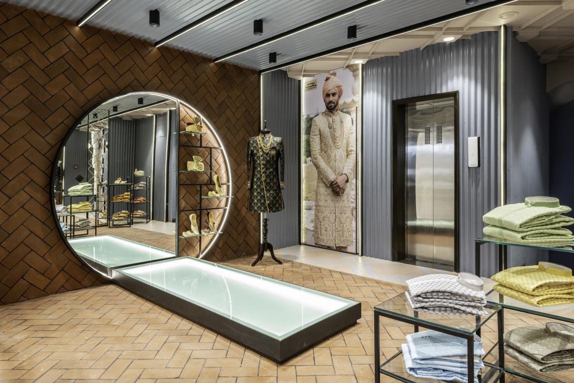
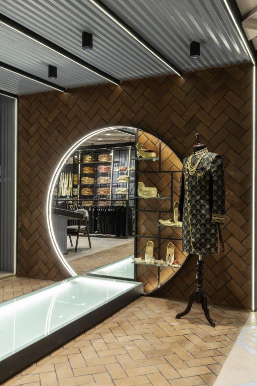
A definite highlight is in the men's ethnic section, where a circular, mirrored, outlined-with-light wall element with an abridged catwalk in front creates a striking spatial pause, besides providing the right environment to contemplate a purchase.
Project Details
Project: Pehnawa Location: Aurangabad Area: 5,400 sq ft
Design firm: Portico Design Concepts @porticodesignconcepts
Principal architects, founders and spokespersons: Shruti Tanwani and Gopal Tanwani
Budget: INR 1.2Cr; INR 2,200/sq ft
Photographs: Photographix India @phxindia
More Images

Keep reading SURFACES REPORTER for more such articles and stories.
Join us in SOCIAL MEDIA to stay updated
SR FACEBOOK | SR LINKEDIN | SR INSTAGRAM | SR YOUTUBE
Further, Subscribe to our magazine | Sign Up for the FREE Surfaces Reporter Magazine Newsletter
Also, check out Surfaces Reporter’s encouraging, exciting and educational WEBINARS here.
You may also like to read about:
The story behind Krishija - Retail Store for Pure Food from Farmers sold directly by Then
A winning project that challenges ideas about a retail fashion store!
And more…