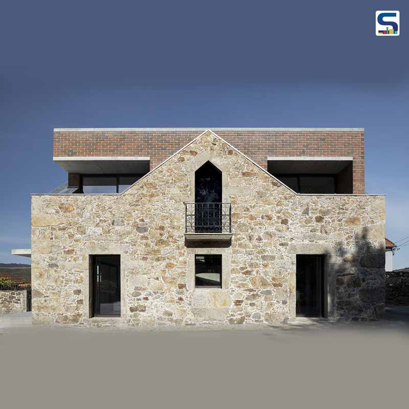
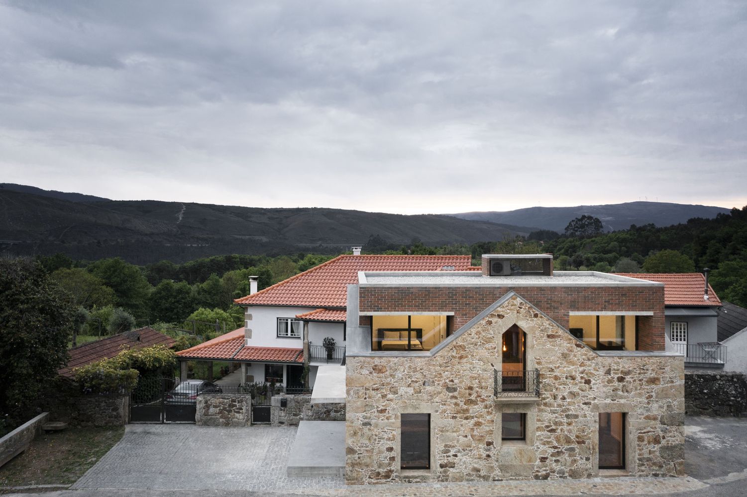
Portuguese architect Tiago Sousa renovated the ruins of a traditional stone abode in the village of Romarigães by inserting a modern ‘Box’ house without any expansion to the existing footprint. A new red-brick volume in the contrasting stone structure appears above the original roofline. This remodelling project showcases the contradiction between past and contemporary living, while the material and colour palette explores the balance and tension between the existing and the inserted form. Read on about the inserted ‘Box House’ in detail below at SURFACES REPORTER (SR):
Also Read: Transspace Uses Boxes to Add Character in This House | Vadodara | Gujarat
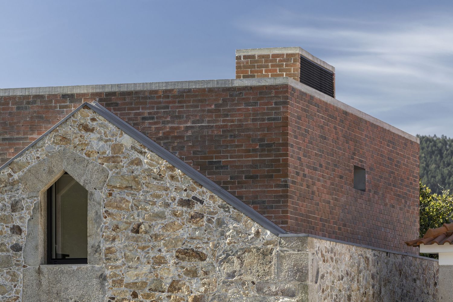
The new box house peeps above the gabled roof of the rigid and rudely built existing volume.
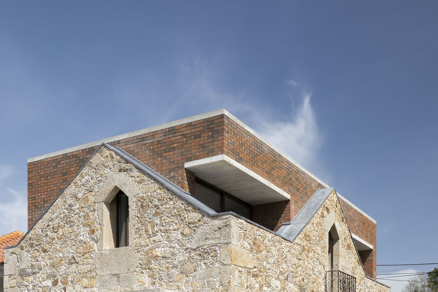
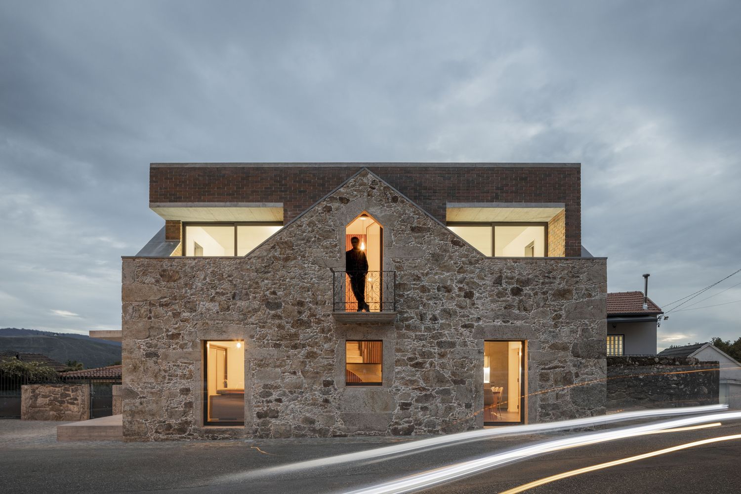
The added volume has a contrasting symmetrical shape. It is a single-family residence with two stories- the ground floor that features social spaces such as a dining and kitchen space to the north and a living area to the south, and the upper floor encompasses two bedrooms and a bathroom.
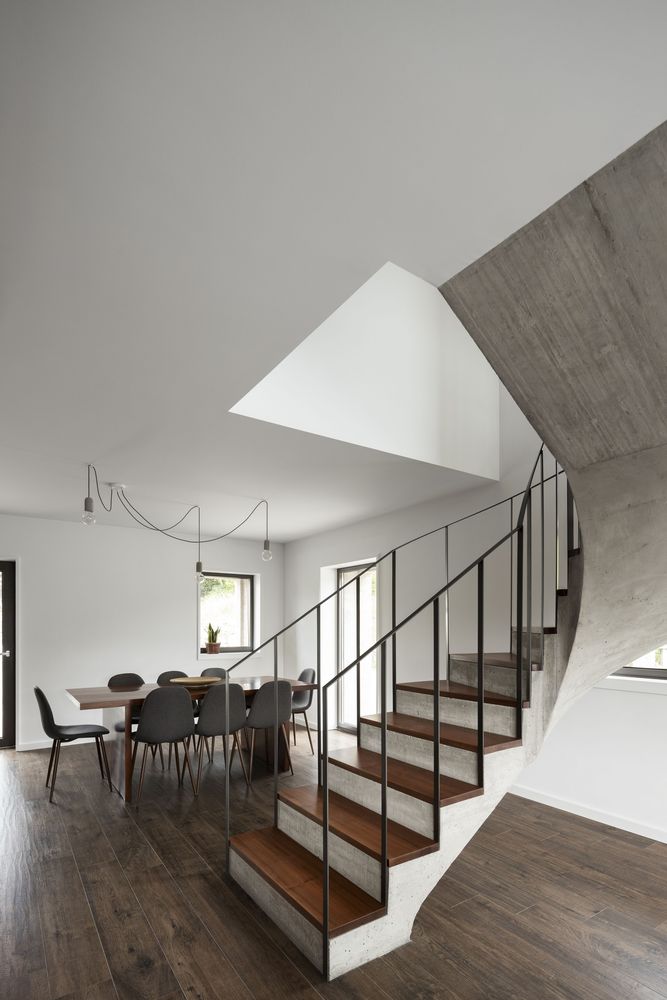
A spiral staircase in concrete and wood leads the dwellers to the upper floor.
There is a raised patio that connects directly to the living area through a set of sliding doors. A concrete canopy shelters it from the sun rays.
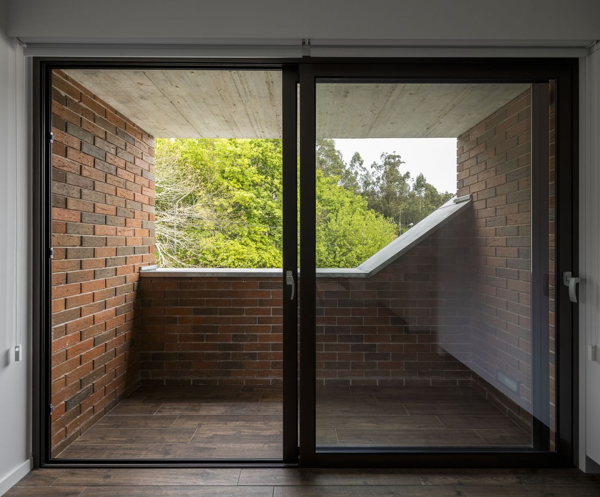
Besides, the balconies, openings and terraces slot into the old building.
The Alignment of Old with New
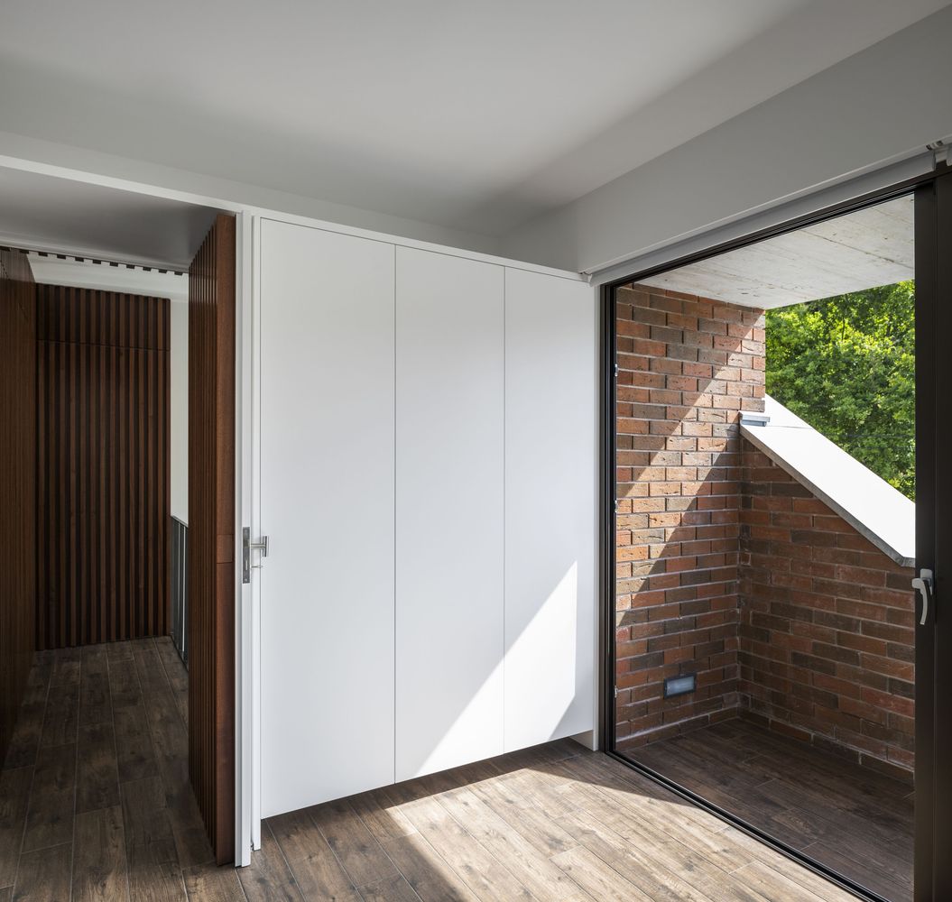
The new structure is retracted from the existing walls to form two small terraces with edges. The openings are lined up with those in the old structure to the deep recesses and framed with thin metal.
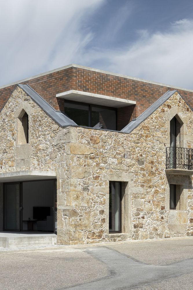 The original balcony was retained on the western elevation, though it is inaccessible now. Brickwork covers the window, arranged with original openings, forming a decorative feature.
Also Read: A Stack of Uneven Cuboid Boxes Forms the Exterior of Double-Storey Sarpanch House | Telangpore | Neogenesis+Studi0261
Material Palette
The firm applied a concrete and stained wood material palette. The single-space layout on the lower floor is clad in wooden slabs where a curvilinear stairway, in concrete and wood, leads to the upper level.
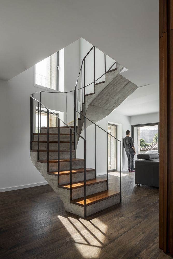 This curvy stair acts as an ornamental sculptural piece and segregates the dining area from the living space.
Muted Colour Tone
The interiors are simple and minimal, with both doors and walls are wrapped with natural wood creating alike and abstract surfaces.
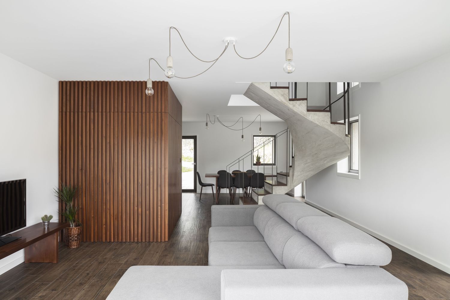 The architect used predominantly white colour in the interiors of the space that are aptly lined with beamed wood panels.
Project Details
Architecture Firm: Tiago Sousa
Area: 150 m²
Year: 2021
Photo Courtesy: Ivo Tavares Studio
Lead Architect: Tiago Sousa
Source: Archdaily
Keep reading SURFACES REPORTER for more such articles and stories.
Join us in SOCIAL MEDIA to stay updated
SR FACEBOOK | SR LINKEDIN | SR INSTAGRAM | SR YOUTUBE
Further, Subscribe to our magazine | Sign Up for the FREE Surfaces Reporter Magazine Newsletter
Also, check out Surfaces Reporter’s encouraging, exciting and educational WEBINARS here.
You may also like to read about:
Jewel Box Home That Evokes a Feel of Mansion with Abundant Natural Light and Ventilation | SASW
The Sunken KHI house & Art Space by Lassa Architects Features Rippling Concrete Facade | Greece
The Rammed Concrete And Copper Teahouse by Neri & Hu Restores Chinese Traditional Culture and Identity | Fuzhou
and more...