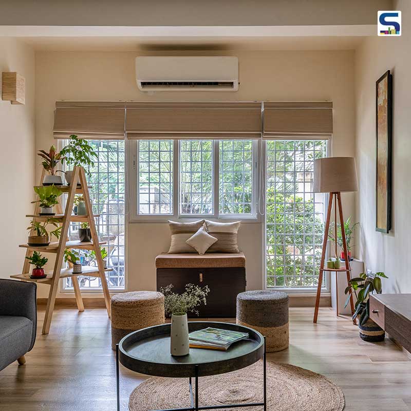
The correlation of luxury with size is a thing of the past. These two dynamics of designs that exclusively determine lifestyle with space have undergone a tremendous change in the past few years. Today, opulence is parallel to minimalism. Clean lines and sleek designs, bare walls, empty floor space, warm wood and pastel or bold upholstery encapsulate the meaning and character of minimalist design. Such is the modernist The Not So Tiny House – a 1,000 sqft Chennai apartment where form meets functionality.
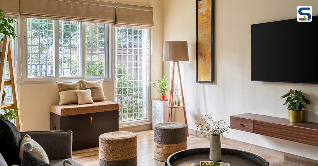 Top: The client wanted the apartment to go from a house to a place that she can call home; Above: With minimalism, traditional and contemporary styles, the team embarked on ideating The Not So Tiny House.
A space odyssey
A DM (direct message) to Roaish Architecture + Design on Instagram further instigated the couple to meet principal architect Aishwarya Krish. The Chennai-based architecture and interior design firm received a short but clear brief for their apartment located in RA Puram, Chennai. The client, who are in their late 50s, had been keen on having a home with a subtle hint of cool tones, a living room and a small dining space that could seat six and four people respectively. Elaborating on the client’s brief, Krish explains, “A cozy space was what they kept stressing on. They wanted a light-toned kitchen as it was her dream and the idea of easy-to-maintain it was taken into consideration. We also took into consideration that the client is a plant lover. Overall, she wanted the apartment to go from a house to a place that she can call home, and of course, to make the apartment appear bigger in terms of spatial area.”
With minimalism, traditional and contemporary styles, the team embarked on ideating The Not So Tiny House. Krish and the team decided to start fresh with the bare shell that clinched onto the concrete and colourless walls. The designing process of the 2-BHK apartment kicked off with the amalgamation of the living and dining spaces into one volume. Beginning with cleaving the cluttered space, Krish commenced working on the closed kitchen. “We knocked off a part of it to make it semi-open and plonked a breakfast counter connecting the kitchen and the dining space,” she adds.
 A part of the kitchen was knocked off to make it semi-open and a breakfast counter was plonked connecting the kitchen and the dining space.
“A minimal approach is what we believe in as a firm; a subtle art of composition of furniture and elements is what brings the space together,” she cites. A feature wall illustrating raw, exposed white brick engages for the most part of the living and dining space of the house. The idea to include this European element with a shade of half of white was to create a cozy space that the client was looking for. To spatially enhance the 1000 sqft apartment, a generous number of mirrors have been incorporated around the apartment. Elaborating the space, Krish adds, “A clean sense of composition of elements helped us achieve the look and feel that we had envisioned. It is crucial to function over aesthetics and then marry it with the perfect form. Since it was a 1000 sqft apartment, we had to keep in mind the size constraint as we were on a mission to make it look bigger and more spacious. The colours and materiality further helped a lot in bringing that about.”
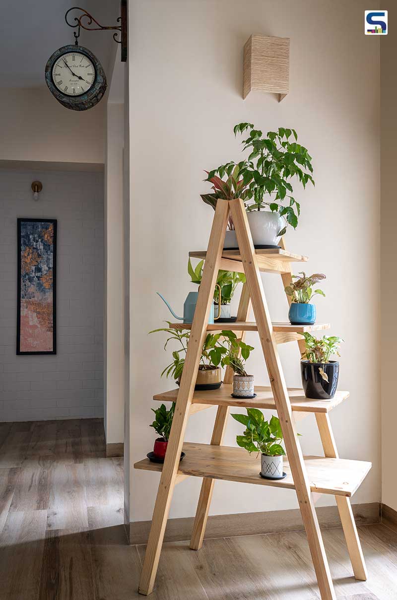 A tint of natural green is established in the living area where plants are housed on a frame stand to augment the lively ambience.
The beauty in simplicity
A neutral palette fits in the modern apartment with a pop of blue. The white brick wall gives a hint of a modern space ambience to the square-shaped living room. The feature wall is articulated with paintings that complement the decor, thereby achieving a holistic vision with minimal openings and electrical points. A tint of natural green is established in the living area where plants are housed on a frame stand to augment the lively ambience. Encapsulating the subtle tone of the interiors, jute, cane and walnut wood furniture is set up in the apartment. The existing pieces of furniture which belonged to the client have been refurbished to retain the cultural and emotional aspect it carried over the years.
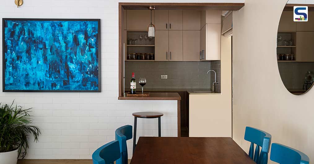 A functionally designed and aesthetically pleasing breakfast counter on the refurbished open kitchen blends the living and dining spaces.
A functionally designed and aesthetically pleasing breakfast counter on the refurbished open kitchen blends the living and dining spaces. The C-shaped breakfast counter intermingles with the other brown hues of the zone as opposed to the grey backsplash tile that mimics the concurrent white brick wall in the living room.
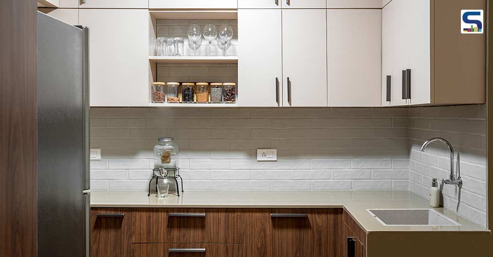 The grey backsplash tile mimics the concurrent white brick wall in the living room.
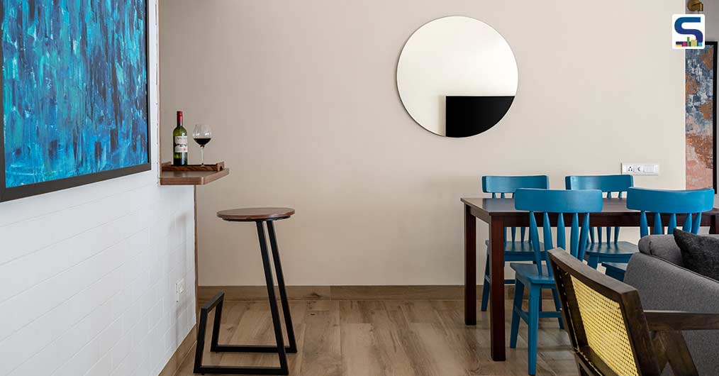
As for the dining space, the refurbished dining table had been the starting point, beyond which came the design of the bespoke Windsor chair with a twist of colour. Reminiscing the moment, Krish recollects, “There was a debate about what to place on the wall above the dining set. When in doubt choose a curve. And that is when we went with a frameless circular mirror that reflects the living, appearing it to be a bigger space.”
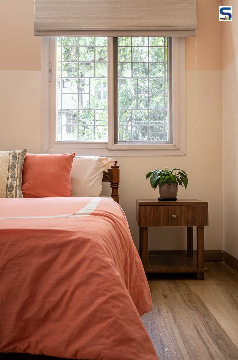 A sense of tranquility is created in the master bedroom with pastel shades in contrast to a simple teak bed.
The design of the master bedroom revolves around the less-is-more concept with a quirky approach through brass accents. A sense of tranquility is created in the master bedroom with pastel shades in contrast to a simple teak bed with a customized side table and wood tile flooring. A sliding mechanism has been introduced to the bathroom door to enhance mobility and has been repainted to the dual tones of the half-white wall.
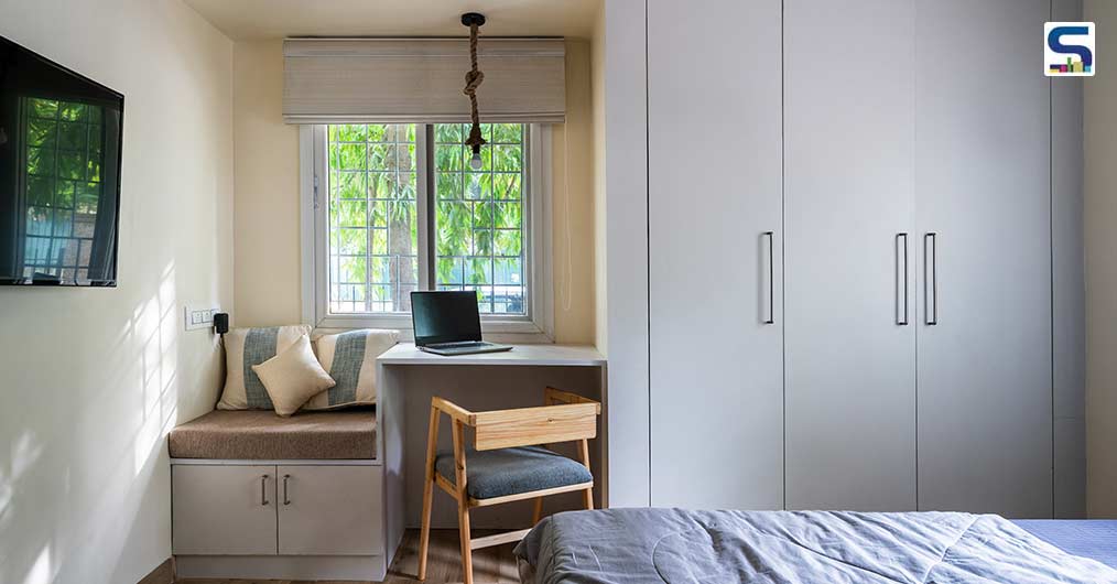 The L-shaped, light shelving units and a study-cum-bay window seating alongside the wardrobe in the boy’s bedroom underline the core of a study room design.
The L-shaped, light shelving units and a study-cum-bay window seating alongside the wardrobe in the boy’s bedroom underline the core of a study room design. “To plan three functions on one wall was a tricky situation as we had to understand ergonomically how much area each function would require,” informs Krish. A brushed nickel accent breaks the mainstreamed grey-blue colour in the boy’s bedroom.
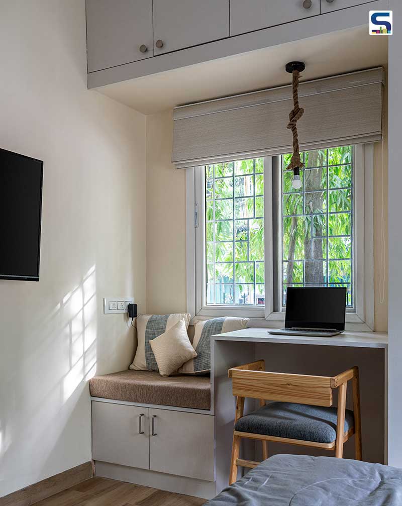 It was a tricky situation as the team had to understand ergonomically how much area each of the three functions would require on one wall.
1000 sqft of happiness
Although Kirsh recalls the elemental transition of the Not So Tiny House with subtle undertones to be a beautiful process, the ride was slightly bumpy. The planning of the apartment was tricky as the team had to work with the furniture blocking the space circulation. “We wanted to create a seamless transition from one space to the other such as the living and dining existing in close proximity,” she mentions. Besides space and budget constraints, the apartment’s execution took place during the second wave of COVID-19. And Krish believes the only way they achieved perfection despite the pandemic was through her team of designers, labourers, stylists and contractors. “I think the USP of this house would be making a 1000 sqft home look much bigger, keeping in mind all the prerequisites and aesthetics. I’d like to tag this project a 1000 sqft of happiness,” she concludes.
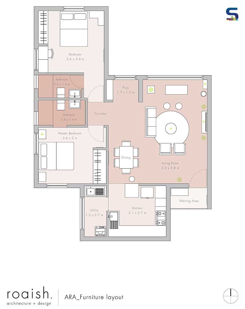 Floor plan of The Not So Tiny House.
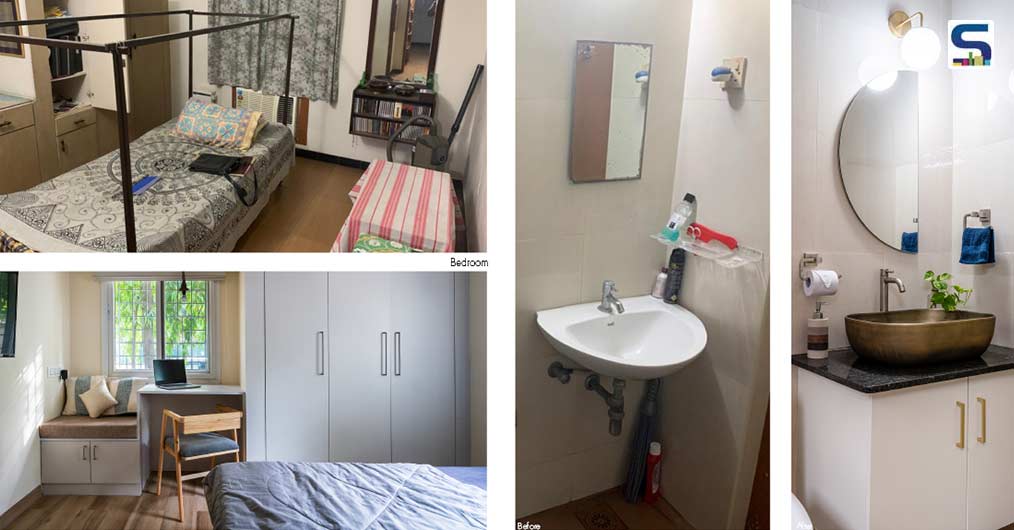 Before and after images of the project.
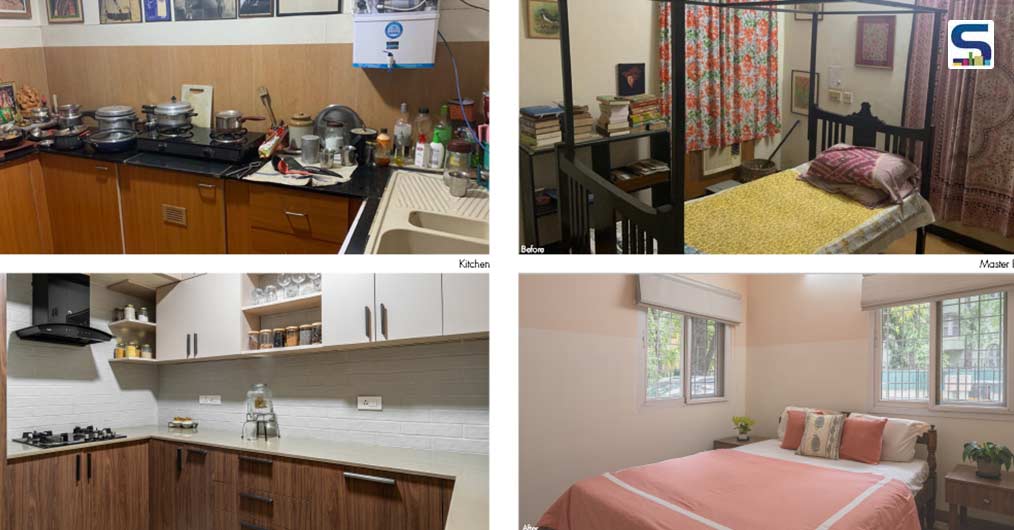 Before and after images of the project.
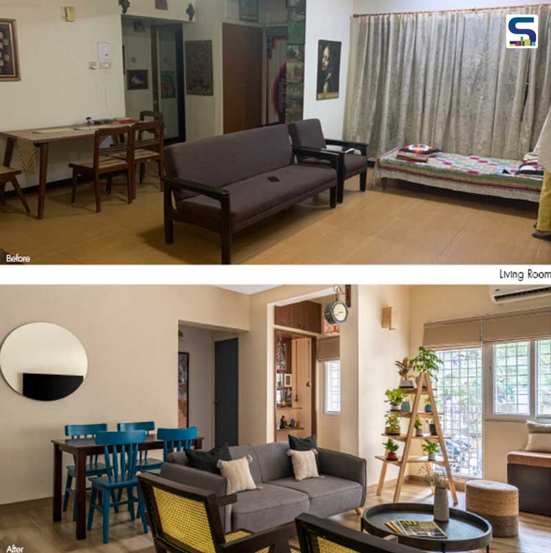 Before and after images of the project.
Project details
Project name: The Not So Tiny House
Location: RA Puram, Chennai
Area: 1000 sqft
Completion date: July, 2021
Principal architect: Aishwarya Krish
Design team: Ayoob, Sruthi, David and Rahul
Contractors: Roaish Architecture execution team
Photo credits: Yash R Jain

About the firm
Roaish Architecture + Design is a design firm based out of Chennai that teaches or learns architecture and design as an everyday experience. The firm believes in an environment where there is comfort amongst design, coffee and other things. Principal architect Aishwarya Krish’s passion for architecture, art, aesthetics and design is what keeps her going. After five years of architecture school, she went full steam ahead and opened her own firm. Currently, she is busy changing the status quo of design in Chennai with one project at a time.