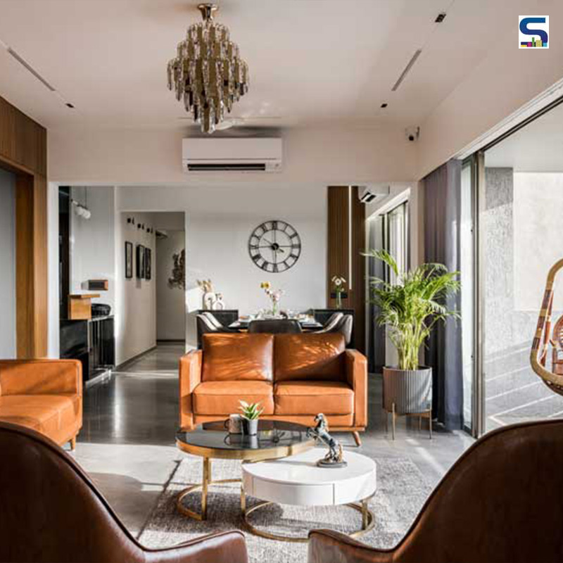
Ravi Dave & Anushi Shah with their creative design team Hetal Mehta, Kartik Panchal, Arth Patel, and Brinda Parekh have designed this contemporary residence in Ahmedabad, Gujarat for a working couple with a growing child. "The main Key for designing the project was minimalism with bright spaces. The client really wanted less furniture tells the designer to SURFACES REPORTER (SR). Aptly named, "Sunset House", the abode sees the beautiful play of light throughout the day. The client wanted their home to be a space where they declutter and experience peace, having a low-maintenance home with a muted colour palette. This residence is around 1900 sq. ft floor space with four bedrooms and one home theatre space along with the kitchen, living and dining area. See how the designers modelled this fascinating home while keeping in mind the directive of the homeowners. Have a look:
Also Read: Organic Shapes, Green Walls and Nature-Inspired Hues Give A Dreamy Vibe To This Restaurant | Ahmedabad | Amogh Designs
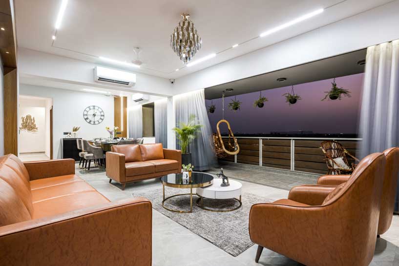 The ideology of “Less is more “is clearly reflected in the overall space of this apartment located on the 6th floor of a building. Its position also allows more natural light and ventilation and panoramic views. Huge windows in the living, dining reflects maximum light as it opens up in the west side.
With thoughtful space planning and placement of furniture, the designers make optimum utilization of the available area. "Open floor plan was also done considering larger floor space of living, dining, kitchen and home theatre by avoiding unnecessary partitions between these spaces," said Dave.
Entrance Gives A Sneak Peak Into The Interiors
The play of the ceiling’s horizontal and the door’s vertical veneer panelled lines showcases the continuity of space and gives visitors a pause point. The entrance space gives a subtle introduction to the whole space and takes one to the living area.
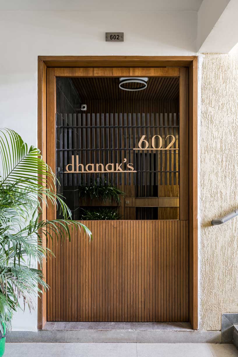 The entrance door is designed as a functional aesthetic where it also has the name plate incorporated in the design itself. The vertical lines of the metal grill establish the inside-out connection.
Avoided Unnecessary Partitions
Living, dining, theatre and kitchen are kept open without any physical partition to maintain the open space plan. It enhances the scale of the house. Frame by frame can be visualized from the entrance space. Living room area is kept a bit unconventional.
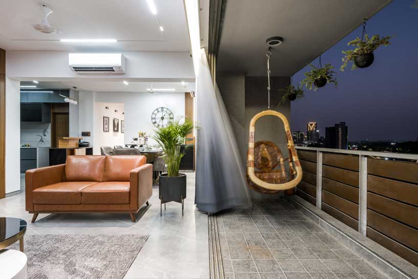 The sofa is facing the balcony area instead of facing back towards the balcony. So, once you open the sliding doors of the balcony, the living room space doubles up. The wall in the living area is kept blank as the natural light can have its constant play all around the time. The dining area continues from the living space and one can enjoy the view while having meals.
Shades Of Grey In The Kitchen
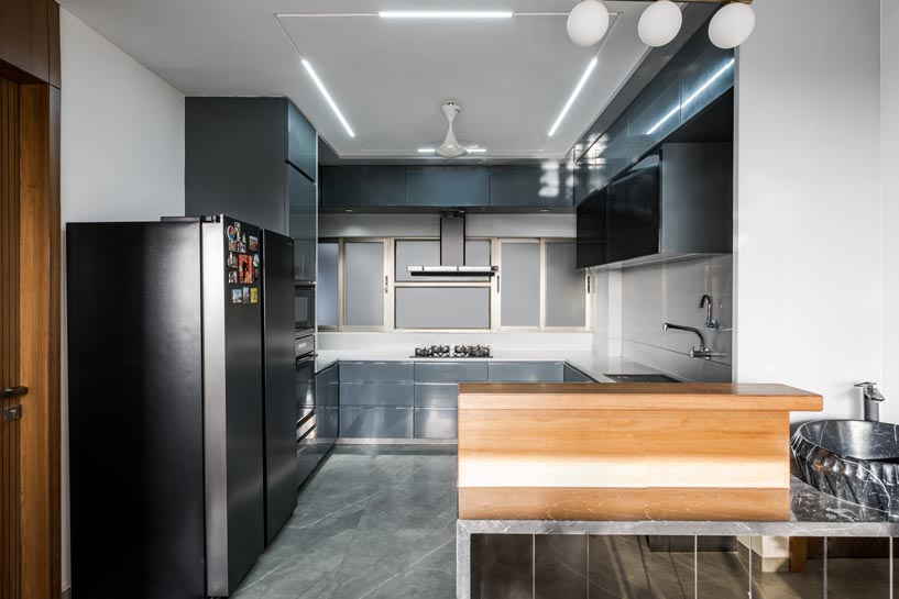
The kitchen is designed in a neutral palette, in shades of grey. One continuous acrylic border runs throughout from platform inbuilt machines till the breakfast counter. Clean lines in the kitchen give it a decluttered aesthetic. PU paint finish and plain acrylic sheets have been used in the kitchen space with the breakfast counter.
 Bedroom spaces act as the secluded part of the house as the two-bedroom cluster is accessed by a small passage and a compact vestibule area, parents bedroom is along the passage.
A Touch of Bohemian Style in Master Bedroom
The Master bedroom reflects minimalism with a hint of bohemian vibes. The colour plays of grey and white along with the wooden flooring and veneers add serenity to the space.
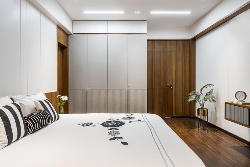
The slight ray of light entering the room makes the design of the space more peaceful. Vertical tidy lines are used in staggering proportion in the foreground of light tones walls. The bathroom is done in a monolithic way using dark tile in the complete bathroom. Hanging light and glass wardrobes are added to give a more elegant feel to aesthetics.
Playful Kids' Bedroom
The kids bedroom has a play blue, grey, and white colour palette. This room reflects playfulness. The display spaces are created in the room for the kid to highlight his skills. The study table is designed with a plain blue and white look with shelves above and a magnetic board. The World map is placed against the white walls.
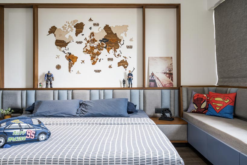 Experiencing a playful, joyous atmosphere in the space is created through colour and graphics. Grooving patterns are done in sync with the ideology used in the overall house. Attached Bathroom in the kids’ room reflects the same colour palette as the room space.
Also Read: House With a Movable Core Wall - Architect Komal Matharoo Matharoo Associates, Ahmedabad
Vastu-Compliant Parents Bedroom
The bedroom for parents is kept very subtle and the furniture layout is done according to Vastu where the bed should not face north.
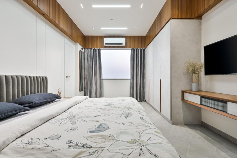 Lighter tones of grey are used and fewer details are added to the space to keep it minimal.
Home Theatre and Multipurpose Room
Home theatre is designed to keep the practicality of noise output, as the client did not want any partition between living and theatre. All the walls are covered with fabric panelling to achieve maximum sound output. This also reflects the overall language of the house through straight lines and colour palate.
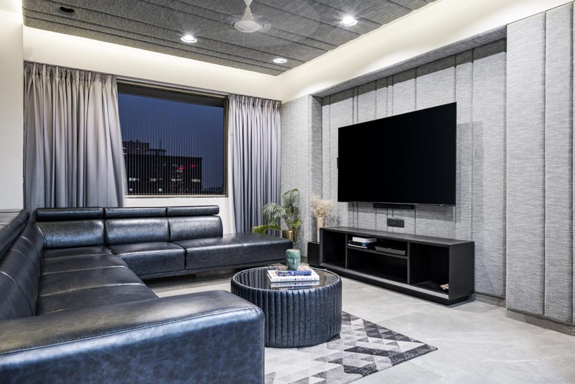 One bedroom near the entrance space is kept as a multipurpose room, which reflects the more powerful feel of the dark-toned interior. Being a sports fan, one wall is dedicated to the Indian cricketers with multiple composed frames.
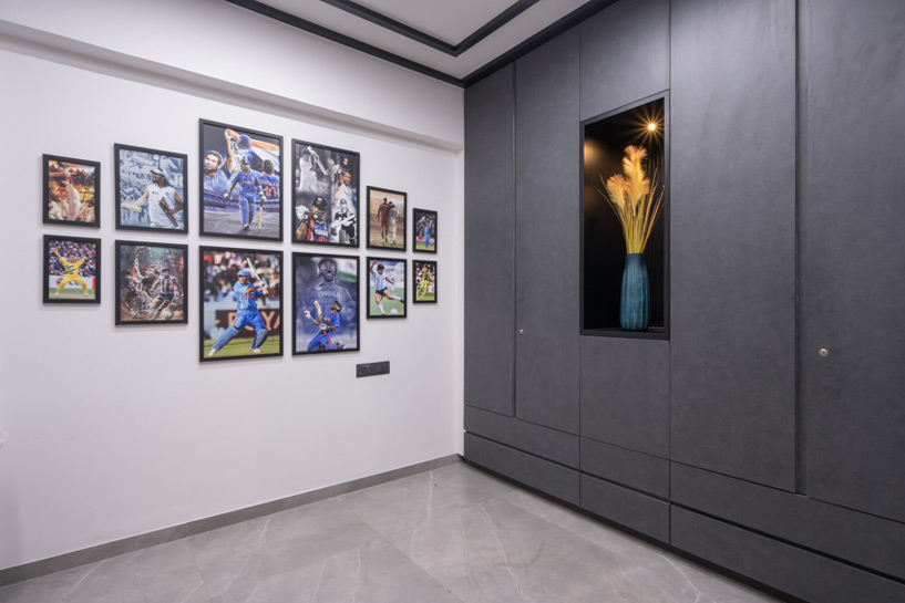 This space was designed as the owner always wanted a room dedicated to his wish and thoughts, where he can have his own time. By amalgamating all the factors with client needs and site context, the residence turns out to be minimal yet elegant.
Project Details
Firm Name: Studio Invoke
Project Type: Apartment Interiors
Project Name: Sunset house
Location: Sankalp Saphire, Prahladnagar, Ahmedabad, Gujarat.
Principal Designer(s): Ravi Dave & Anushi Shah
Design Team : Hetal Mehta , kartik Panchal , Arth Patel , Brinda Parekh
Size: 1900 sq ft carpet area
Year of completion: 2022
Duration of project: 8 months
Photo Credits: MKG studio
Products/Materials/Vendors :
Lighting: Light Inside
Sanitaryware: Jaguar
Furniture: customised ( sofa- comforto furniture)
Paint: Asian Paints
Keep reading SURFACES REPORTER for more such articles and stories.
Join us in SOCIAL MEDIA to stay updated
SR FACEBOOK | SR LINKEDIN | SR INSTAGRAM | SR YOUTUBE
Further, Subscribe to our magazine | Sign Up for the FREE Surfaces Reporter Magazine Newsletter
Also, check out Surfaces Reporter’s encouraging, exciting and educational WEBINARS here.
You may also like to read about:
An Exposed Material Palette Creates This Raw and Relaxing Weekend Home | Vihar Fadia Architects | Ahmedabad | The Epicurus Home
Timeless and Elegant Design Elements Adorn The Interiors of This Jewellery Showroom | Ahmedabad | Verve Atelier Designs
Indian Design Aesthetics Meet Moroccan Decor In this Ahmedabad Home by Mistry Architects
And more…