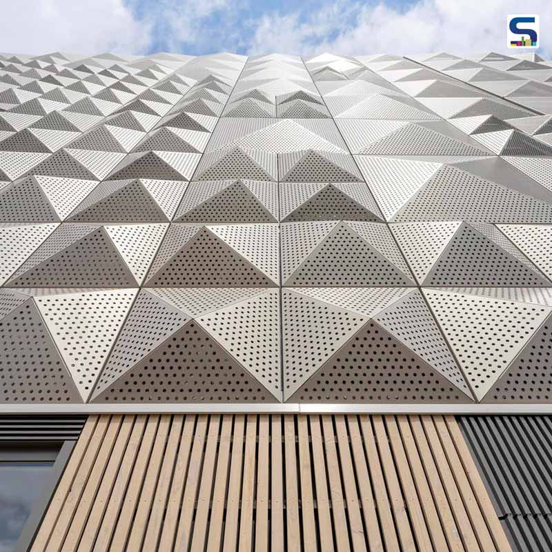
With the great expansion of cities, the number of personal vehicles increases on the road, leading to a serious parking problem. The reason is- the parking area in the towns hold doesn’t match with the cars on the road. But how great it would be if you find a place where you easily access your ride when required. The parkeergarage A1 provides required parking of 250 spaces for local communities, and it is the first of two car parks designed by XVW architectuur in Buiksloterham, Amsterdam. It stretches in a former industrial waterfront of 100 hectares at Buiksloterham in the north of Amsterdam. It also includes a ground-level health centre level. The beautiful car parking area features sleek geometric patterns on its façade, which reacts and changes colour just like a chameleon when light falls on it. Get to know more impressive features of this car parking space at SURFACES REPORTER (SR):
Also Read: A Geometric Delight by Morphogenesis
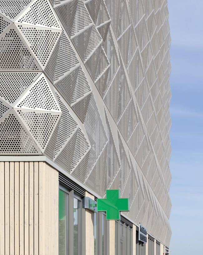
The geometrical exterior with the landmark quality of this new building gives a special feeling and creates a sense of arrival in Builksloterham. It is part of a master plan designed by Studio Nine Dots for the de Alliantie housing corporation.
With the concept of parking as a gateway to the neighbourhood, this project also stresses open and more free space on the streets, allowing other important daily activities to continue without any trouble.
The key of this project is to attract both small scale and collective developers for buiksloterham. Focusing on social housing and home provision as this residential-led design has a less conventional and more flexible approach.
Chameleon- Like Exterior
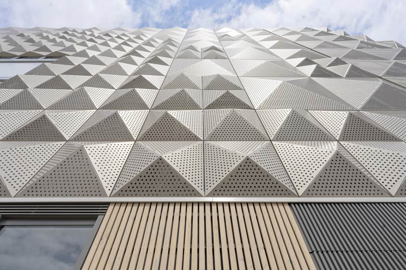
The chameleon-like appearance of the car park is formed in façade panels and custom-made paint. The volume of the building breaks down when the façade catches the light; it reacts and changes colour when walking across it.
Also Read: A Playful Geometric Facade
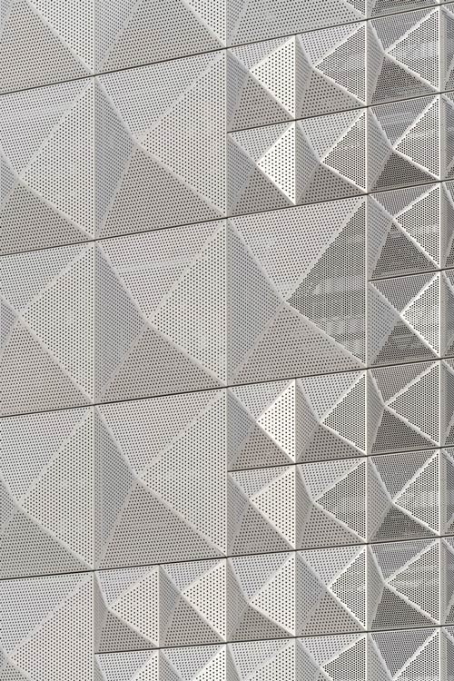
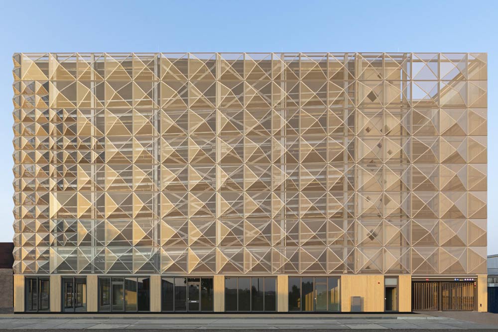
Xander Vermeulen Windsant, the founding member of the Dutch studio XVW architectuur, says, “Our design has covered the car park with a skin that does not deny the parking function but abstracts it. Only up close do you see car-parking floors through the perforation of the façade panels. This allows the building to have a role beyond parking and be interpreted more like a threshold or gateway to its neighbourhood.”
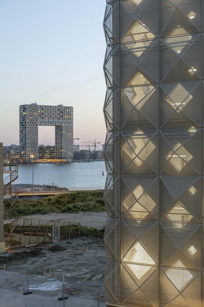
The steel mesh diagrid elevations give a distinctive quality to Parkeergarage A1 building which is more like a neighbourhood parking. The building provides a slight indication of what it holds within them with its non-descript sheds.
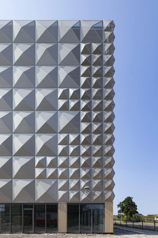
A Gateway to the Neighbourhood
The parkeergarage A1 is more like an ingress to the neighbourhood and less like a car park. Rather than parking outside of home, the driver can easily access the ride when they want.
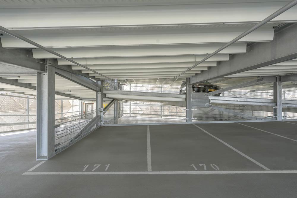
The timber-slatted cladding on the street level introduces a cosy and more human interface.
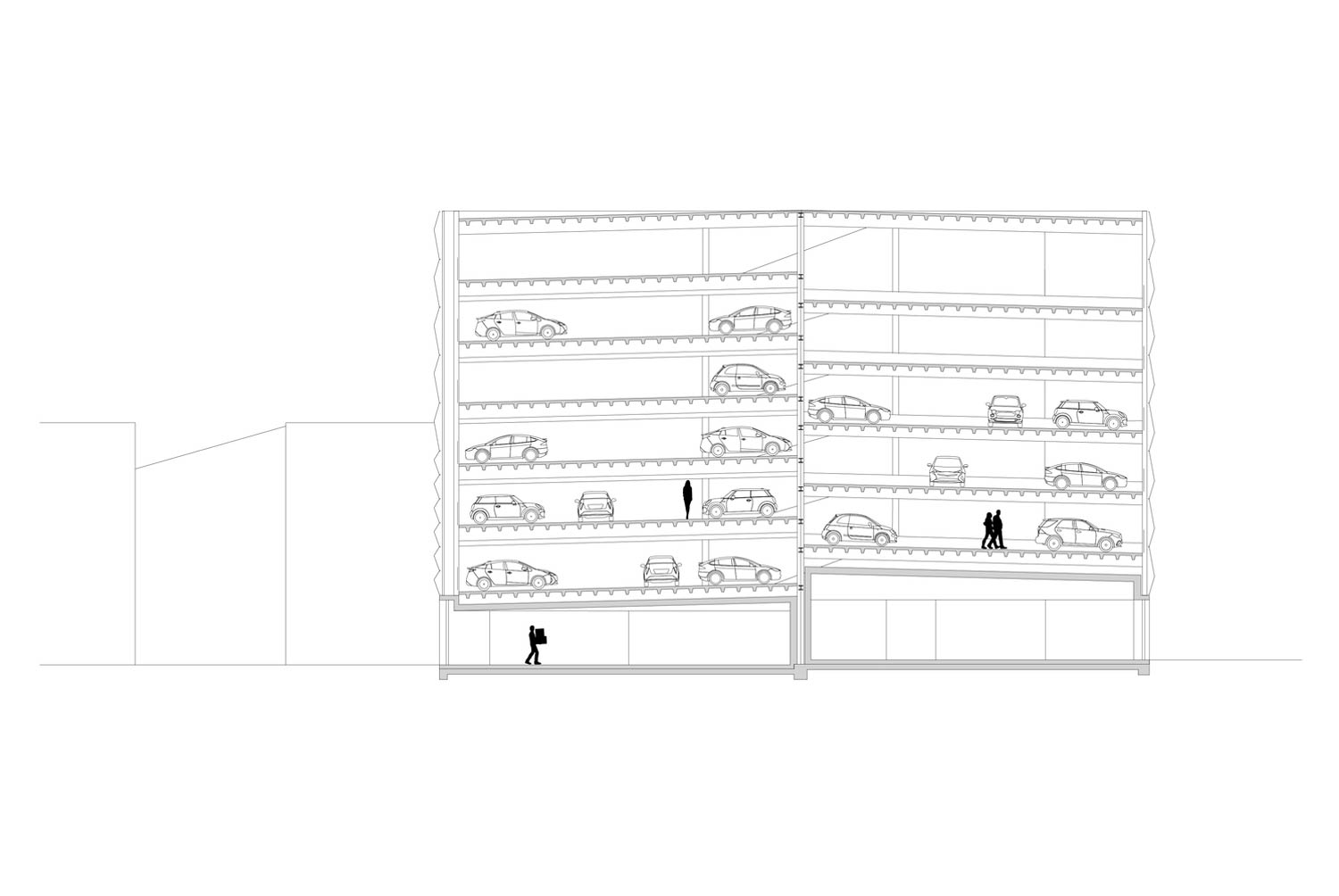 The cooler sleek steel with the natural wooden finish architecture contrasts above. Incorporating a health centre at the ground level is an example of a new experience that provides social value to their community linked with infrastructure projects.
Project Details
Architecture Firm: XVW architectuur
Location: Amsterdam, The Netherlands
Area: 8320 m²
Year: 2021
Photographs: Stijn Brakkee, Isabelle Nabuurs
Manufacturers: Kingspan Insulated Panels, Aluprof, Metadecor, Huber, Huber system, Rutolux
Keep reading SURFACES REPORTER for more such articles and stories.
Join us in SOCIAL MEDIA to stay updated
SR FACEBOOK | SR LINKEDIN | SR INSTAGRAM | SR YOUTUBE
Further, Subscribe to our magazine | Sign Up for the FREE Surfaces Reporter Magazine Newsletter
Also, check out Surfaces Reporter’s encouraging, exciting and educational WEBINARS here.
You may also like to read about:
Fascinating Red Ceramic Façade with Sculptural cuts | RED7 by MVRDV in Russia | SURFACES REPORTER
Fascinating Facade with White Fibreglass Panel | House of Dior, Seoul | Christian de Portzamparc and Peter Marino Design
And more…