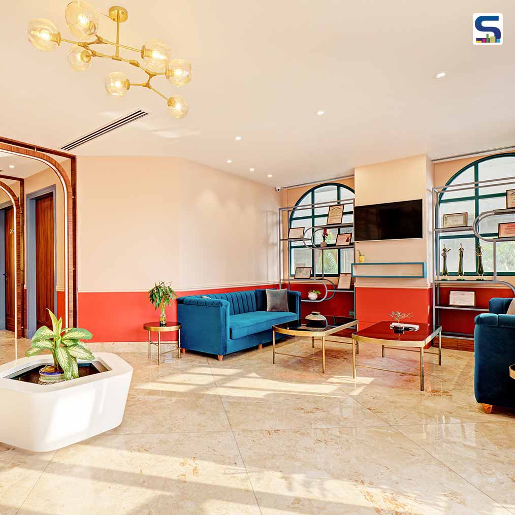
A well-designed clinic satisfies the patients' needs while it is also vital for the well-being of the healthcare providers who assist them. Keeping this in mind, architecture and design firm- Scapesmiths studio led by Aman Lamba, Bhavuk Jain, and Nikhita Singh fashioned this aesthetically pleasing and functional laser & plastic surgery clinic at Mahesh Nagar in Jaipur, Rajasthan. The main goal was to create a delightful yet calming atmosphere that encourages openness in patient-doctor interactions. The use of a bold colour scheme, which is uncommon in a healthcare facility, gives a unique identity to the space. The design team has shared detailed info about the ambitious project with SURFACES REPORTER (SR). Read on:
Also Read: Urban Zen Creates Spa Lounge-Feel Inside This Skincare Clinic in Hyderabad | SR Exclusive
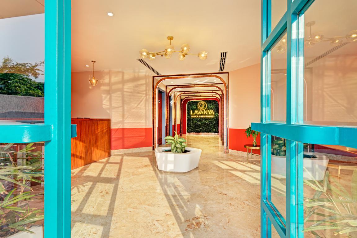
Inspired by the quote “Be bold, never regular”, the project features the use of colors and materials not regularly used in a medical facility. These colours express both warmth and worth and bolster the client’s confidence is a step towards integrating the interiors and objectives of the clinic.
The idea was to optimize patients' experience through the design of the built environment by creating spaces that are relevant to the evolved generations of patients and the needs of the workforce.
Spaces Segregated Into Two-Halves
The spaces have been divided into two halves volumetrically. The ground floor: where all the outdoor patient's visit and the first floor: where all the in-house patients get treated hence demarcating floor-wise public and private zones.
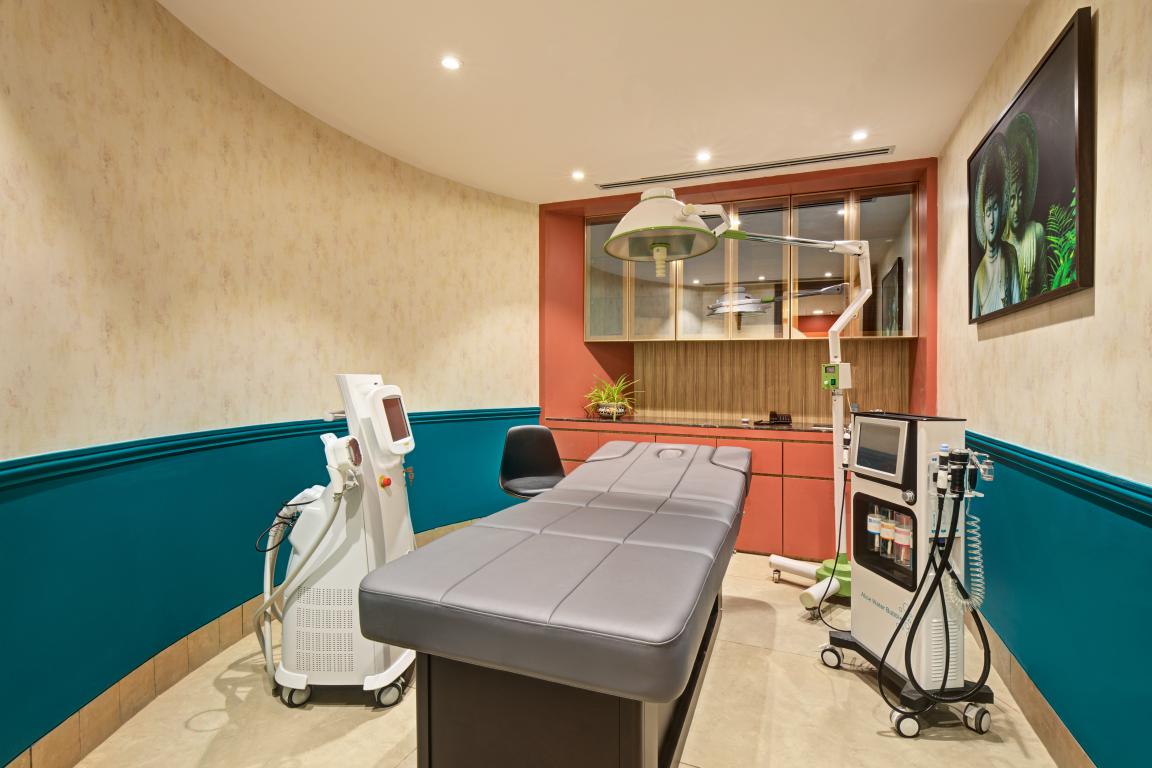
Although the clinic is organized in a conventional rectangular planform, the articulation of spaces within the clinic and the circular twist to the laser room, forming the corridor for the patient’s rooms on the first floor, makes it unconventional.
A Playful Colour Combination
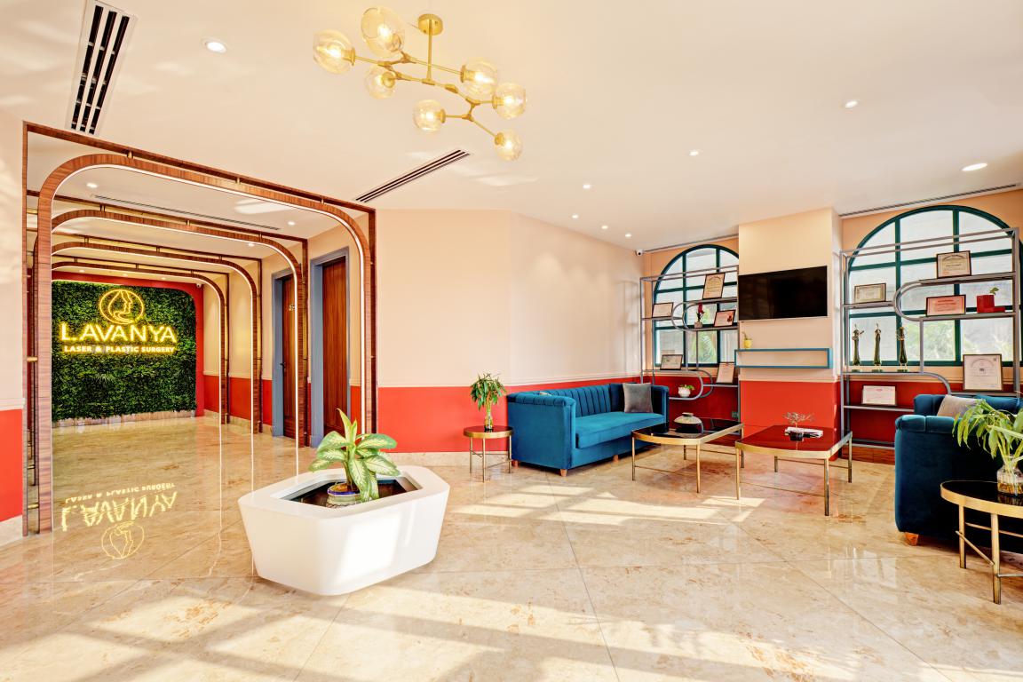
A perfectly lit arched corridor takes one’s eyes to the green wall with the brand’s name displayed over it, marking one’s entry into the clinic.
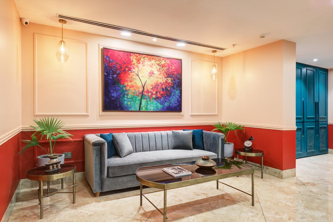
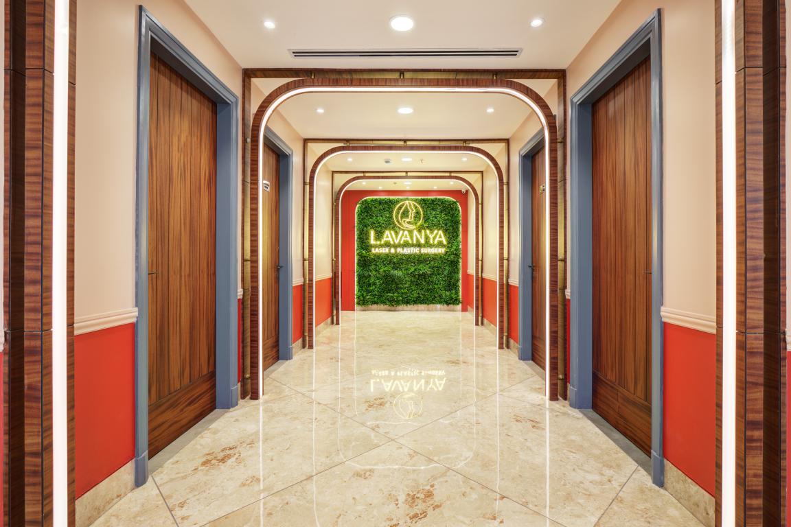 A whimsical approach to the color combination, textures and patterns, creates a welcoming yet eclectic atmosphere. The combination of light and dark on the walls at strategic heights creates an effect of open and weightless spaces.
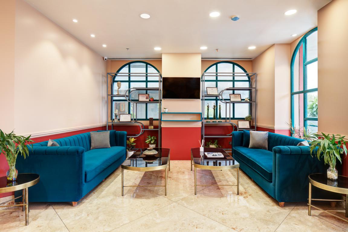
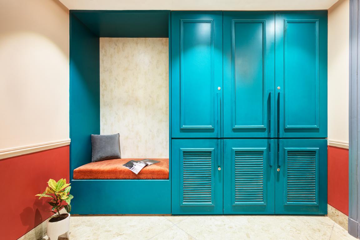
The cream and orange-colored walls create a beautiful contrasting backdrop against the teal-colored furniture and the framed openings along with hints of antique gold furniture here and there.
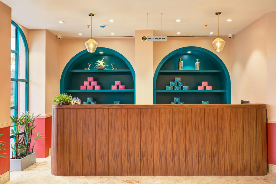
“The right color can make or break a space and we love how this bold color scheme gives a unique identity to this space,” said the team.
Also Read: Cushion Vinyl A Good Option for Senior Homes and Healthcare Facilities
Ample Natural Light and Air
The changing intensity of light through the day changes the intensity of the painted walls in the common area, framed by arched doors and windows from two sides, evoking the impression of openness and light.
The waiting and reception area creates a perpendicular axis with the corridor that further opens up in different consultancy rooms.
 The O.P.D. chambers have wall-to-wall bookcases as backdrops to stack the reference study material and various bits and pieces of antique artifacts showcasing the aesthetic side of the owner doctor!
The areas most “lived-in” such as the patient’s rooms, the waiting area, reception, and the OPD were strategically placed in the front to have access to direct sunlight compared to the service area and the operation theatres which need to be power-lit in any case.
Adorned by Artworks and Paintings
Our client’s inclination towards art made the firm adorn the walls with artwork and paintings everywhere in the clinic.
 As we go upstairs, pictures of the monumental beauties of Jaipur are showcased on the walls of the deluxe rooms developed for the in-house patients and the corridor leading towards the rooms, giving an insight into the rich heritage of the city to the outstation patients.
Drenched in Bold Colours
The whole 3000 Sq. Ft. space of this clinic is bathed in a riot of bold colors such as tangerine, emerald green, burgundy blended with cream and grey, demarcating and grouping categorically the various areas accessible to the visiting patients and areas designated for the use of the staff at the clinic and the in-house patients.
Non-Institutional Look and Feel
Visually interesting and tactile materials such as metal, colored walls, veneer used in a combed manner over doors and furniture are used throughout the clinic, shaping a center that is functional and space-efficient yet non-institutional in look and feel.
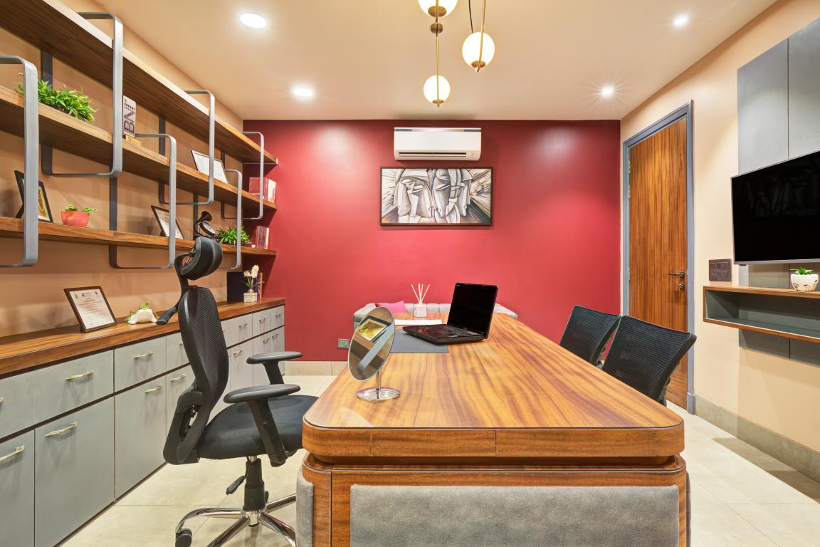
In designing this practical and yet a visionary delight to the eye the firm has followed English psychoanalyst Anthony Storr’s advice: “Originality implies being bold enough to go beyond accepted norms”.
Project Details
Project Name: Lavanya Laser & Plastic Surgery Clinic
Project Category: Interior Design
Project Location: Jaipur, Rajasthan
Project Size: 3000 Sq. Ft.
Project Status: Built
Design team: Aman Lamba, Bhavuk Jain, Nikhita Singh
Photographer credits: Studio BluOra
Keep reading SURFACES REPORTER for more such articles and stories.
Join us in SOCIAL MEDIA to stay updated
SR FACEBOOK | SR LINKEDIN | SR INSTAGRAM | SR YOUTUBE
Further, Subscribe to our magazine | Sign Up for the FREE Surfaces Reporter Magazine Newsletter
Also, check out Surfaces Reporter’s encouraging, exciting and educational WEBINARS here.
You may also like to read about:
How Equipped Is India’s Healthcare System To COVID-19 and Future Pandemics?
4 Parameters For Designing Healthy Building
And more…