Following the posters dedicated to the 1960s and 1970s, the multi-award-winning Italian illustrator Emiliano Ponzi unveils his image for the third decade of the Salone del Mobile and discusses the concept, the narrative and the language on which it is based.
Emiliano Ponzi has been asked to illustrate the various ages of the Salone del Mobile.Milano. In his original and distinctive style, he manages both to narrate and to communicate. The six striking posters – one for each decade in the history of the trade fair – allow viewers to perceive and relive the fundamental ties between the Salone and the city, and with the evolution of Italian design and customs, from 1961 to today. The campaign is a narration split into episodes, which manages to pick up on the fact that the Salone has never just been a trade fair but has become a mouthpiece for the values and skills that have made Milan the undisputed global capital of design.

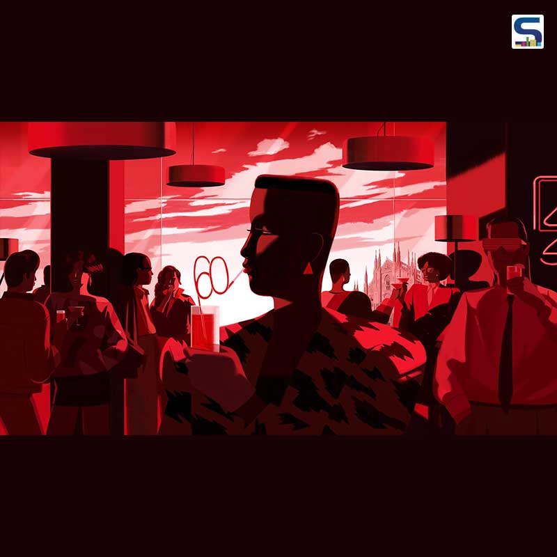
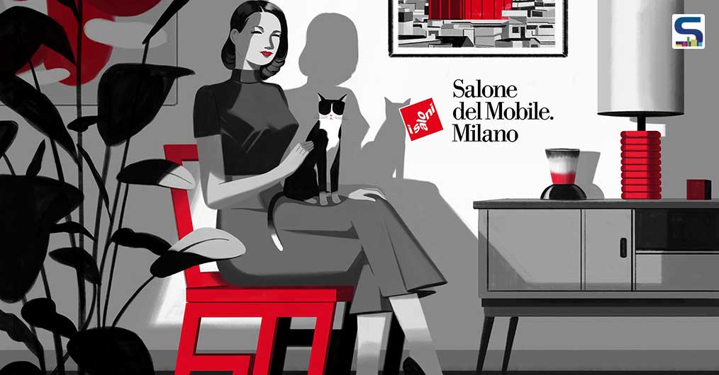
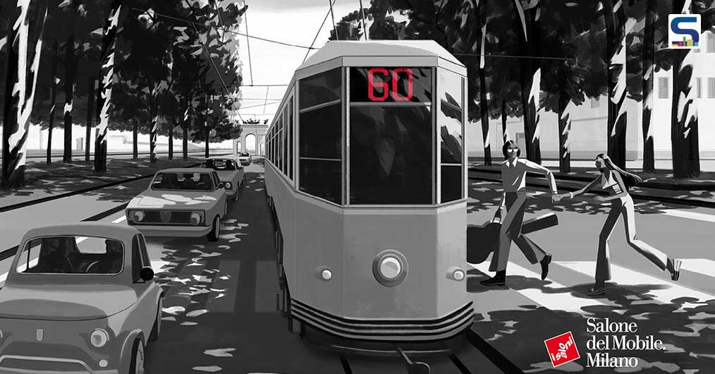
His first creative step was to tease out a common thread that would run through all six posters, not in terms of theme but in terms of style and language, one or more elements that would make them recognisable as a single, harmonious collection. His first and immediately obvious expedient was to use a particular colour range, the traditional Salone del Mobile.Milano red and black, with the addition of white and their respective gradations. The second, more original note was the insertion of the number 60 into each of the illustrations. In this way, the age of the trade fair becomes an integral part of each picture, making for the wow effect that the Salone has elicited year on year. The decision to incorporate Milanese landmarks – the Velasca Tower, the Duomo, La Scala, the fairgrounds and the iconic trams – makes for a consistent style. Lastly, the shared sense of conviviality and passion shines through each of the designs, helping to underscore the concept and the narrative and, no less important, allowing the viewer to enter into the illustration.
Elaborating his work, Emiliano Ponzi adds, “The first poster depicts a 1960s Milanese interior, which is why it’s in black and white, with just a splash of red in the picture of the Velasca Tower. The second depicts a city on the move and the hippie atmosphere of the 1970s. Then there are the atmospheres of the 1980s: the design, fashion and parties during a decidedly pop era, which is why the illustration is a riot of reds and a homage to Grace Jones. I was inspired by La Scala for the 1990s, by its concerts and ballets and its ties with the Salone, while for the first decade of 2000, I focused on the fairgrounds, on the space designed by Massimiliano Fuksas. The final poster reflects on the present and opens out towards the future based on the values of sustainability and inclusivity.”

In collaboration with Alkanoids, a creative Milanese studio specialising in motion graphics, 2D/3D animation and filmmaking, a new digital component has been added to the image: when the QR code in each poster is scanned by smartphone, the illustrations come to life, changing from a static, 2D state to a moving one.
Rounding off the suggestive illustrations, the stirring and positive copy message, Join the Design Wave, breaks with the Salone’s traditional communication methods to stoke amazement with a light-hearted call for us all to come together collectively around design, Milan and the Salone del Mobile.
Image credits: Salone del Mobile.Milano