Edward de Bono’s wise quote, “Creativity involves breaking out of expected patterns in order to look at things in a different way,” articulates the journey of Goa’s leading luxurious wellness spa, Snip Salons & Spas. After branching out in Goa’s Panaji, Calangute and Grand Hyatt in Bambolim, its owners Archana and Sumeet Bhobe settled to open its fourth outlet in Porvorim. Hailing from art and fashion backgrounds, the clients desired to get on board like-minded creative heads who would help in enunciating the fourth outlet with a ‘warm, minimalist and luxurious vibe.’ Archana and Sumeet’s natural choice for this new project were architect Keta Shah and interior designer Varun Shah of Ahmedabad-based Workshop Inc who have been previously associated with the owners for renovating their other outlets.
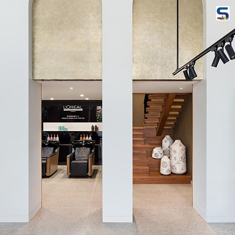
 The double-height arches add volume and create space, thereby emancipating a peaceful trance experience to the patrons.
The clients desired to create the Porvorim outlet – a 6,000 sqft leased building nestled on the main highway leading from Porvorim towards the beaches of North Goa – one of the biggest salon and spa centres which would extend beyond the space into hospitality and service as well. Keta and Varun took charge of the site when the architectural shell was up, and focused on the advantages that lay ahead of them including the prime location, the enormous site and the fact that the building owner was open for structural changes. Also, the long association with Workshop Inc had established its utter most value toward core ideas that govern the design using simple solutions to achieve the end product in the minds of the clients. This led them to assign the architectural finishes related to the interior space as well. The client’s brief for the duo was to simply segregate the spa and the salon area spatially, since the requirement, character and ambiance for both these spaces were different.
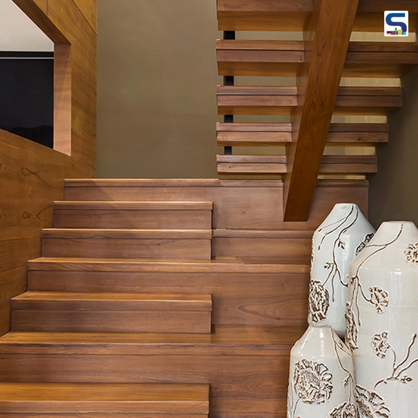 Located next to the hair wash area, solid wood-made stairs lead up to the mezzanine level where the nail bar and waxing rooms are stationed.
These essential notes helped the duo in crafting the design philosophy of the ground-plus-two-floors structure. Laying out the floor plan, the duo explains, “The building is in two bays, with a central zone for circulation. The ground floor – a designated space for salon area – is a double height space with a 14’ height, a part of which has been converted to a mezzanine area. Apart from the main salon area, the client needed to incorporate a hair wash and colour zone, a pedicure zone, a nail bar, and waxing and treatment rooms for the salon zone. Since their requirement could fit into the ground floor and mezzanine area, the first floor was kept for the spa zone including the requirement for room variations for couples, individuals alongside a foot and head massage zone.” The second floor, however, was kept unchanged and was to be done in the second phase for adding more massage rooms and an office.
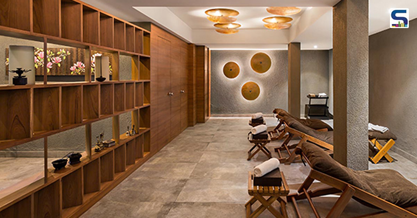 The wooden screen on the left doubles up as a display unit for curios. Although it physically separates the space from a corridor which leads to the massage rooms, it visually maintains a spatial connection.
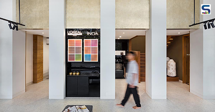
Patrons walk in through the double-height reception and waiting area which balances the extravagant Goan house-inspired arched walls. The double height space camouflages into the structure for the mezzanine area. The walls conceal the pedicure, hair washing and colour zones with the circulation bay on the left. Rising above these stations is the nail bar, waxing room and pantry. Besides, a VIP salon is also stationed on the ground floor.
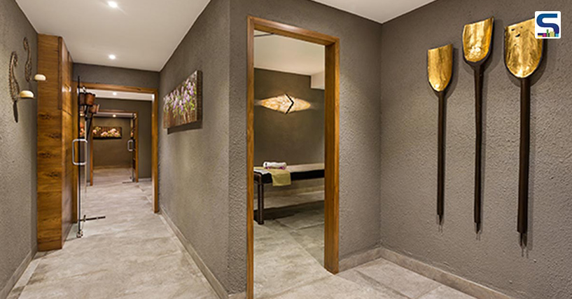 Warm and dark shades of grey cover the rustic spa zone, creating a homogenous and calm atmosphere.
A small triple height atrium at the central bay is created to access the lift and the stairs as the building was designed as a commercial complex. To access the mezzanine, a separate staircase is incorporated within the salon space to segregate the spa and salon areas. The lift or the main staircase in the central bay transports patrons to the spa area on the first floor. Cocooned on the first floor of the glass facade building, seven massage rooms, a panned out space for foot massage and miniature lounge comprises the spa zone. “A number of civil changes were done to accommodate the toilets and steam rooms for each room,” informs the duo.
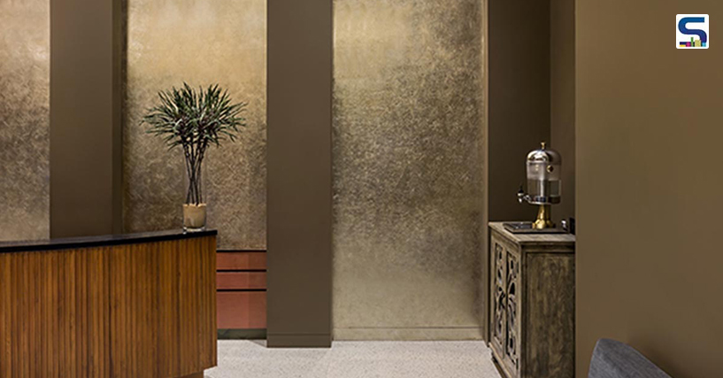 Cutomised solid wood reception desk sits at the front in the company of a display wall of personal care products from partner brands on the side.
The salon and spa spaces demanded visibly linear and simple designs, and textures resonating with their different characteristics. Keta and Varun tweaked a subtle duality of function within a singular space, giving different identities to each through the material palette. Light grey vitrified tiles with a matte terrazzo finish span throughout the space complementing the simple tones of grey and white on the walls, while deep olive green walls with a play of gold-foiled arches at the entrance breaks the monotony of the colour scheme. A series of bright whites on smooth plaster with metal details and black accents distinguish the salon area, cleverly shifting the focus on dark, earthy shades of grey coloured spa rooms with gold tones and wood accents including the custom made solid wood recliners and stools, and massage tables from Snip chain’s furniture range. To maintain a sense of continuity, artworks from the client’s personal collection which they have collected over the years from their travels and customised decorative light fixtures by Sonja Weder and Thomas Schnider of Goa- based SotoHaus are slipped in. Besides creating a visual point of interest, the decorative light fixtures fashion a warm spa-like ambient glow. Indirect lighting throughout the space – except the salon area where stylists need specific lighting requirements – shuns harsh glares.
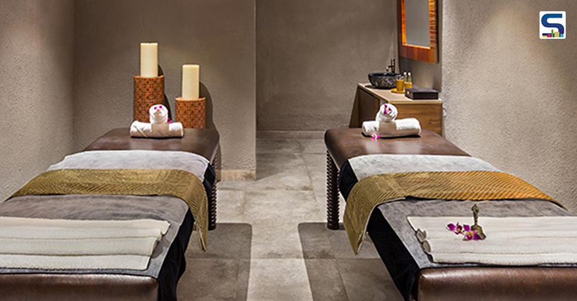 Signature of Snip Spa’s designs, the massage tables are crafted in precise sizes and materials; whereas the mirrors are custom made from SotoHaus.
Maximising the usage of space without compromising its functionality was a crucial call for Keta and Varun. “It was essential to ensure that all the services were incorporated seamlessly,” they inform, such as, “the arched walls that spans the entire length of the project. It is the most significant spatial inserts for us. It incorporates the structure for the mezzanine, adds in lots of storage and serves as transition planes. They are aptly highlighted and give the grandness of scale to the project.” Walloping their triumph for harmonising their creativity and clients’ preferences, Ketu and Varun believe they were lucky to work with clients whose design sensibilities resonated with theirs. “The end product is an amalgamation of all our ideas put together,” they add.
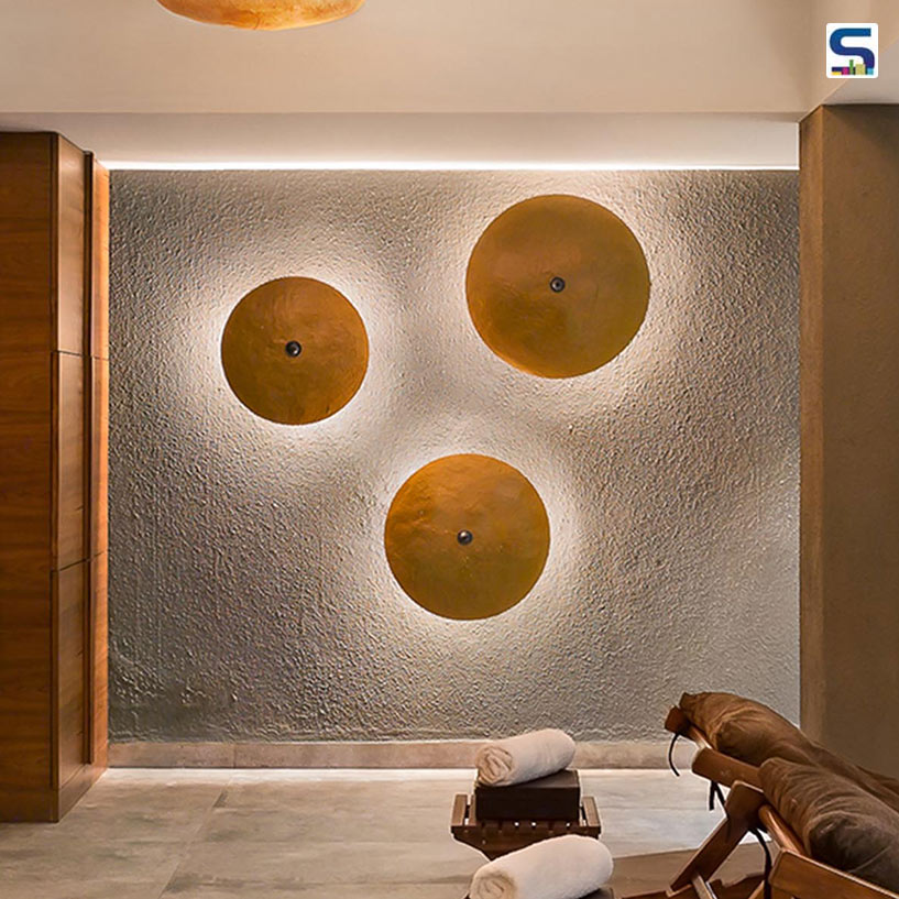 Custom designed lighting fixtures on the ceiling and wall by SotoHaus create a cosmic illumination.
Hospitality lies in the tradition of Goa. And the fourth outlet of Snip honours this saying with its minimalist interiors, balanced shade card with neutral aesthetics and of course, its top-notch service that leads on driving patrons to a place of calmness – a blissful break from all the outside chaos.
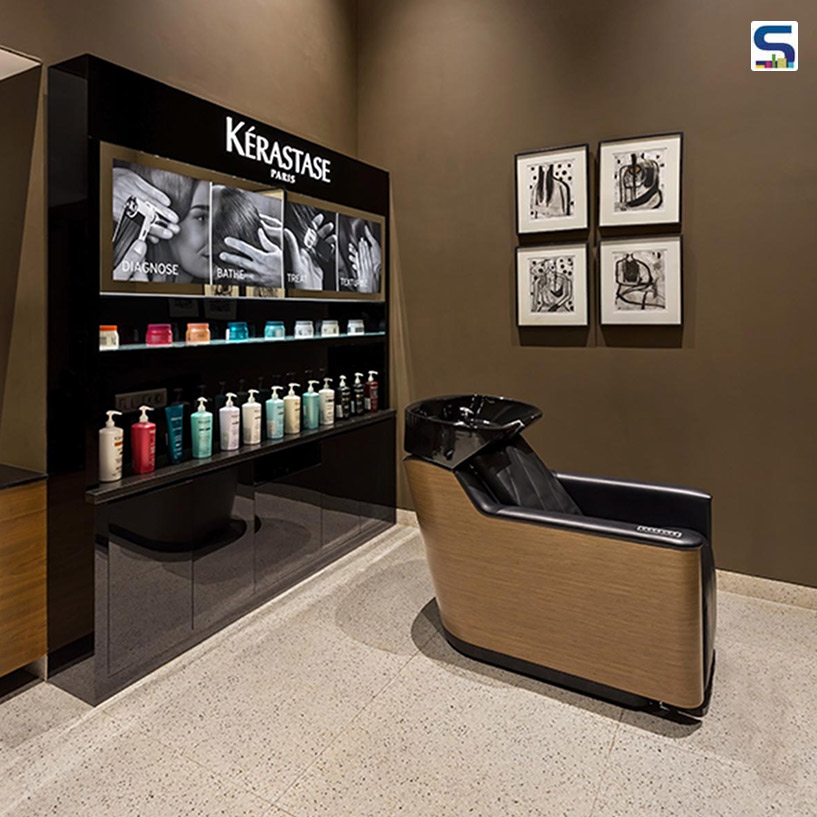 The VIP salon, nestled on the first floor, is carved out of the entrance atrium of the existing building.
Project details
Project: Snip Salon & Spa
Client: Archana and Summet Bhobe
Location: Porvorim, Goa
Area: 6,000 sq ft
Principal architect: Keta Shah
Principal interior designer: Varun Shah
Design team: Kirtan Panchal
Interior contractor: Shilp Furniture, Ahmedabad
Image credits: Kunal Bhatia