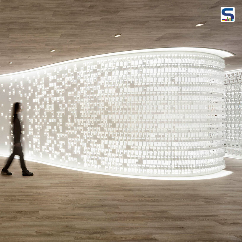
Tokyo and Milan-based design studio- Nendo- undertook the work of designing a new office space for Pokémon co-owner's new office- Creatures Inc. The firm took cues from the company's extremely popular trading cards, digital games, 3D modelling, and motion design to accomplish an unusual and future-proof workspace. The office is characterised by thousands of steel trading cards replica of its Trading cards. Read more about this striking project in detail below on SURFACES REPORTER (SR):
Also Read: Discarded Fishing Nets Get Altered into 3D-Printed Chair | Kelp Collection
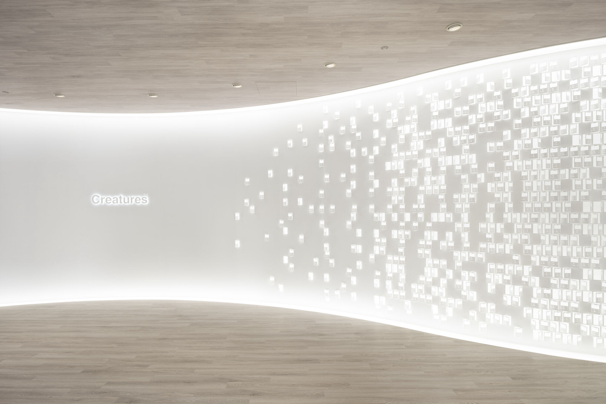 Located in Creatures Inc.'s existing Tokyo headquarters, the new office- which is one of the three companies that started Pokémon- will be an example of a futuristic interior design showcasing the wonderful inclusion of abstract design elements that are steel trading cards. The cards feature intricate patterns that increase the beauty of the interiors manifold.
How Elaborate Steel Cards Are Developed?
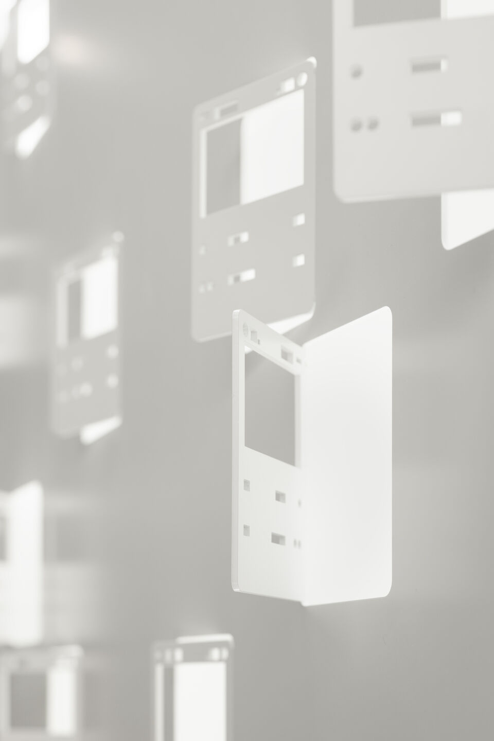
They carved an interpretation of Pokémon Cards in their actual size onto a 2.3 mm thick steel sheet with the help of a laser cutter. According to the design team, " The cards are manufactured by first printing a large sheet with a constellation of elaborate designs, which is then cut into small pieces of 63 mm width by 88 mm length."
 Each piece was bent manually after cutting into a card shape. The bent is done at twelve different angles to control the viewers' sight while adding texture to the space.
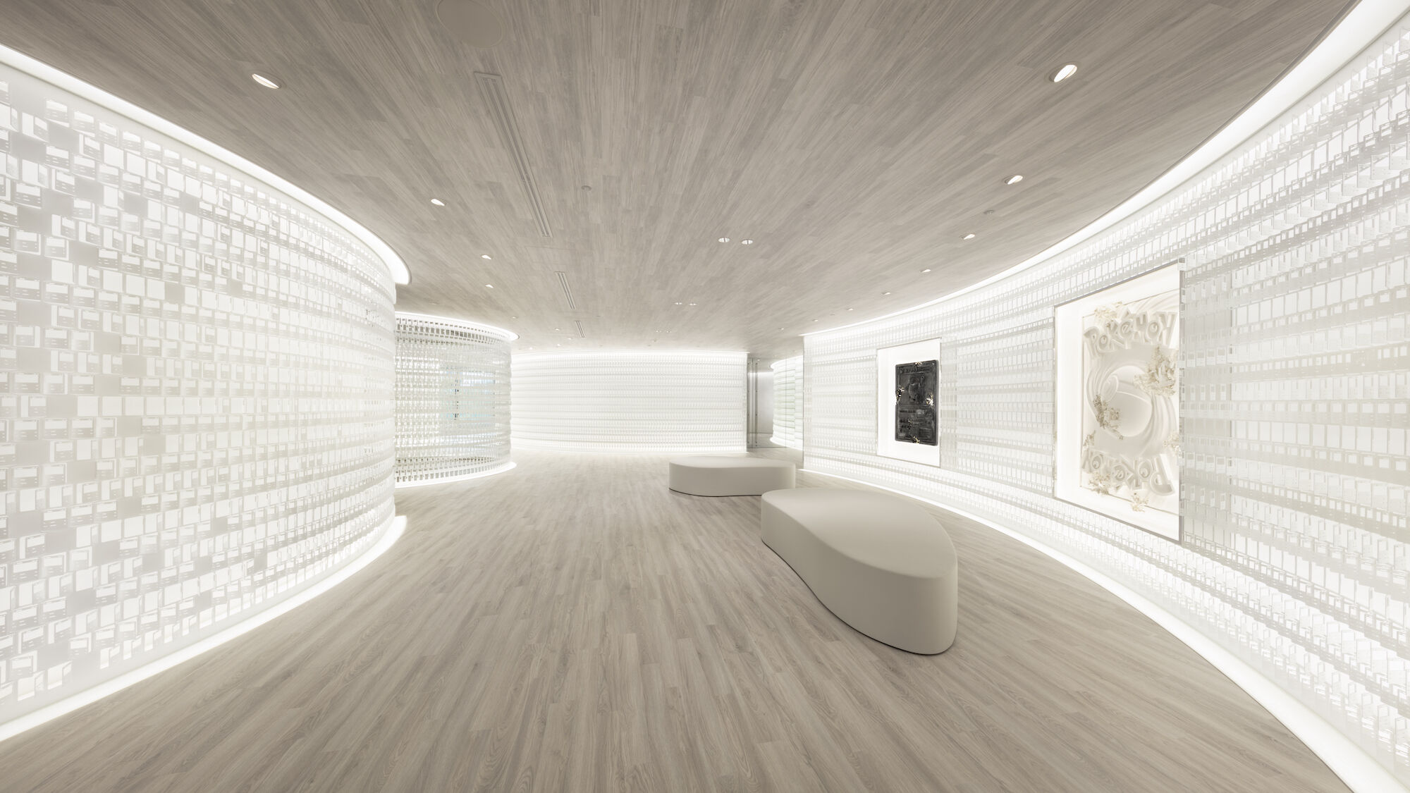
Consequently, a scheme appears in the form of cards, which are placed in a way to substitute the real walls while allowing visual communication between the spaces.
Nine Hidden Energy Cards
Apart from the normal card designs, they also created nine types of Energy cards as ‘secret items,’ each concealed in the interior.
 "Since its release in October 1996, the Pokémon Trading Card Game has long been loved by fans worldwide. What makes the cards so special is that every piece is filled with creative ideas with a touch of emotional value," the team shares.
Different From Traditional Office Design
The plan of the office goes beyond a typical office design packed with rectangular tables and box-like rooms. Instead of such an arrangement, the firm introduced curves and organic walls to create distinctive interiors. The organic forms add extra functionality, enabling users to fine-tune the layout as per the number of participants or meeting format.
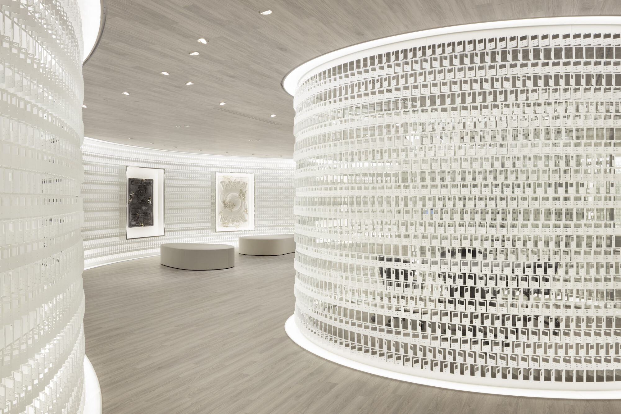 The team informs, "The concept was inspired by the story behind the multiple organic shapes incorporated into the original logo of Creatures Inc. It expressed how living beings evolved by adapting to the environment or circumstances and how the company aims to keep being like them. The design is the outcome of striving to reflect such sentiment in the office environment."
Project Details
Project Name: Creatures Office
Designer: Nendo
Client: Creatures
Collaborators: Yuko Hata, Mado, Hsieh Hui-Hsi, Madoka Takeuchi
Completion Year: 2023
Photography: Takumi Ota
Keep reading SURFACES REPORTER for more such articles and stories.
Join us in SOCIAL MEDIA to stay updated
SR FACEBOOK | SR LINKEDIN | SR INSTAGRAM | SR YOUTUBE
Further, Subscribe to our magazine | Sign Up for the FREE Surfaces Reporter Magazine Newsletter
Also, check out Surfaces Reporter’s encouraging, exciting and educational WEBINARS here.
You may also like to read about:
Tetris Game Inspires The White Canvas-Like Facade of House of Ayoob in Kerala | 3dor Concepts
Transform The Fas Pendezza Games Into Furnishings: New Collections | Italy
And more…