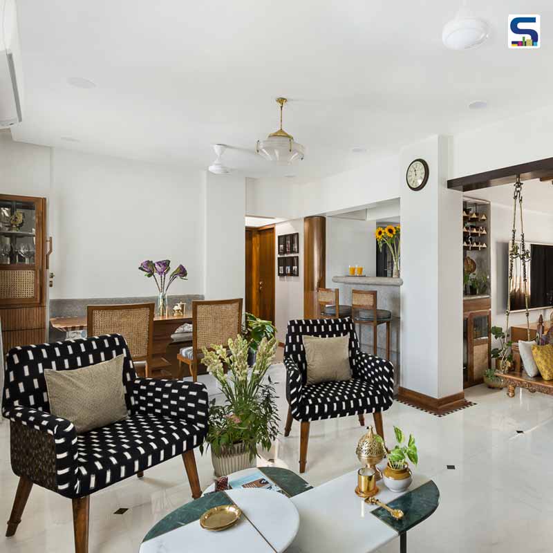
Mumbai-based Insitu by Kalakaari Haath, led by architect Sahiba Madan, has renovated the interiors of this simple and sophisticated home for a young working couple, the designer herself and her pilot husband. The house was originally bought as additional space for the client's parents living on the lower floor. As the client wasn't based in the city, the house remained untouched for almost 7 years. "It's like a balance between the oldest t-shirt you've been sleeping in since school and the new outfit you bought and aspired to be seen in," says Sahiba. The designer conceptualised the abode with a contemporary aesthetic infused with character and functionality. Despite muted colour palette, the house gives a bold and arresting look. Incorporating functional furniture, beautiful crafts, rich textiles, stunning artworks, handcrafted rafters and locally sourced materials offers a classy appeal to the interiors. The designer shared more details about the project with SURFACES REPORTER (SR). Scroll down to read:
Also Read: This Delhi Home Features Sun-Filled Interiors, Natural Materials and Sober Colour Palette | AKDA
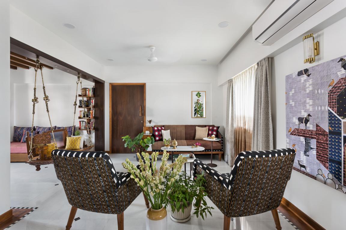
The concept while designing this abode was to use simplistic and familiar materials usually associated with homes and re-interpret them through unconventional details and application. Each element has been created with a strong association to the client's story its relevance to space.
An Interaction of Functionality and Experience
Since this was an old home, the primary design intent was majorly functional. The design team looked at the idea of the house as a space you return to after a long day of work, where you unwind and entertain your loved ones.
Much like any other Mumbai home, every space was crucially sculpted to optimise storage and usability. Each area extends a synergy in function and experience that lends to this larger personality of the home.
Also Read: Attractive Corridor Accentuates The Interiors of This 4 BHK Apartment | Kolkata | Spazio Interiors
The studio looked at every piece of furniture as a functional object, each of specific purpose and character floating in an otherwise neutral canvas of white floor and walls.
The intention was to incorporate art within the design process. Some of the furniture has also been looked at as a translation of artworks. Some pieces were even designed on wheels as service tools in the entertainment / social spaces of the house.
Ample of Natural Light and Cross Ventilation
The design team's idea was to open out the plan as much as possible to bring in maximum natural light and cross ventilation. They tried to maintain homogeny through materials that would add expanse.
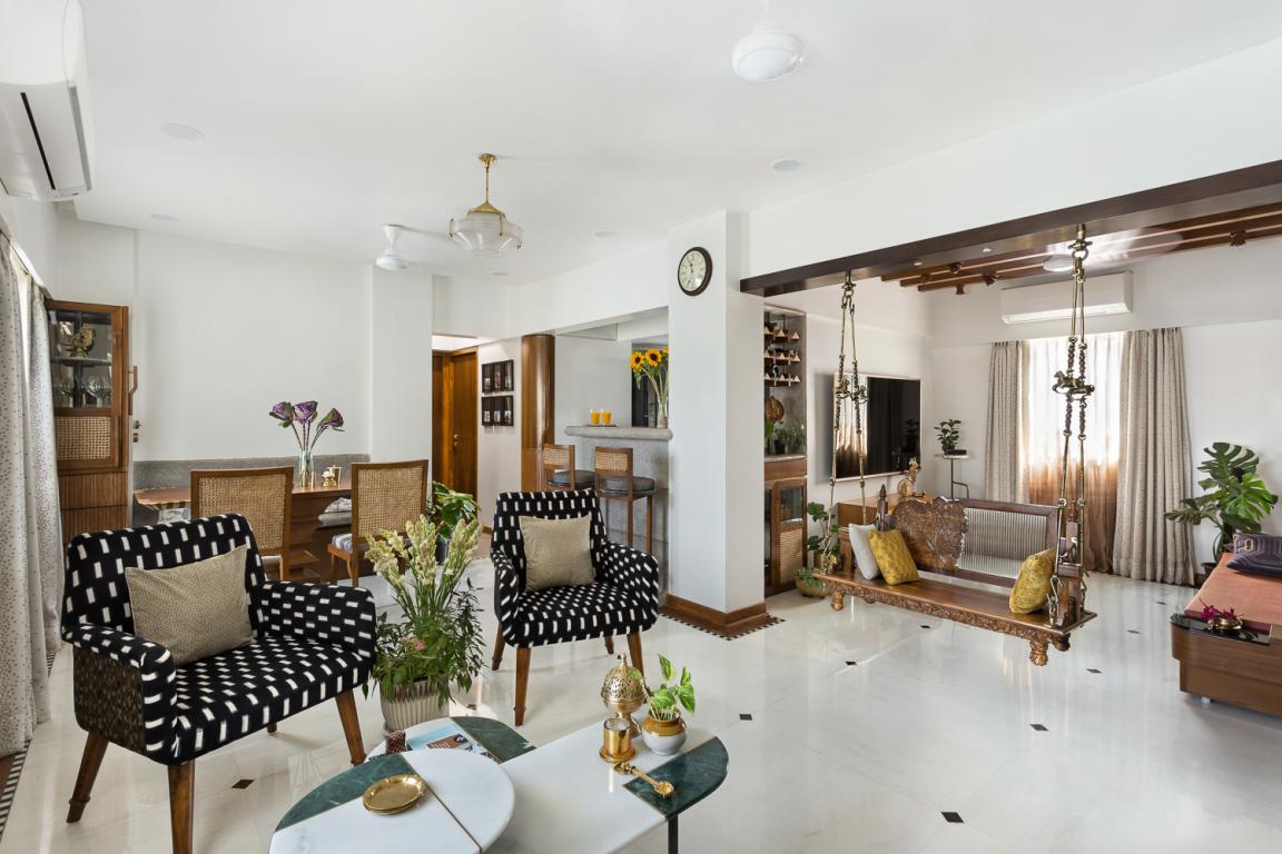
The walls are primarily white without excessive cladding that adds unnecessary weight and makes space look smaller. The furniture was essentially loose and designed on legs to reduce the unnecessary use of visual floor space.
Media Room
As each room had its function and characteristics, the wooden rafters in the media room celebrated life and its quirks.
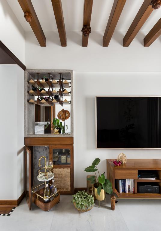 Given that the couple would end up unwinding, socialising and spending the most time here, the design team thought of incorporating this concept through the process of a blooming lotus.
Also Read: Drushti Architects Designed Warm And Charming Vastu-Compliant G+2 Residence in Aurangabad, Maharashtra
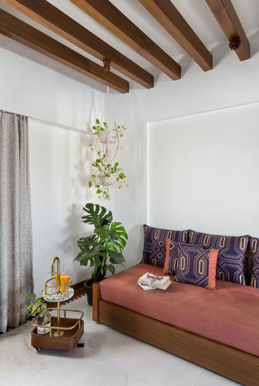
The Lotus was used as a metaphor to celebrating life through all its stages and people. Each phase of the lotus was hand-carved in restored Burma teakwood, right from a nascent bud to a full bloom lotus. Its incorporation in the ceiling reinforced the sense of aspiration attached to the idea of looking up towards something.
Kitchen
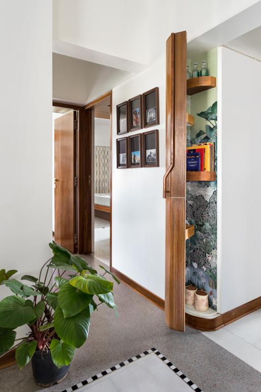
The design team looked at creating function for every nook and corner. The passage towards the bedrooms holds a tiny yet highly functional corner cabinet for the extra kitchen books, notes, tally diaries and supplies that need to be handy yet never find a designated spot in the house.
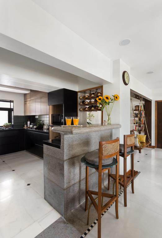 The idea of incorporating a wallpaper inside this cabinet made this functional gesture almost ornamental, an element of surprise.
Master Bedroom
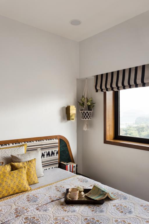
The bedrooms, like any other city home, were designed to be functional.
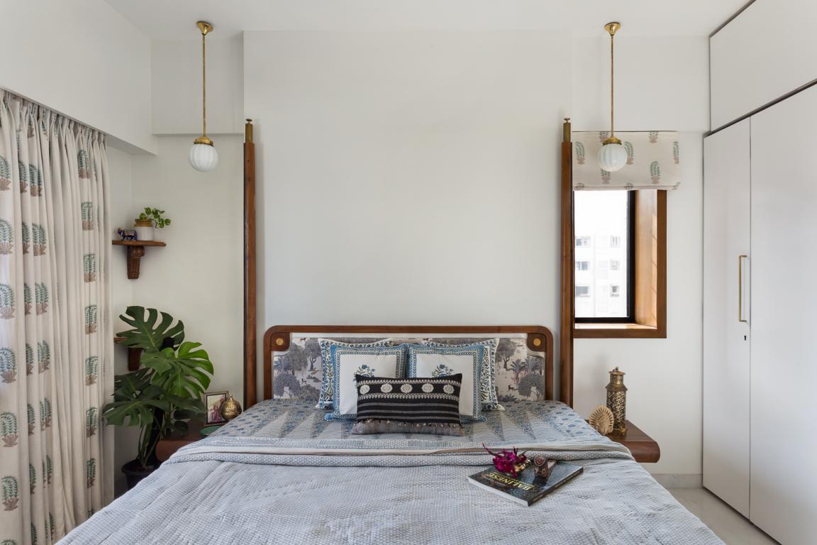
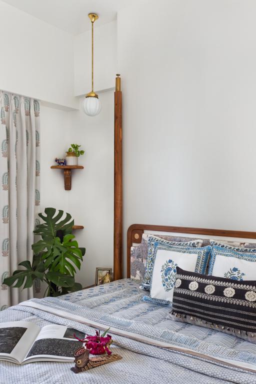
The design team added shelves that could hold collectables from travels and falling branches of money plants held in barni's purchased from Kumbharwada in Dharavi.
Guest bedroom
Apart from plants and fresh flowers, the design studio looked at greens coming in through materials as well.
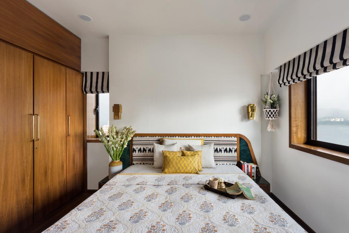 The bedside tables created with Baroda green marble add in just the right amount of colour to an otherwise monochrome room.
Material Palette
The material board was largely based on familiarity, nostalgia, warmth, comfort, attributes that extend to the idea of home they were creating.
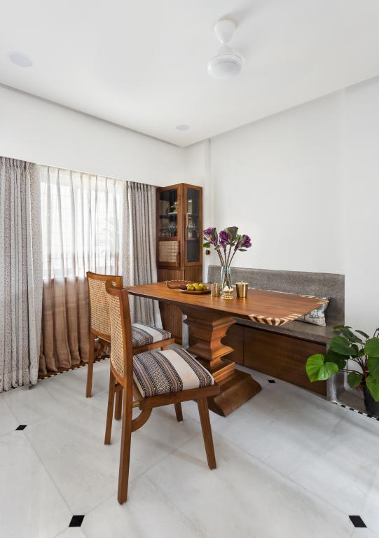
Teak wood, Indian marble, terrazzo, brass, and cane were the primary materials used. This, in turn, became the primary colour palette.
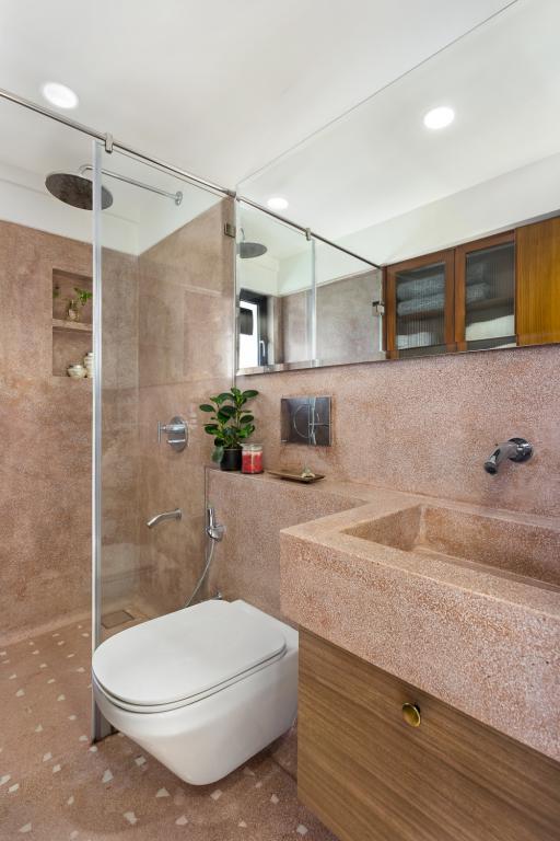 The overall tonality of the house is fairly muted, brightened with natural light through various parts of the day—the extensive experimentation with material that adds tones to an otherwise white palette.
About the Design Studio
Insitu is a Bombay based interior and space design studio thriving on the age-old idea of crafting in place. The studio takes on projects related to interior design, architecture, exhibition, furniture and objects tailor-made for the user, function and context.
Project Details
Client: Capt. Karan Gupta and Mrs. Sahiba Madan
Location: Powai, Mumbai
Year of Completion: 2019
Size: 1000 sq feet
Number of bedrooms and bathrooms: 3BHK (3 bedrooms & 2 bathrooms)
Designed by: Insitu by Kalakaari Haath
Type of Project: Residential Interiors
Photograph courtesy: Kunal Bhatia | Studio Kunal Bhatia
Other Products Used in the Project
Lights: Al-Aziz, Mutton Street
Paints: Asian Paints
Furnishings: Landmark Furnishing
Sofas: Insitu by Kalakaarihaath
Dining table: Insitu by Kalakaarihaath
Flooring tiles: Indian Marble
Rugs: N.A.
Furniture in living/family room: All furniture was custom made by Insitu by Kalakaarihaath
*Text and images are provided by the Insitu studio
Keep reading SURFACES REPORTER for more such articles and stories.
Join us in SOCIAL MEDIA to stay updated
SR FACEBOOK | SR LINKEDIN | SR INSTAGRAM | SR YOUTUBE
Further, Subscribe to our magazine | Sign Up for the FREE Surfaces Reporter Magazine Newsletter
Also, check out Surfaces Reporter’s encouraging, exciting and educational WEBINARS here.
You may also like to read about:
Neutral Hues and Clean Lines Adores the Interiors Of The Fluid Home, Mumbai | Quirk Studio
An Exuberant Use of Colours, Clean Lines and Linear Spaces Set the Tone of Blue Scoop Haus by DIG Architects
Corbusier and Jeanneret Influenced the Art, Furniture and Muted green interiors of Ash Abode | FADD Studio | Bengaluru
And more…