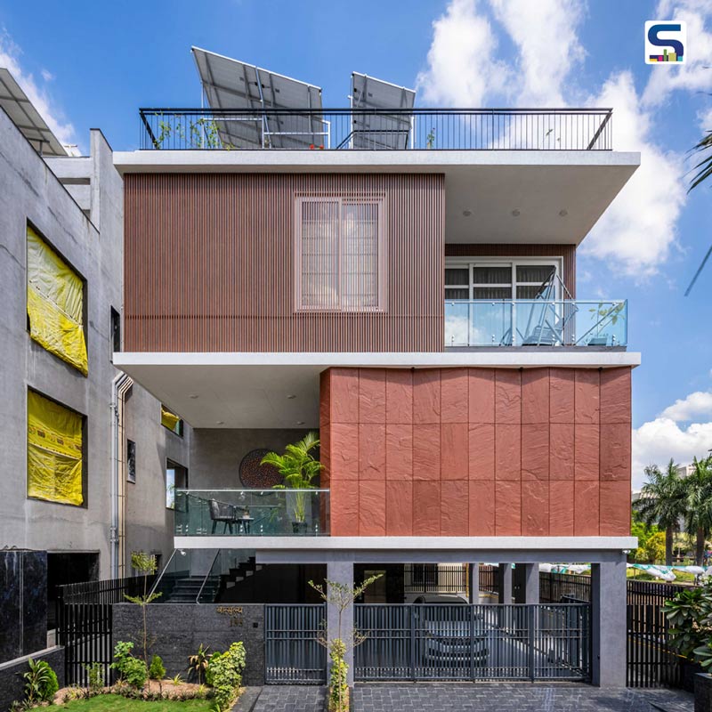
A box with a flat surface becomes four lines drawn in a painting. What is it called? A two-dimensional figure? All it takes is a change of vision and perspective to make a "CUBE", a three-dimensional figure. More or less addition of few angles, few vertices and few lines. Mayur Mangukiya and Ankit Sojitra of Studio 17 used this ideology while designing this stacked family residence 'Tritaya' in the diamond city-Surat, Gujarat. The house features a stack of cubes on both ends, giving a uniform poise of architecture language from the front side. The Surat-based architecture firm added depth into the breadth and length of the house to make it more dynamic. The indulgent play of materials in the exterior with beautifully placed Red Agra stone in the pattern of short and sharp turns gives it a zig-zag look, breaking its own straightness. The design team at Studio 17 has shared detailed information about the project with SURFACES REPORTER (SR). Have a good read:
Also Read: Srijit Srinivas Gives The Form of Platonic Cubes To This House, Set In A Small, Three Cent Plot of Land | Ruby’s Cube |Trivandrum city
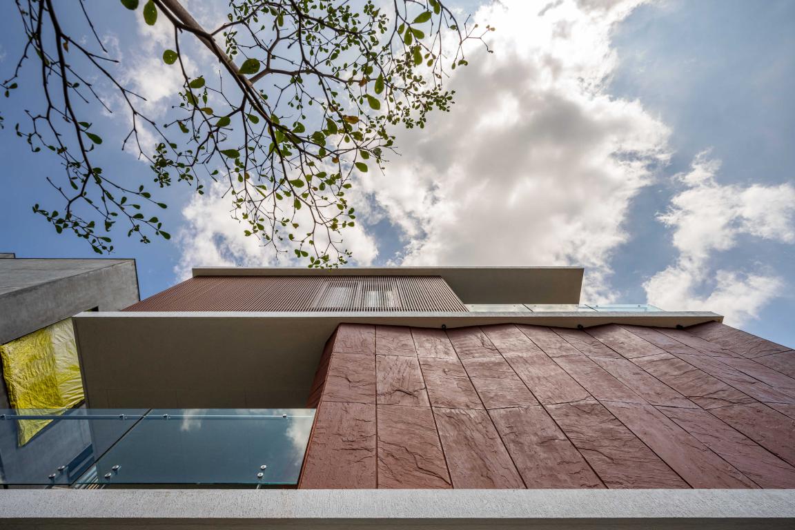
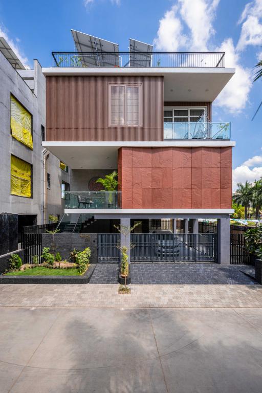
Situated in Surat, Tritaya house is characterised by the stacked cubes on its both ends. If we talk about the materials, the firm used Red Agra stone on the exterior of a cube. The play of levels is distinguished by the change of materials . The design team incorporated aluminium fringes that subtitling the look of Red Agra and adding privacy to an individual.
"We had an ideology of creating a woodland on its own but by bringing out the three dimensions of each material", said the principal designers, Mayur Mangukiya and Ankit Sojitra.There are ample materials to bring the lines out of a plane. Making it three-dimensional throws an impact of design to this world.
A forest is always bustled with trees, with its hard surface and textured ground substantial tree trunks in the elevation and splash of white colour in the sky. This house is the twisted form of forest with its dark flooring, dyed veneer in the elevation and use of natural white stone.
First Floor
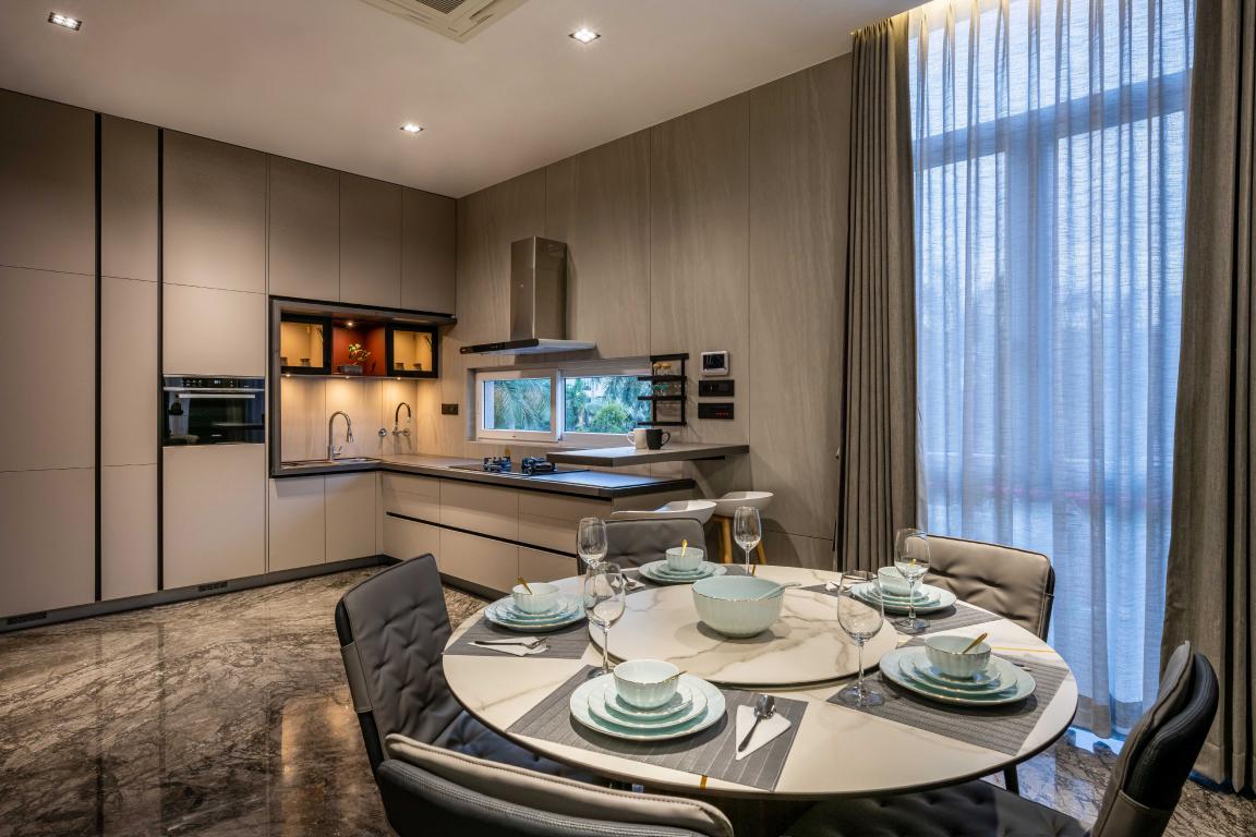
First floor is an area of the home where a person spends quality time whether by watching TV, or working in the kitchen or having their everyday meal. So, the designers made it practical, comfortable and soothing for the dwellers.
An entrance leading to the private home is flanked by amazing foliage of landscape done on the sides of the main gate.
As you move forward to the upper floor, the first thing that comes into visualization is the nicely settled foyer and few here-and-there seating with a nice curio placed on the wall.
This artwork gives a warm feeling of sparks indulging in a forest. The spooky orange colour enlightens the dead grey texture wall.
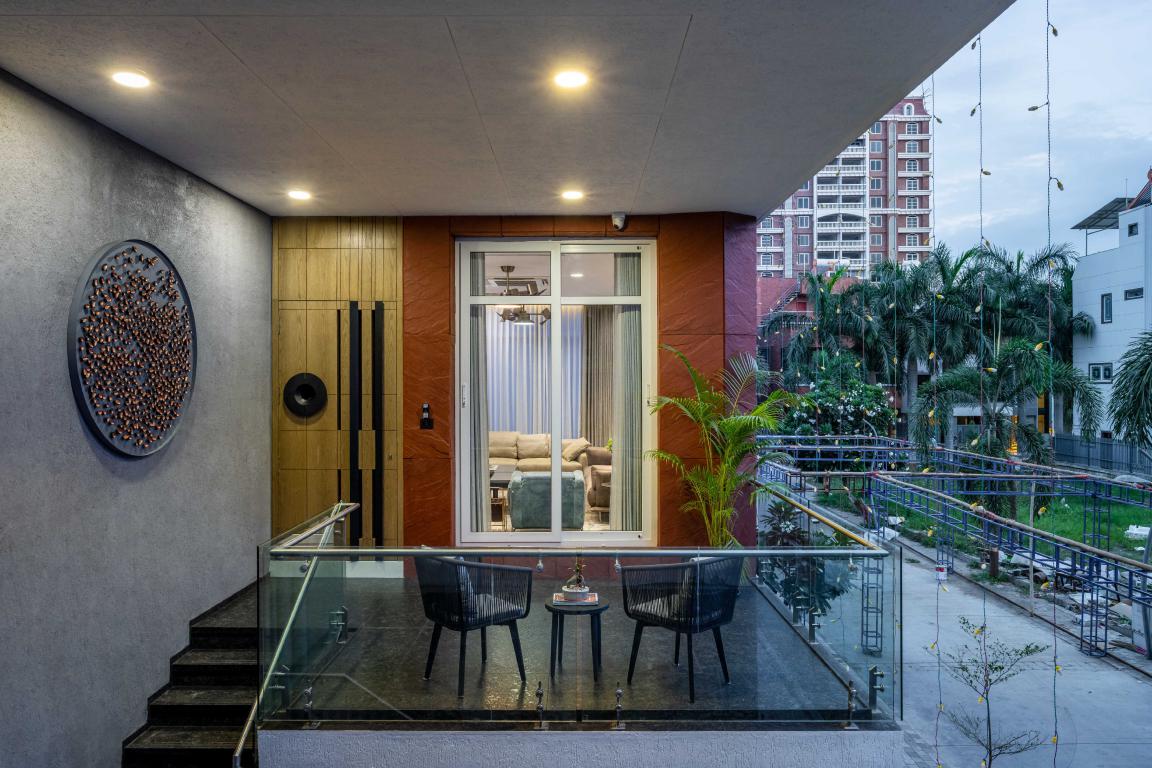
Reciprocating the circular shape of artwork, the amazingly crafted circular handle made by black coated metal brings out the simplicity of the door.
Living Area
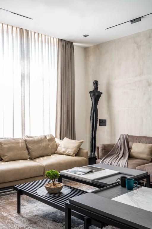
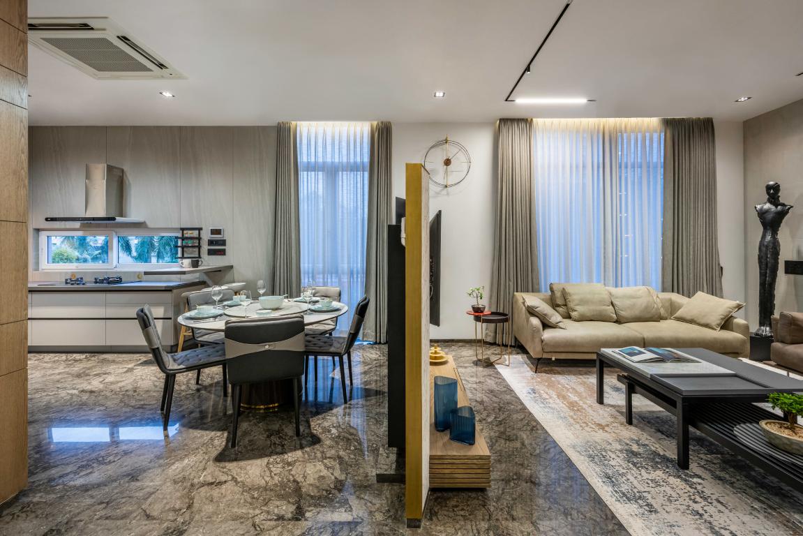
Stepping past the door into the living room divides the box into two with the free-standing TV unit. The spread of golden veins with its dark and powerful brown colour is what we call a great William grey stone flooring.
.png)
The Living room is very subtle, with its plain textured wall and beige sofa bringing out the flooring. The TV unit is amazingly made of white stone with its essence of zig-zag play.
Also Read: T House: Minimal Interiors with a Sense of Sustainability | Kalpak Shah | Studio Course | Pune
Whether its kitchen or connected dining room everything is bounded around the concept of tritaya.
 Second Floor
Second floor consists of all the private space where inhabitants rest and feel relieve. It provides a silent and calming atmosphere.
Bedrooms
Escalating to the upper floor brings out three bedrooms with their own uniqueness in the design.
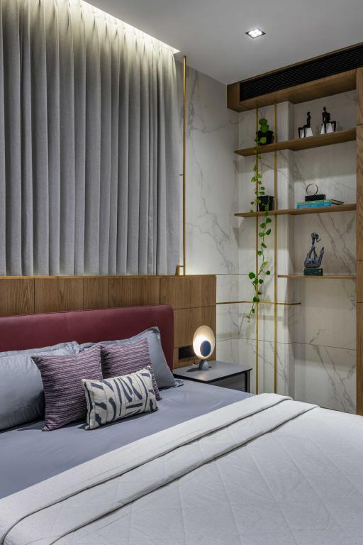
Starting anti-clockwise from the left bedroom, the bed back has stained ash dyed veneer and a continuous line of brass rod cutting the corner edge out from the bedroom and creating small storage for beautiful artefacts.
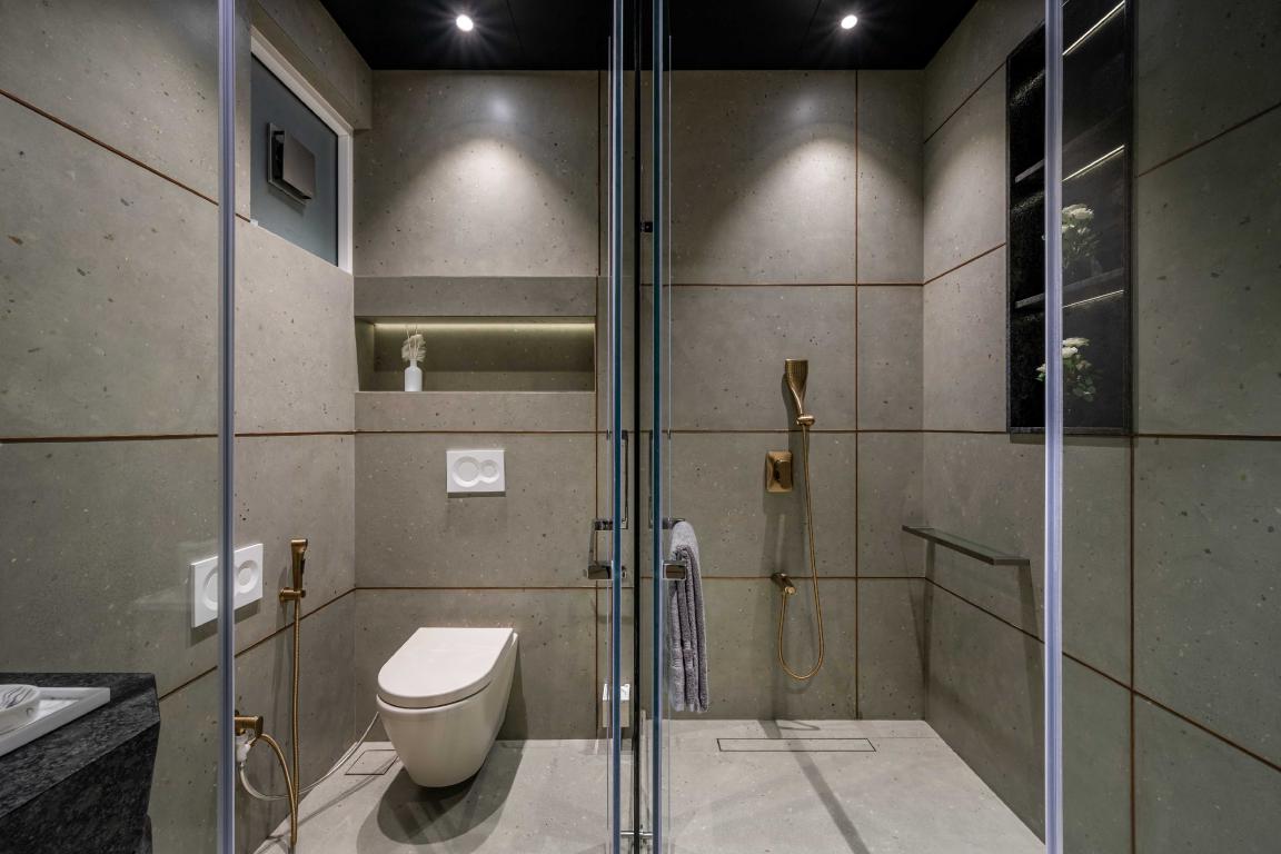
Moving forward to the centre room, the eye-catchy white marble used in the bed back containing tints of grey veins with the interplay of brass and green colour palette is what makes it silent yet powerful.
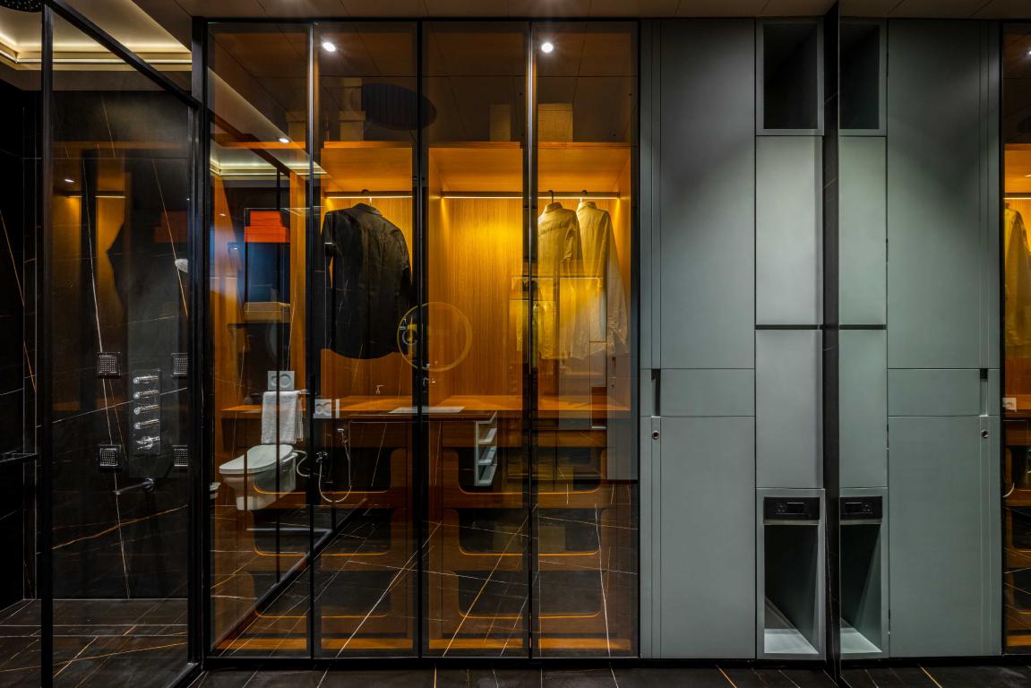 As it was said earlier, exploring material is what the firm was looking for. So, giving a touch to embossed lines in a repeated manner really breaks the stone's plain surface, making it more sluggish.
Also Read: A Peaceful "Veranda on a Roof "With A Library, Pantry and a Terrace in Pune | Studio Course
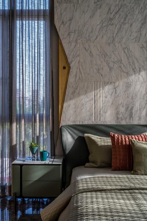
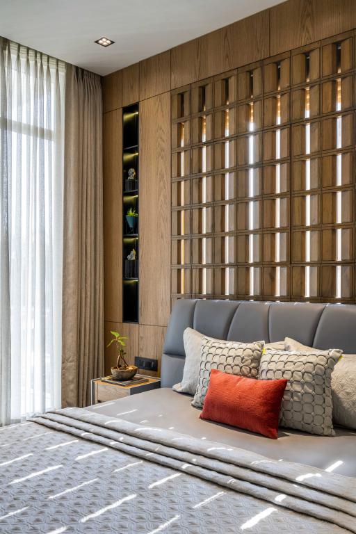
The last bedroom on the floor is interconnected with the main bedroom through the balcony.
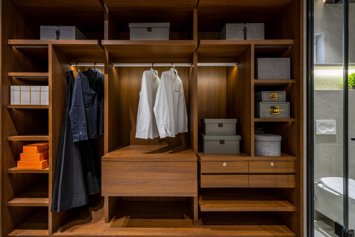 The screening design is captivated so that a small ray of sunshine is always present in the room, bringing a positive synergy in it.
Terrace
The terrace floor containing a bedroom and half terrace completes the bungalow to the fullest. It is a nicely setteled open terrace for arranging any nice get-together or barbecue party.
Project Details
Project Name: Tritaya
Location: Surat, Gujarat, India
Principal Designer: Mayur Mangukiya and Ankit Sojitra
Designer Team: Dhruvik Panwala, Radhika Savani , Shivani Maiyani, Uttam Chauhan, Mohit Dungrani, Rupesh Koshiya, Dipesh Vala
Total built-up Area: 4631.334 sq.ft
Photo Courtesy: Noaidwin Studio | Nilkanth Bharucha
About the Firm
Studio17 was co-founded by Mayur Mangukiya and Ankit Sojitra in 2017. The Studio is a blend of dedicated talent, creative hunger & special human beings, a multidisciplinary tribe of dreamers driven by their creative. The practice always imagines smart concepts and craft rich visuals to build innovative and impactful Space experiences for the clients.
Keep reading SURFACES REPORTER for more such articles and stories.
Join us in SOCIAL MEDIA to stay updated
SR FACEBOOK | SR LINKEDIN | SR INSTAGRAM | SR YOUTUBE
Further, Subscribe to our magazine | Sign Up for the FREE Surfaces Reporter Magazine Newsletter
Also, check out Surfaces Reporter’s encouraging, exciting and educational WEBINARS here.
You may also like to read about:
This Adaptable Office Space Consists of Many Activities To Keep Employees Active | Studio 17 | Coruscate IT Office
KDND Studio Stacks the Volumes to Design The Shift House | Maharashtra | Surfaces Reporter
Light Filgree Like Wooden Screens Characterize House of Voids Designed by Between Spaces
And more…