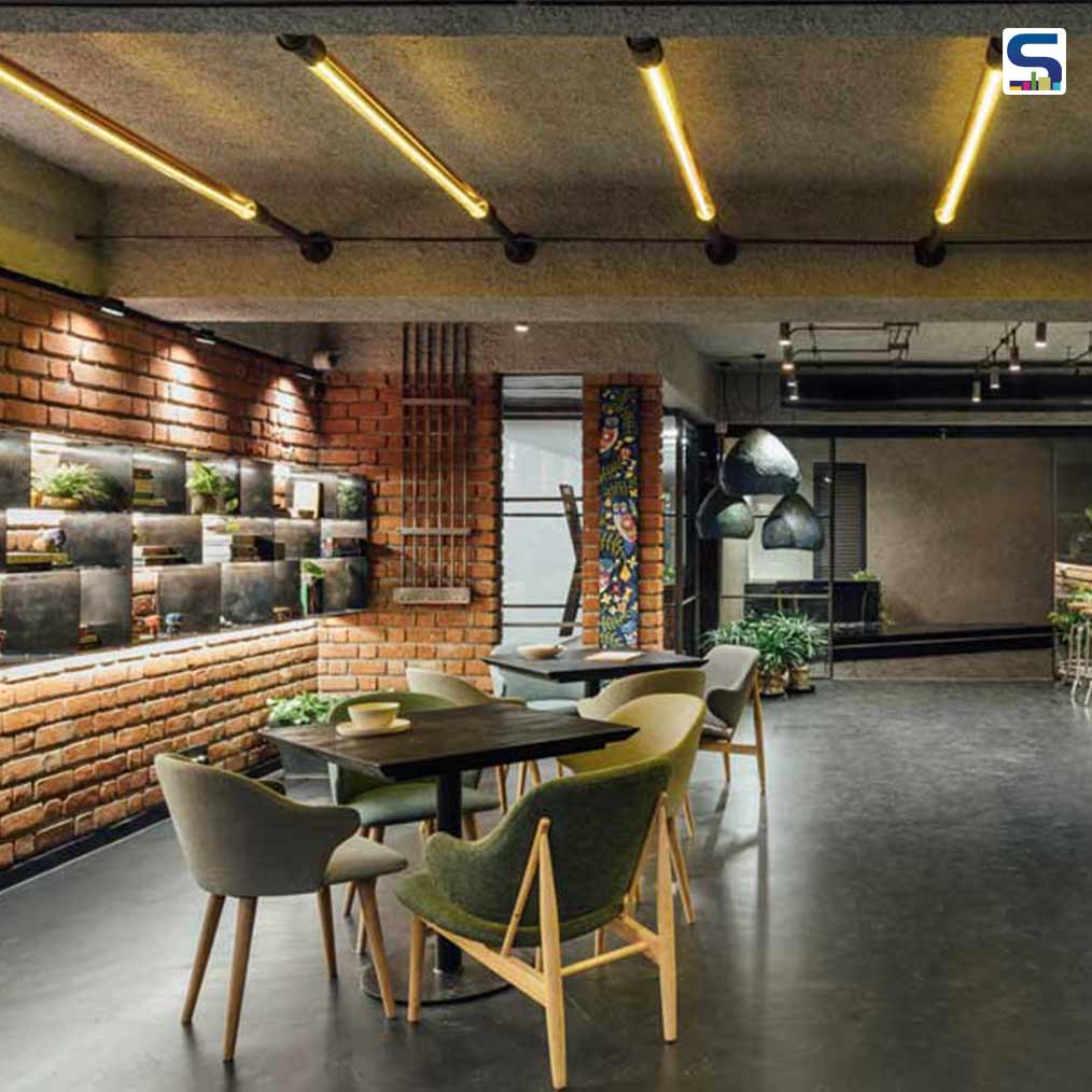
Imagined at a crossroads between a place to relish artisanal coffee and one to savour good design – Modernist Coffee, as the name suggests, is a raw, modern approach to coffee culture designed by Harsh Boghani of The Crossboundaries. The firm envisioned and designed a large, open plan for the cafe and used exposed brick and custom-made light fixtures to make it apt for co-working and gathering and art displays. A spacious 1350 sq. ft space, punctuated with 900 sq. ft of lush terrace gardens in a high-rise building, this coffeehouse-cum-art gallery is tucked away from the city, open for exploration. The coffee house showcases several eye-catching features, including sculptural installations, sustainable custom-designed light fittings, stylish high-bar stools, eclectic furniture, and much more. The design team has shared detailed info about the project with SURFACES REPORTER (SR). Scroll down to read:
Also Read: Various Associates Lines C2 Cafe & Bar With Wooden Cladding To Emulate A Cabin | Shenzhen | China
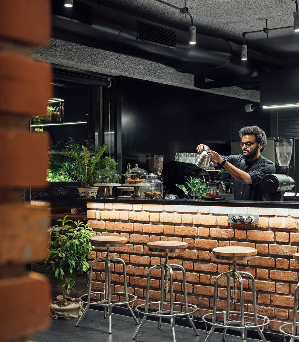
A cup of fine Cortado perched on a sleek bar, awash with a special light—warm hot chocolate at sunset from the terrace ledge. Rich aromas are made deeper by the texture of brick walls. These are visuals from the many moods of the new Modernist café, designed by The Crossboundaries studio.
Room for Flexibility
As typologies of cafés becoming more than just an eatery and transforming into art galleries, co-working and gathering spaces develop around the world – the design of Modernist Coffee cleverly unites various concepts.
Using the brand’s idea of ‘Spaces, People and Coffee’ to intermingle and flow into each other, the café floor is conceived as a large open plan, with room for layout flexibility.
The Earthiness of Exposed Brick Walls
The rawness of exposed brick, specially designed lighting pieces, and framed views of the sky are the first impressions of this space- with aromas of coffee wafting in the background.
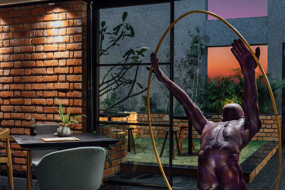
As a signature statement of The Crossboundaries, a sculptural installation awaits at the entrance of the café. Sculpted with raw jute, and carved wooden beads in the form of spilling coffee beans, this custom-made art piece immediately gives a sense of arrival at a temple of coffee!
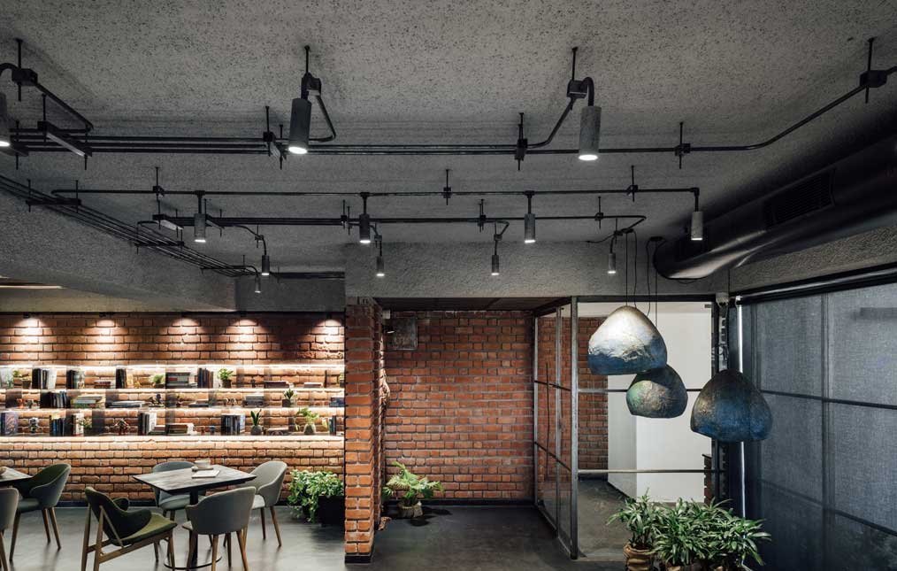
Within the café space, the seating areas, bar and open kitchen area, and terrace areas are arranged for an effortless flow of beverages and people during times of large gatherings. The spacious bar counter, with an open kitchen or preparation area behind it, is clearly visible upon entering.
Also Read: Broken Ceramic Tiles and Terrazzo Flooring Decorates This Cafe Designed by Dubai-based Roar Studio
Cladded with brickwork and a jet-black granite counter, the bar is an imposing piece in the space. It immediately anchors the visitor within the space, under a floating storage unit overhead.
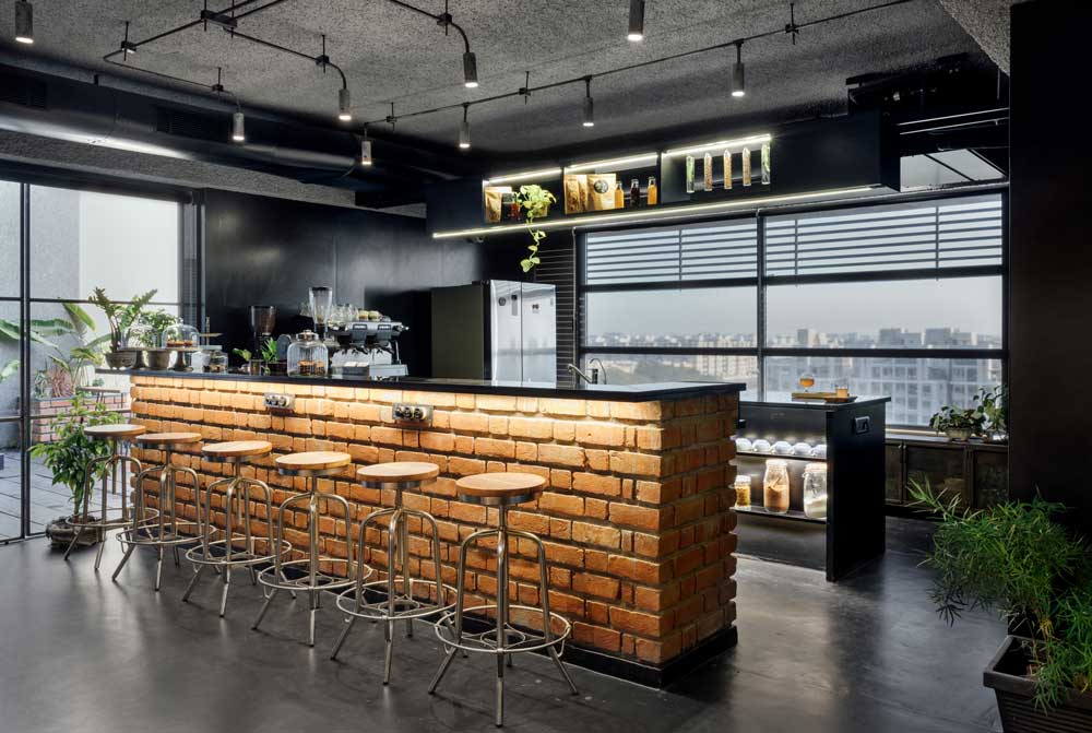 An array of elegant high-bar stools make for easy seating at the bar counter, behind which lies a service island for quick food preparation. The idea of a transparent kitchen and service space stems from the concept of the café brand, which believes in an osmotic customer-barista relationship.
Eclectic Furniture
A unique feature of this café is the furniture selection, which forms a physical catalog of the eclectic furniture brand, Olivi. Stools, café tables, high chairs, and loose furniture are part of the furniture brand’s display.
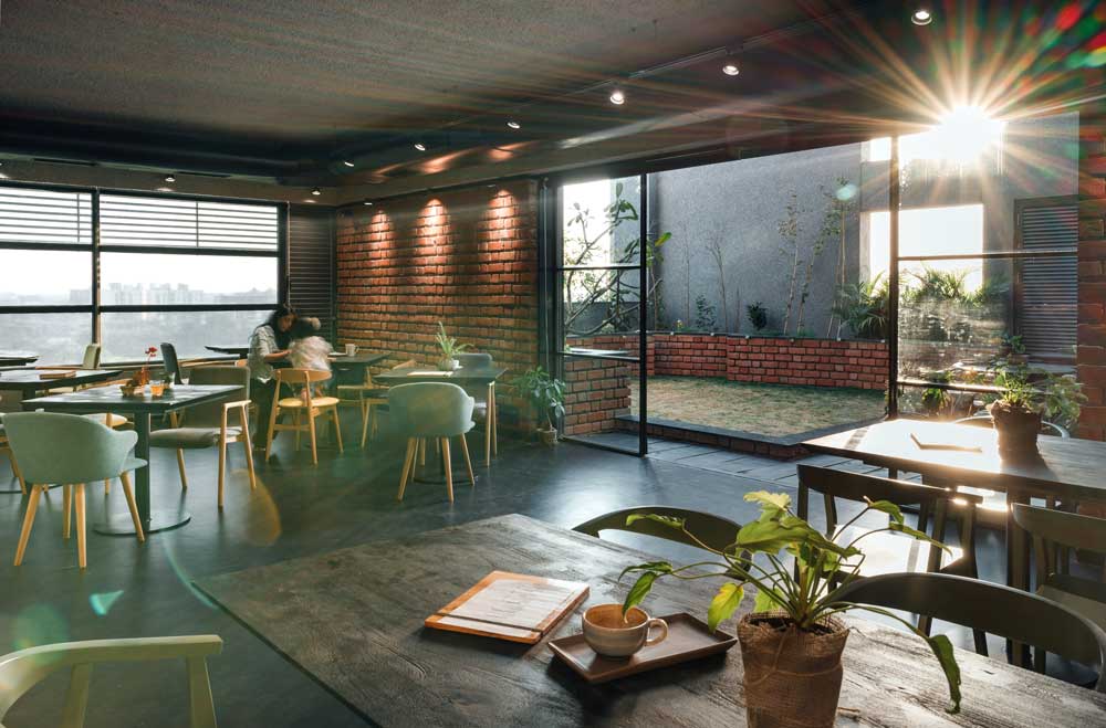 Sleek and stackable chairs, deep couches, and tables with a burnt black wood-finished top all become part of the ensemble to both use and purchase!
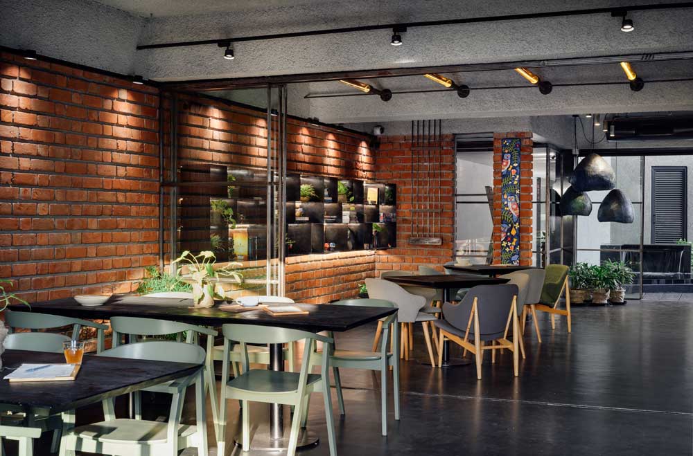
The role of furniture in this café goes beyond fulfilling the needs of seating and storage. As required, furniture and interior objects become space creators, which, when removed or rearranged, create different types of spaces within the café.
An Intimate Art Gallery
Sometimes a regular café evening can be transformed into an intimate art gathering by removing and rearranging furniture pieces. An art exhibition can flow into a night of music and performances, spilling over onto the terraces and lounges, as several cups of coffee are brewed!
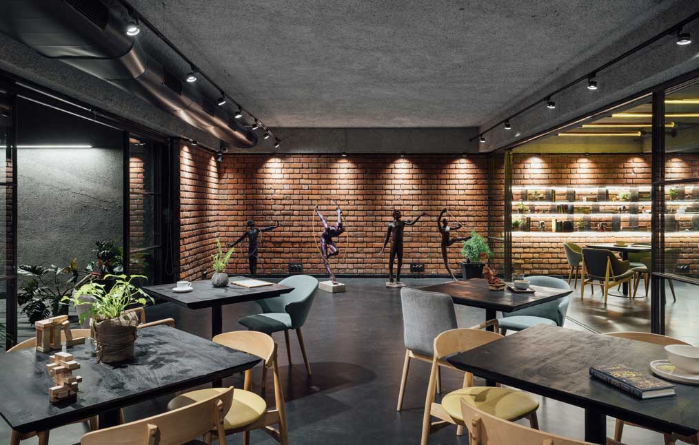
Low- maintenance and sleek metal plates arranged horizontally along with the wall act as shelves to display books, board games and assorted objects. Sprinkled with greens, the bookshelf spanning the length of the wall becomes the perfect backdrop as a quiet space for a book lover!
Modular and Lightweight Partitions
The designers have attempted to make these transitions as seamless as possible with the use of a lightweight and delicate system of partitions. The vertical partitions were designed to impart maximum transparency through the 8mm clear glass panels, housed in a thin MS flat section.
Also Read: Concrete Drapes Tumble Down to Form Organic Seats in the Tease Me Cafe
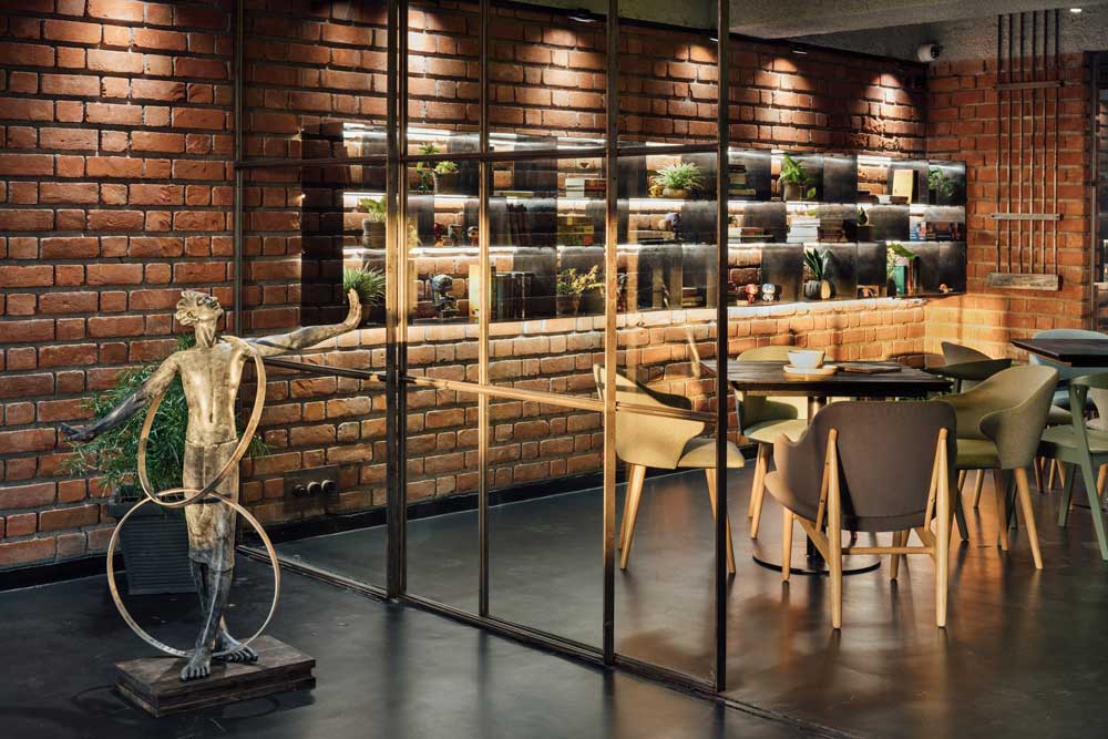
Running on a thin channel, the glass screens are almost non-existent while allowing for privacy and acoustic cut-off when needed. As homage to the industrial quality of the café’s ethos, the main entrance door, again uses similar language as the internal partitions. Nonetheless, as a dash of dramatic playfulness, the main door swings open with the help of a suspension system, counterbalanced on a pulley!
A Soft, Warm glow in the Interiors
Enveloped by the rugged texture of brick-cladded walls, the café seating space is cast in a warm, subtle glow when all the partitions are open.
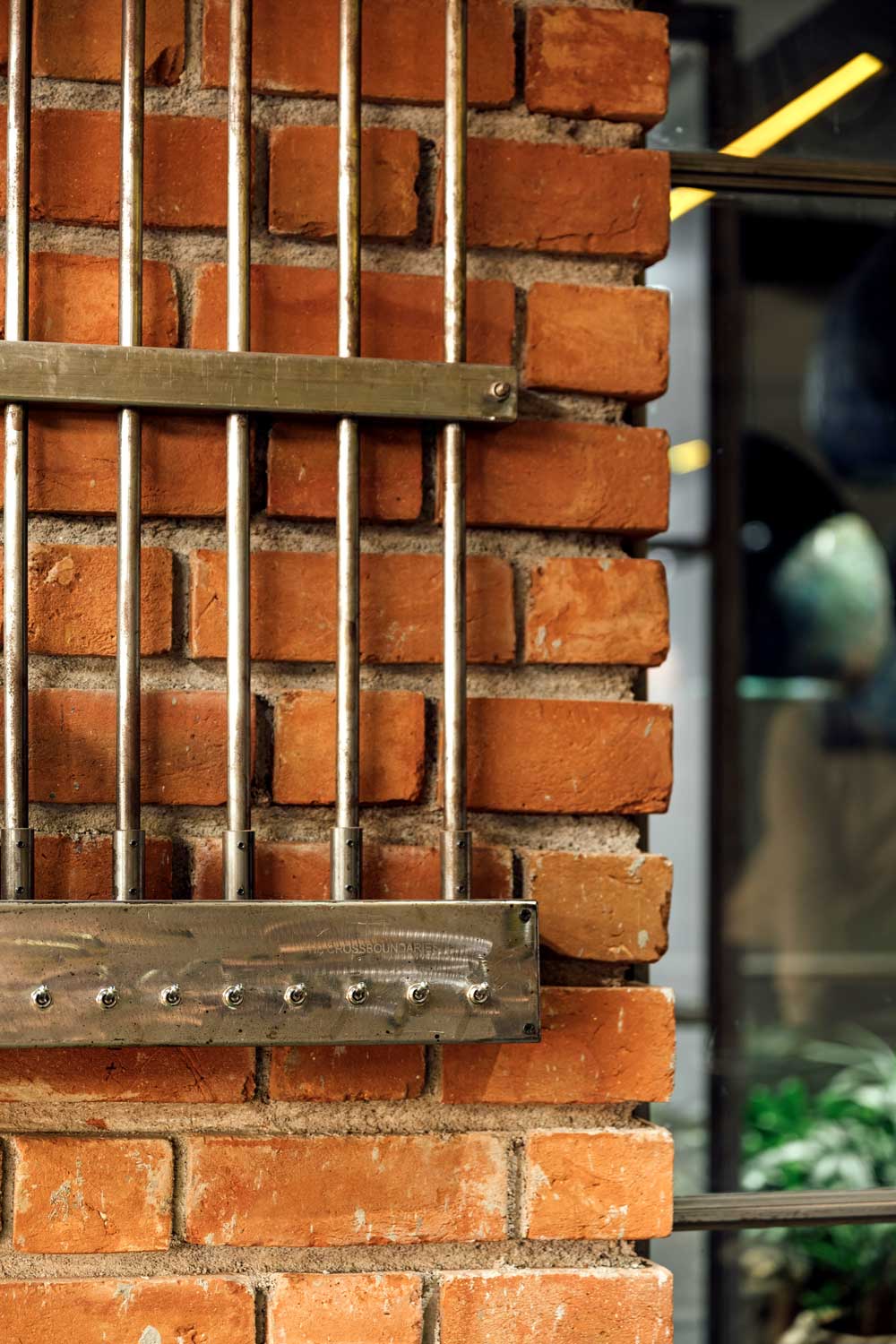
The ingenuity of the designers lies in using cut-bricks along the stretcher course on vertical surfaces, with deep grooves or distinct ‘pointing’ This arrangement of brickwork creates layers of shadows, overlapping with the sheen of the flooring.
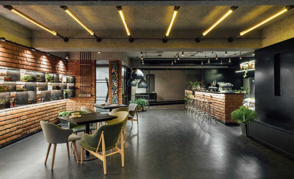
The flooring is a seamless expanse of graphite pigmented-microcrete, a material that softens the gaze and brings shallow reflections of light across the surface. The fairly smooth flooring is a contrast to the rather raw and textured finish of the ceiling, in stippled dana plaster. In tandem with contrasting smooth and raw finishes, the main service core, which holds the pantry, ducts, customer restrooms and storage, has been cladded in matt-black ACP sheets. This “black box” tucks away all wet and dry services and is visible yet invisible to the workings of the café.
Custom-Designed Lighting System
An important feature of the café’s experience is the carefully designed and selected lighting.
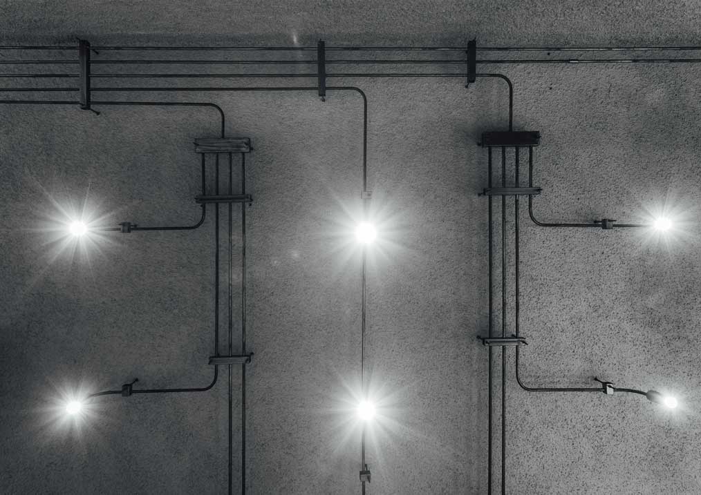 As part of The Crossboundaries’ quest for innovation and invention with new products, the overall lighting system is a custom-designed, calculated grid. Running across the ceiling and along the beams, an array of bent-GI pipes, grouped equidistantly and fluidly ending at different lengths.
The pipes terminate in a bent curve, with a cylindrical spot-light fixture at its end. The radius of each curve has been carefully calculated and executed in place, to precisely illuminate a spot. In order to specially demarcate an area in one of the seating galleries, a row of track lights run parallel to two beams, leaving the central ceiling area untouched.
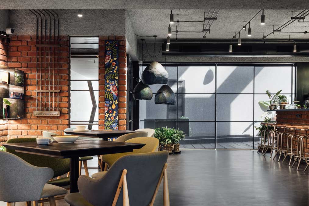 This throws diffused light in a space that is intended for multiple use, especially as a makeshift art gallery showcasing eclectic artwork.
Light Fixtures or a Work of Art?
Apart from designing lights to highlight artwork, some light fixtures themselves have been designed as a work of art! The central bay's linear lights spanning between beams are uniquely fashioned out of brown medicine bottles and metal sheeting.
This gives a brown-yellow gentle glow to the space. As part of their in-house innovation and experimentation process, this lighting product, named “Cyclotron” by the designers, is a one-of-its-kind, as it uses special industrial materials, and is made to order.
Eco-Friendly Lights
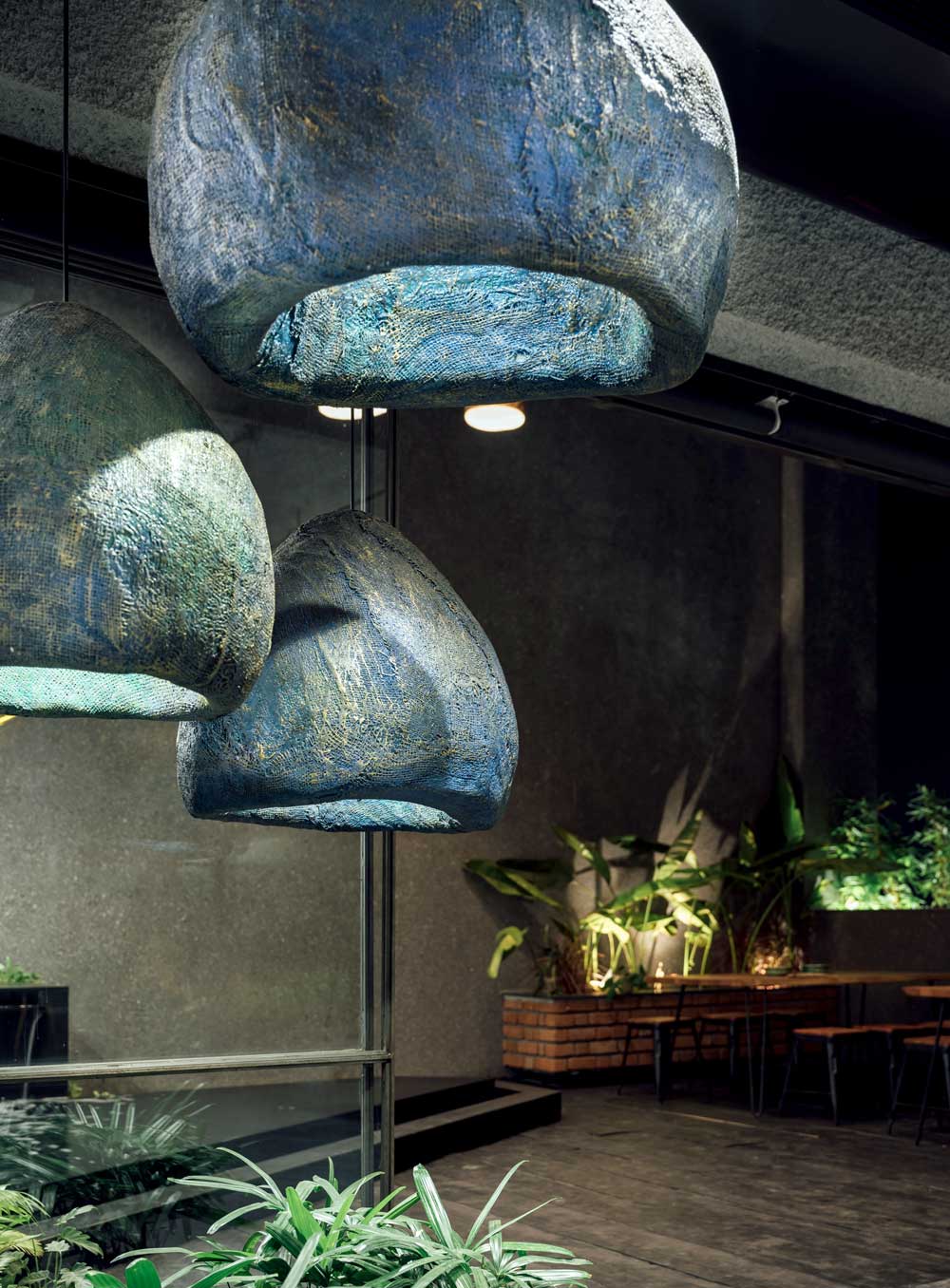
Some more feature lights to accentuate the mood have been custom-designed in jute and fibre. Colored in mellow blues and rust, the large, suspended jute lights go well with young plants. An array of 9 jute lights can also be seen, gently reflected in the infinity pool created on the left terrace.
Also Read: This Newest Offline Cafe in Lucknow has lively colours, bold graffiti, and selfie corners for millennials | Intaglio Design Studio
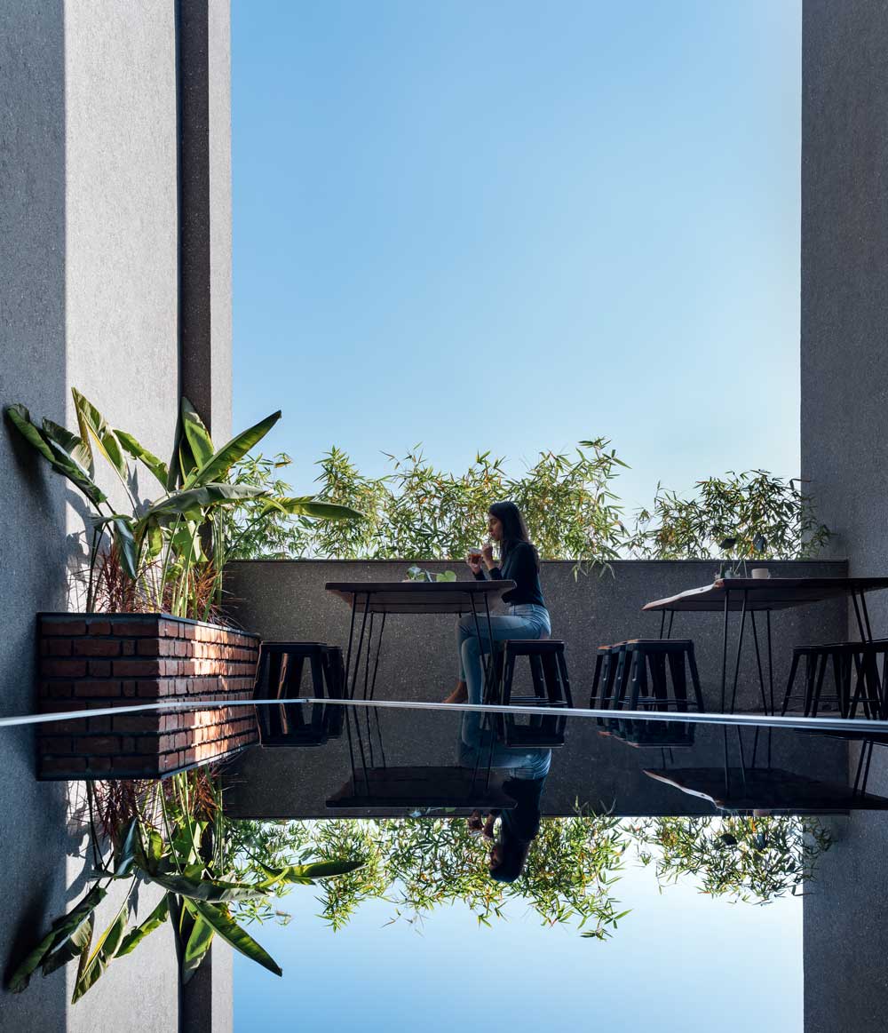
As the eye travels across the matt blackish café floor towards the glow of the terrace beyond, the sky is reflected in the infinity pool, sometimes with glimpses of birds and greens. This calm, meditative space was designed in the double-height volume and is finished in hand-picked black granite surfaces.
Terrace - The Tranquil Place for a Cup of Coffee
As a contrast to the other spill-out terrace, which is occupied with angular parapets and planters, this terrace is one for a quiet cup of coffee, perched on the high tables.
However, the terrace at the other end of the café is an open air outdoor performance and gathering area, as nuanced by the angularity of its parapets. These brick-clad parapets act as informal steps to an impromptu amphitheater, or just a cosy nook for a cup of coffee! 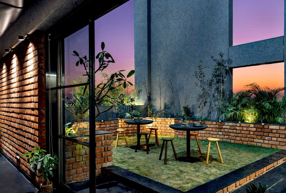
With abundant greens sprinkled around this place, this café is a tribute to fresh, natural experiences and the finesse of raw, contrasting materials and textures!
Project Details
Project Name: Modernist Coffee
Project Architect: The Crossboundaries
Size: 2250 sq.ft
Location: Vadodara, Gujarat, India
Design Team: Forum Jariwala, Vijay Dhabi, Neel Patel, Rishabh Prajapati, Khushboo Gunjal, Nidhi Vyas, Dhruv Prajapati, Pooshan Mahajan, Akshay Mer, Shailesh Boghani & Harsh Boghani
Art work: Abir Chakroborty & Ashish Chakroborty
Client: Dhaval Mehta & Nishar Diwan
Photography: Ishita Sitwala ( IshiFishy)
Text: Niharika Joshi
*Text and images have been provided by the architects
Keep reading SURFACES REPORTER for more such articles and stories.
Join us in SOCIAL MEDIA to stay updated
SR FACEBOOK | SR LINKEDIN | SR INSTAGRAM | SR YOUTUBE
Further, Subscribe to our magazine | Sign Up for the FREE Surfaces Reporter Magazine Newsletter
Also, check out Surfaces Reporter’s encouraging, exciting and educational WEBINARS here.
You may also like to read about:
Rahul Jain Designed Infinity-Shaped Cafe by Using Recycled Shipping Containers | RJDL
Grandeur Achieved From Common Materials | Tea Villa Cafe | Mitesh Antala | Janki & Parth Hakani | Rajkot
And more…