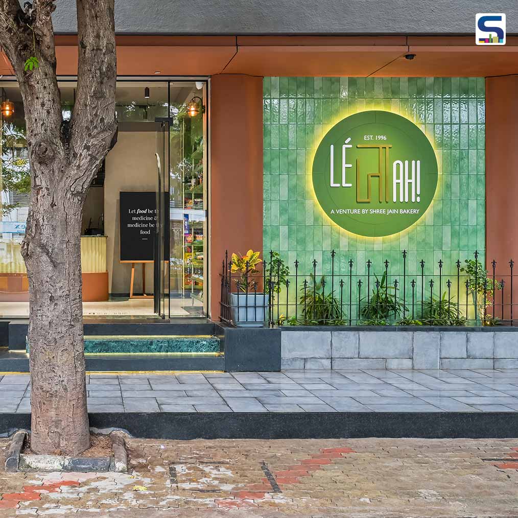
Mayur Mangukiya and Ankit Sojitra of Studio 17 have given a contemporary touch to an old bakery store, established in 1996, in Surat, Gujarat. The duo developed a simple design concept that features green tones, black granite surfaces, and terrazzo green chips flooring, complemented by plenty of natural light. “ For us Green was our happy color, supporting nature and keeping us healthy just the way our client wants to keep their customers healthy resulting in the usage of green shades all around," says Mayur Mangukiya. Although the budget and time constraints were there, the designers ensured that it will not get in the way. “ Tight Budget was nothing but an asset to NOT restrict ourselves with material and explore more,” Says Ankit Sojitra. SURFACES REPORTER (SR) received more information about the project from them. Take a look:
Also Read: Apples New Store Apple Al Maryah Island In Abu Dhabi Features Some Stunning Design Elements
 The Client has had its bakery since 1996 providing their solitude to the customer and making them happy. It came to the designers to expand which is right next to the existing bakery. "We took this as an opportunity to serve our client with nothing but goodness just the way they do to their customers, expresses Ankit Sojitra. With their creative and innovative thinking, the design team has created a green, airy, and well-lit store.
Developing Brand Identity
It all started with a basic step of developing their brand identity from “ Shree Jain Bakery” to “Le-Jaah” which depicts a simple act of coming and grabbing your food.
"Lejaah was our budget-friendly project which came with its own challenge of a tight budget and extremely short time limit to complete it" quotes the designers' duo.
Eye-Catching Exterior
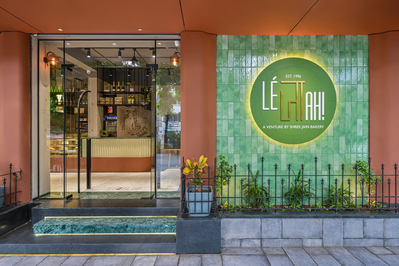
The Exterior has its own beauty gifted from the site as there are three levels before opening the door of Lejaah which was identified swiftly. It follows with the road level than the Footpath ( Walking Path ) level then our pavement block level which is nicely designed with different sizes of concrete tile.
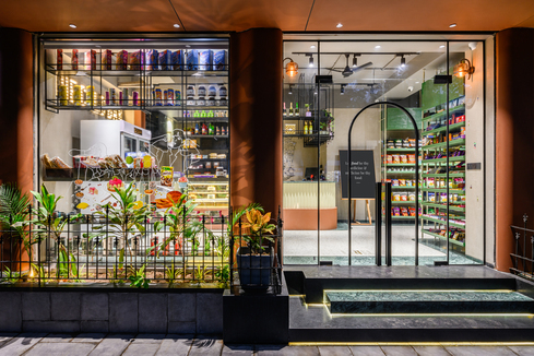 It’s a juggle up of tile placement and lastly our bakery level. The Steps are materialized with the combination of green tone and black granite to bring out its boldness of it.
Boarding- The Focal Point
The Center of attraction was the wall holding up the boarding of Lejaah made out of the metal plate and letters with the finish of brass."
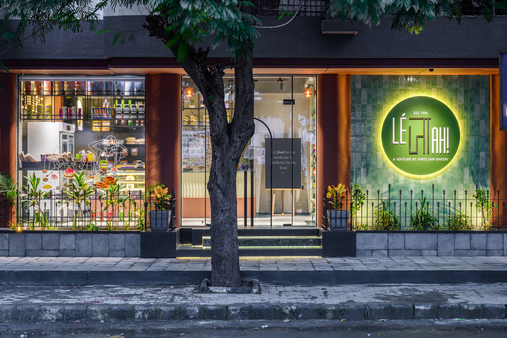 The back of the boarding is covered up with the budget-friendly cladding of subway tiles along with the brick red ACP (Aluminum Composite Panel) Sheet to enhance the elevation and solve the technicality of smuggling the rolling shutter machine in it.
Also Read: Colonial Style Dominates The Interiors of This Flagship Store in Hyderabad Designed by Crafted Spaces
Flooring That Will Leave You Floored
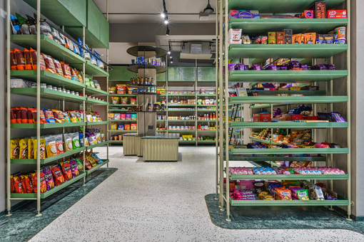
As it was mentioned earlier the doors of Lejaah come after crossing three different levels. Moving forward the bakery is covered with the amazing flooring of terrazzo green chips mixed up with white concrete along with the green stone which details out every piece of furniture/ rack placed.
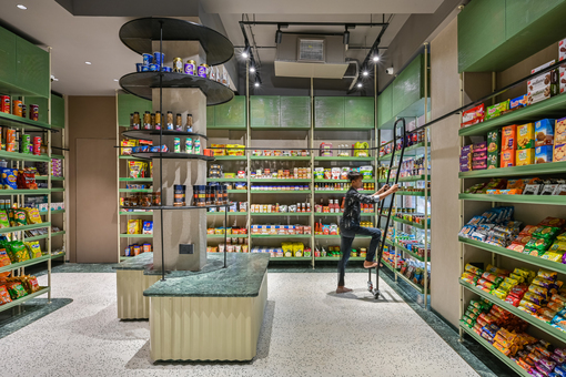 There is an Inlay of Text “Level up" implemented in the flooring as soon as you enter inside conveying a message that “you are finally here and we welcome you with open hands”.
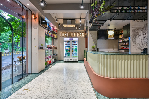 Right after there is an open counter/ Cash counter placed into “ L” with an amazing overhead metal rack. The Material palette was controlled by using the same greenstone and ACP sheet along with a nice zig-zag metal sheet which has been powder coated with pastel green color to break the simplicity of the counter.
Partitioning of Racking Area
The Racking System or the purchasing area was kept secluded towards the right side after a wide opening to avoid the clustering of customers. Each rack is of the same size and same detail to keep it a more subtle look. The rack is of again a metal rod and perforated sheets on the overhead storage for some venting purpose. These racks can easily get dismantled (If needed) and are smooth enough to get cleaned easily. There is a square metal pipe passing through all over the rack for the easy movement of the customized ladder all over the bakery.
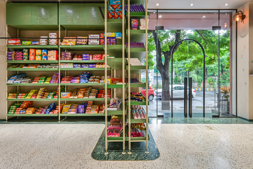 The circulation is getting a break by the center element placed having around the structure member acting up as a display for imported items.
Graphical representation has its equal share all around the bakery. From Miniature size humans drawn on the column to the 5 feet human drawn in the back of the cash counter which is the replica of the client working in his old bakery.
Project Details
Project Name: Lejaah
Principal Designer: Mayur Mangukiya and Ankit Sojitra
Architecture Firm: Studio 17
Project Area: Total built-up Area- 676.45 Sq.FT, 62.84 Square meter
Location: Surat, Gujarat, India
Photo Credit: Noaidwin Studio | Nilkanth Bharucha
About the Firm
Studio17 was co-founded by Mayur Mangukiya and Ankit Sojitra in 2017. Our Studio is a blend of dedicated talent, creative hunger & special human beings, a multidisciplinary tribe of dreamers driven by their creativity. The firm always imagines smart concepts and crafts rich visuals to build innovative and impactful Space experiences that aim to our Client in wonderment.
Keep reading SURFACES REPORTER for more such articles and stories.
Join us in SOCIAL MEDIA to stay updated
SR FACEBOOK | SR LINKEDIN | SR INSTAGRAM | SR YOUTUBE
Further, Subscribe to our magazine | Sign Up for the FREE Surfaces Reporter Magazine Newsletter
Also, check out Surfaces Reporter’s
encouraging, exciting and educational WEBINARS here.
You may also like to read about:
Deearth Architects Blends Art, Design and Experiential Spaces in This Retail Store in Kerala
Aditi Sharma Designed An Experiential Store For Tilfi Banaras, Inspired by the City’s Impressive History In Textile Weaving | Varanasi
A Luxe-Modern Shopping Destination For Sartorially-Inclined Men Crafted By Sync Design Studio | The Kanishk Mehta Store
And more…