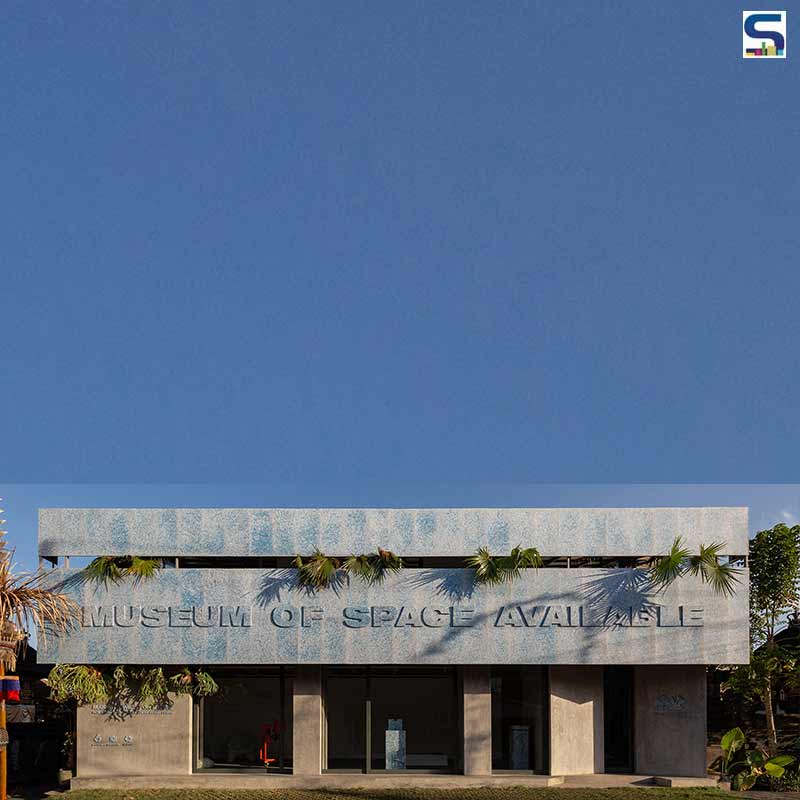
Indonesian architectural design studio Sidarta and Sandjaja recently designed a museum-like space for Space Available studio. The architect duo turned a Bali building into an institution that would be dedicated to circular design. For this, 200,000 recycled plastic bottles had been used only to design the façade of the Museum of Space Available (MoSA). Know more about the project on SURFACES REPORTER (SR).
 Sidarta and Sandjaja renovated an abandoned two-storey building for MoSA, which houses a gallery, recycling station and upcycling bar.
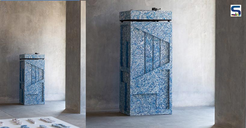
Located in Canggu, Daniel Mitchell, Founder, Space Available wanted to create a museum instead of a conventional shop or gallery which would narrate the story of the studio and its principles. According to Mitchell, a museum allows one to give context to the history of the material and how it arrived at the present. With this brief, Sidarta and Sandjaja decided to create an amalgamation of the studio’s own work and contributions from international artists, designers, researchers and scientists. This allowed MoSA to focus on innovations in plastic recycling, bio-materials and circular designs that would further form an archive of future possibilities. Understanding this, the duo made sure all the objects and products are crafted by hands where no two objects are the same. This allowed them to showcase and emphasize the handcraft culture.
Space Available in collaboration with Sidarta and Sandjaja renovated an abandoned two-storey building for MoSA, which houses a gallery, recycling station and upcycling bar where people can bring in old clothing items to give them a new life. Despite the museum is small, the architects aimed at designing it like a modern European museum with spacious exhibition halls for flexible use.
 To design its striking façade that represents the brand’s vision, 200,000 waste plastic bottles had to be sourced.
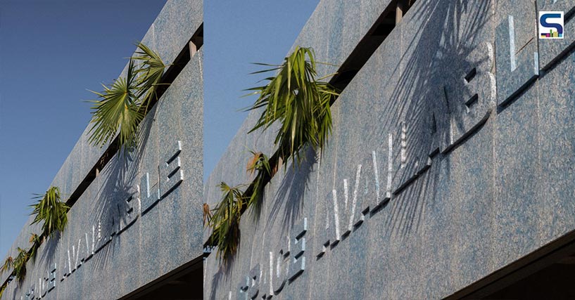
To design its striking façade that represents the brand’s vision, 200,000 waste plastic bottles had to be sourced. A joint effort with Indonesian circular firm Robries, who is known to make façades and signage, joined the bandwagon to design the façade and a few items inside the gallery.
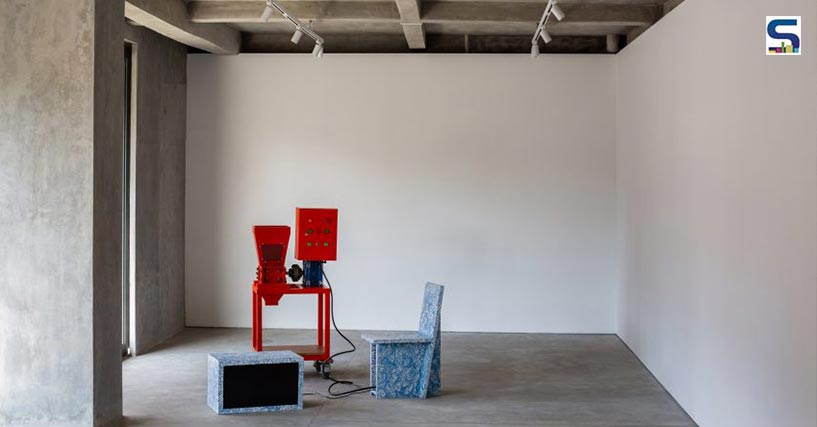
The idea to use waste plastic bottles had been made since it was available in endless supply in Indonesia and which are also a threat to its waterways. To design the plastic façade, the waste plastic bottles had to be shredded. The shredded plastic was then tossed into a sheet mould and heated to make it into blue-hued panels. These panels are positioned on the outside of the building, above the newly added sliding doors and polished concrete fascia. The façade has been designed to look like a continuation of the roof line. The mass is broken up with a narrow end-to-end cutout with poked-out tropical plants and oversized lettering. The interiors of MoSA had been stripped back to their core concrete where existing partitions had been removed to create an open gallery space accentuating white walls and exposed concrete ceiling.
 The interiors of MoSA had been stripped back to their core concrete where existing partitions had been removed to create an open gallery space accentuating white walls and exposed concrete ceiling.
Other than its open gallery space, MoSA will also house retail and repair spaces and act as a learning facility by hosting workshops for the benefit of the local community.
Image credits: Tommaso Riva