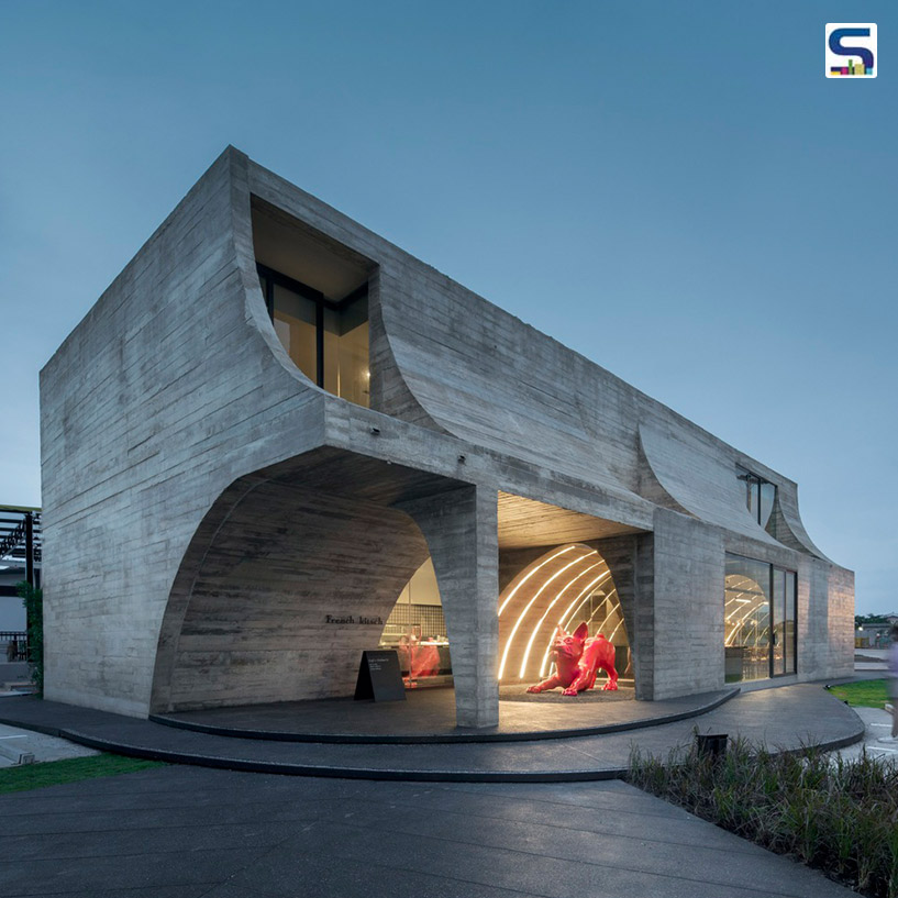
French Kitsch is not your typical French patisserie; it's a special place with a unique idea. It combines French elegance with a quirky charm called 'Kitsch.' This cafe in Thailand isn't just about delicious food; it's a treat for your eyes too. The design is all about embracing imperfections using cool architectural elements and materials. Discover more about this incredible project on SURFACES REPORTER (SR):
Interesting Arches and Cathedral Vibes
The design is inspired by French cathedrals with those cool arches. But, they're not all perfect and symmetrical.
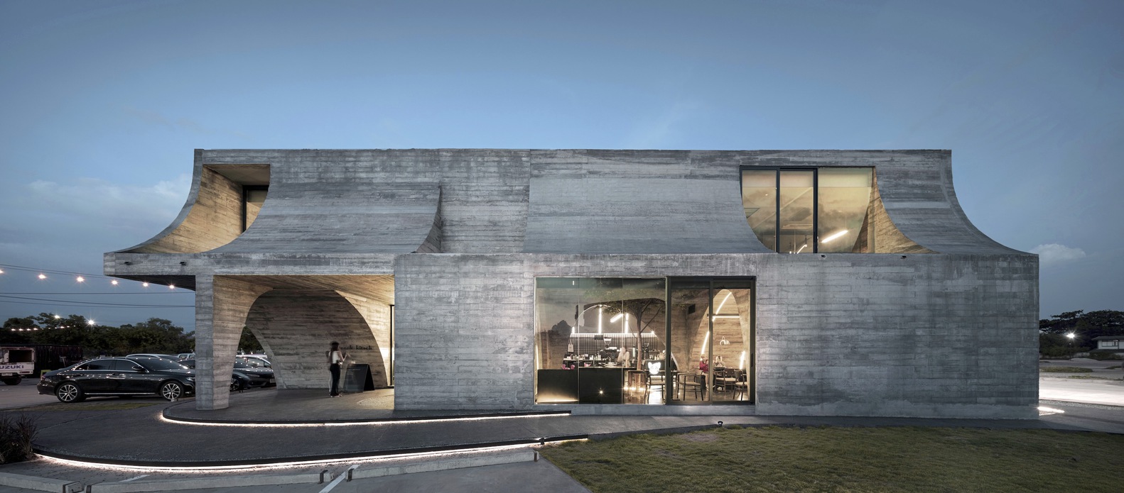 They come in different sizes, creating a super interesting look. The main building starts all perfect but gets transformed with imperfect arches on the first floor and upside-down arches on the second.
Playful with Shadows and Light
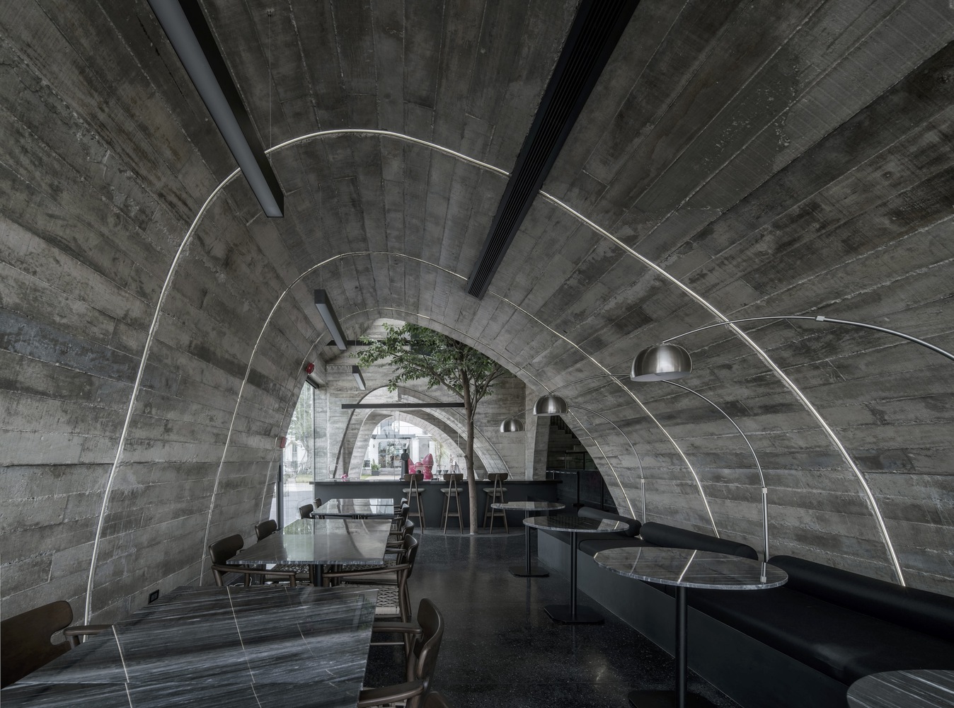
On the first floor, there are these old yet modern arches that guide you, making cool shadows and playing with light like stained glass windows in a cathedral. There's this big, imperfect arch that connects the counter to the second floor, making the whole place feel dynamic.
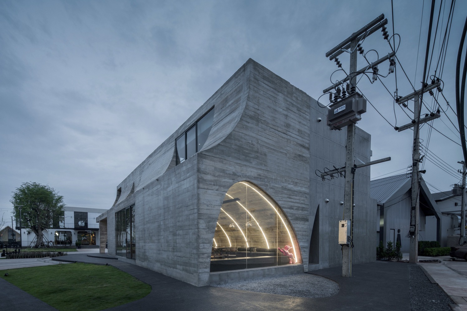 The second floor has gaps in the arches, letting sunlight in, creating a beautiful play of light.
Textured Walls
Now, the walls are made of textured concrete, not all smooth and perfect. It's on purpose, celebrating the beauty of imperfection. It's raw and not polished, showing that imperfections can be beautiful too.
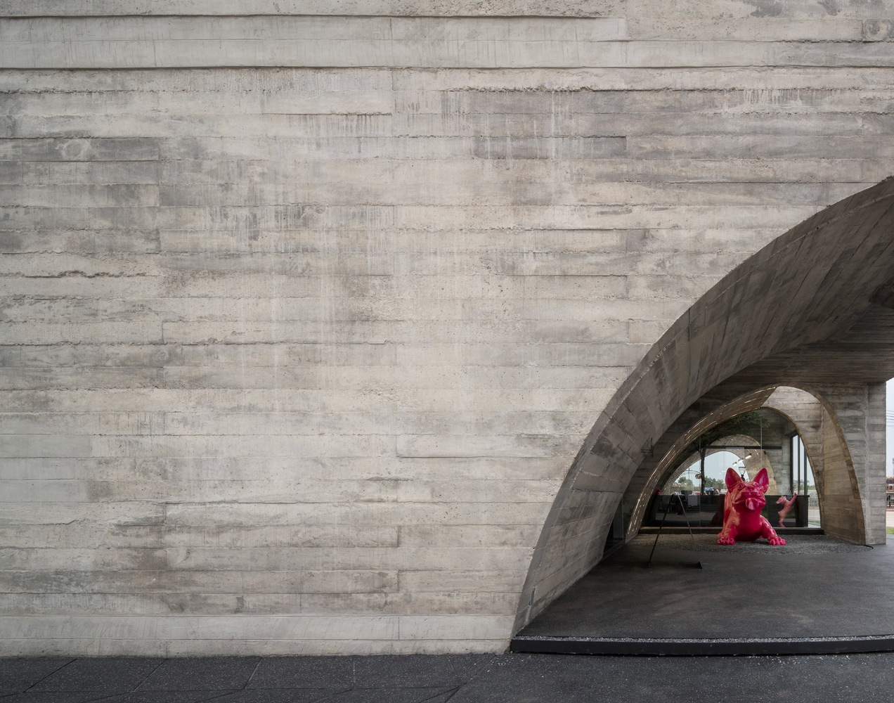
The walls tell a story of authenticity through their texture.
Concrete Everywhere with Fun Colours:
Concrete isn't just on the walls; it's everywhere - the furniture, decorations, and even the LED lights in cool green and pink. It's not just a material; it's a statement. Using concrete highlights the cafe's unique style with bold colors, creating a look that you won't forget. Every piece, from the furniture to the funky LED lights, shows off the cafe's personality.
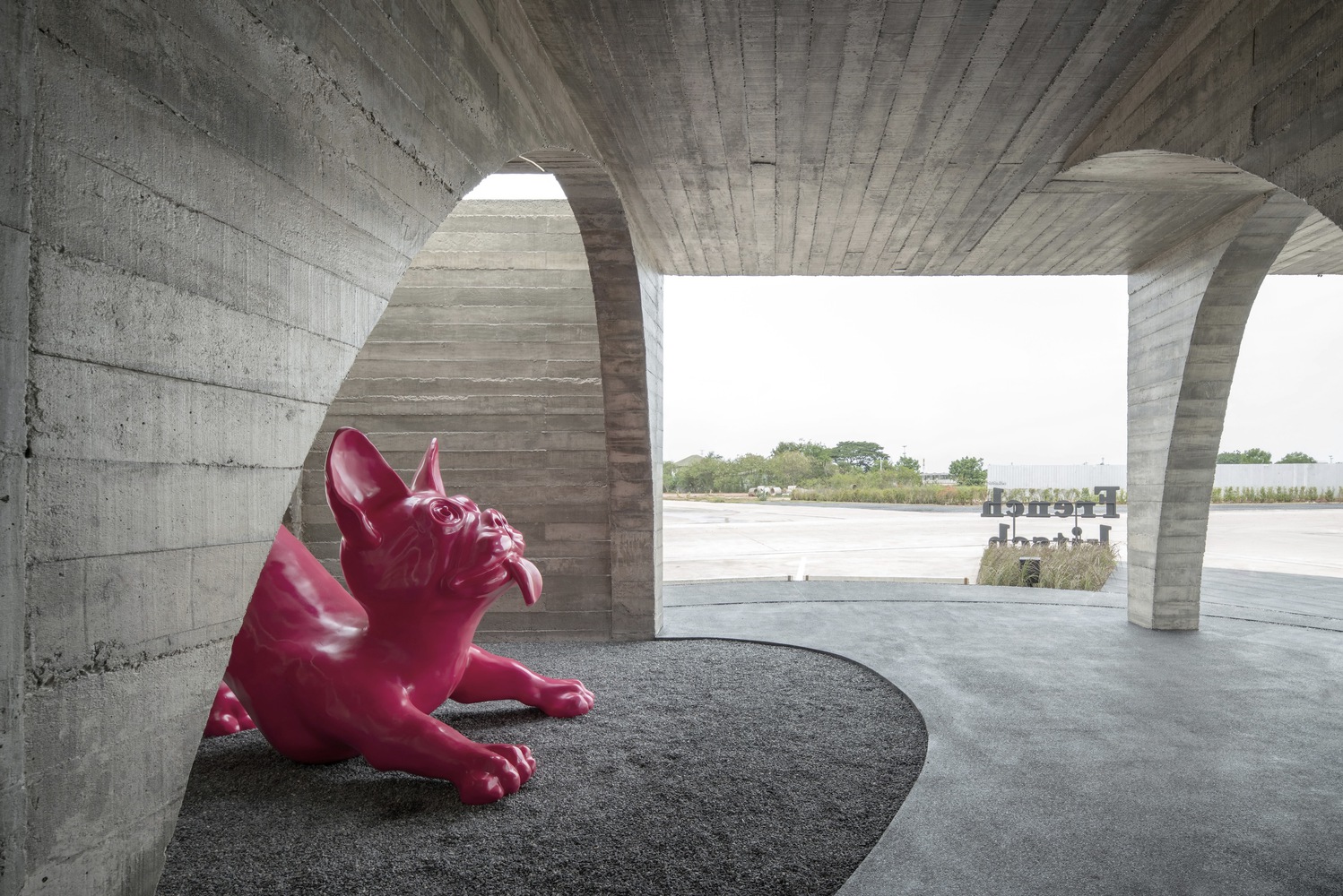
In simple terms, French Kitsch makes imperfections look cool. It's like turning flaws into an art form, making everything real and authentic. The design, mixing cool architecture and materials, turns this cafe into a visual treat, not just a yummy one. It's proof that imperfections can be pretty awesome in design.
Project Details
Project: Coffee Shop
Location: Thailand
Architects: TOUCH Architect
Area: 360 m²
Year: 2023
Photographs: Metipat Prommomate, Anan Naruphantawat
Manufacturers: HOOQ, TOA
Lead Architects: Setthakarn Yangderm, Parpis Leelaniramol
Contractor: Samma Construction